

In this post we will implement asynchronous and synchronous user input validation in ag-Grid. We've illustrated both of these cases with sample code you can easily reuse. The sample is based on JavaScript but you can apply the same approach in any framework.
We have built samples to illustrate synchronous and asynchronous validation separately.
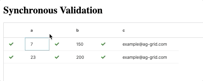
The GIF below is showing the synchronous validation sample.
See GIF below showing asynchronous validation displaying a spinner icon during validation:
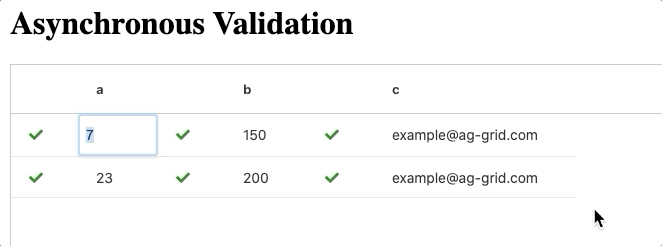
As you see in the sample above, ag-Grid has 3 columns that have input validation logic. If the input is valid, we will display a green tick mark next to the corresponding value column. If validation fails, we will display a red cross with a tooltip listing the reason validation failed. When using asynchronous validation we will show a spinner while the validation is happening.
Live Demo
Here are the live demos that you can play around with and inspect the code.
Synchronous validation example:
Asynchronous validation example:
Contents
- Synchronous validation
- Storing and displaying the validation status
- Handling input validation and cell update
- Showing a tooltip with the validation error
- Asynchronous validation
Synchronous validation
Synchronous validation is used for simple validation logic that is performed on the client without a remote service call. Please see the details of how to implement this here.
Storing and displaying the validation status
We will need to store whether input validation was successful or not so that we can display the appropriate icon - a tick for success or a red cross for failure. We do this by adding metadata to our row data for the fields we will be validating.
Each of our ag-grid fields will be bound to complex objects that include the cell value and the additional metadata property called lastValidation to store the validation status for that cell.
The lastValidation property can be either true (when input validation is successful) or the failed validation value itself (when input validation fails). The failed validation value will be used to display a tooltip showing the reason validation failed together with the failed value.
The code below shows the data for our first row in the grid. As you can see we have a complex object for our cell values which also holds the lastValidation property.
 rowData: [
    {
      id: "id-1",
      a: { value: 7, lastValidation: true },
      b: { value: 150, lastValidation: true },
      c: { value: "example@ag-grid.com",lastValidation: true }
    },
  ]
Since our data now holds a complex object, we will need to provide valueGetters to get the right values to display in the column cells. Please see additional information on using value getters with complex objects in our documentation.
In this sample we are adding an extra column to display the validation status alongside the cells that are validated. However, in your own application, you can display the validation status in the same cell if you'd like.
Here you can see two factory methods, one for the value column and another for a validation status column. We use these two factory methods to create the column definitions for the grid - note that we're passing the same field in both calls to set up a column definition and a second one for its validation status.
gridOptions.columnDefs: [
    createValidationStatusColumn("a", "value must be greater than 5"),
    createColumnDef("a", isGreaterThanFive, numberParser),
],

function createColumnDef(field, validationFn, valueParser) {
  return {
    headerName: field,
    field,
    valueGetter: (params) => params.data[field].value,
    valueSetter: syncValueSetter(validationFn),
    editable: true,
    valueParser
  };
}

function createValidationStatusColumn(field, validationFailedMsg = "", headerName = "") {
  return {
    colId: "validation",
    valueGetter: (params) => params.data[field],
    headerName,
    cellRenderer: validationStatusRenderer,
    suppressMenu: true,
    minWidth: 10,
    tooltipComponent: CustomTooltip,
    tooltipValueGetter: (params) => {
      let isFieldValid = params.value.lastValidation === true;
      if (isFieldValid) return "";
      return {
        field,
        lastValidation: params.value.lastValidation,
        validationFailedMsg
      };
    }
  };
}
Now our cellRenderer logic will show the appropriate validation result icon. If lastValidation is true we show a tick icon, and if not, we show a red cross icon. Please see the cellRenderer implementation below:
function validationStatusRenderer(params) {
  let tick = `<i class="fa fa-check" aria-hidden="true"></i>`;
  let cross = `<i class="fa fa-times" aria-hidden="true"></i> `;
  let icon = params.value.lastValidation === true ? tick : cross;
  return icon;
}
Now whenever the lastValidation property gets updated for a cell, the validation cell will render the appropriate icon.
Handling input validation and cell update
Whenever a user edits an ag-grid cell, a valueSetter gets called with the new and the old value in its parameters.
We will modify the default valueSetter behavior to validate the input and then set the value using a transaction update. Essentially we're replacing the default valueSetter logic with a transaction update. This is why we return false in the valueSetter to cancel the default editing behavior.
For convenience we will also make use of a higher-order function called syncValidateValueSetter, this will be used for partially applying a validating function to our valueSetter.
const syncValidateValueSetter = (validateFn) => (params) => {

    // Side Effect that handles validation and updating the grid
    syncValidator(
        params.newValue,
        validateFn,
        _onSuccess(params),
        _onFail(params)
    );

  return false;
};
Now we can use our valueSetter like this:
function createColumnDef(field, validationFn, valueParser) {
  return {
    //code omitted for simplicity...
    valueSetter: syncValidateValueSetter(validationFn),
	//...
  };
}
Note that we are passing a validation function to the syncValidateValueSetter. This function will be used to validate the value entered by the user.
The syncValidator is responsible for input validation and calling the cell update handlers. This validator takes the new value, the validation function, a success handler and a failure handler, as shown in the code below.
const syncValidator = (newValue, validateFn, onSuccess, onFail) => {
  if (validateFn(newValue)) {
    onSuccess();
  } else {
    onFail();
  }
};
Our success/failure handlers are responsible for updating the row data with transaction updates. In our case we are updating the lastValidation value and the cell value if the value has been successfully validated.
Here is an example of a success handler:
const _onSuccess = params => () => {
  let data = params.data;
  let field = params.colDef.field;

  data[field] = {
    ...data[field],
    lastValidation: true,
    value: params.newValue
  };
  params.api.applyTransaction({ update: [data] });
};
Note that the success handler sets lastValidation to true and sets the cell value to the new value via a transaction.
On the other hand our fail handler gets called when the validation fails and it simply sets lastValidation to the new value (which failed to validate) without changing the cell value. Please see this in the code below:
const _onFail = params => () => {
  let data = params.data;
  let field = params.colDef.field;

  data[field] = {
    ...data[field],
    lastValidation: params.newValue
  };
  params.api.applyTransaction({ update: [data] });
};
Showing a tooltip with the validation error
Whenever input validation fails, we want to display a tooltip to indicate to the user the reason for that. Please see an example of this below:
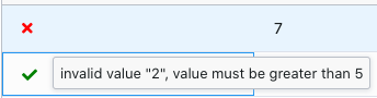
We're passing the field, lastValidation and the failed validation message via the tooltipValueGetter to the tooltip component for the column. See this illustrated in the code below:
class CustomTooltip {
  init(params) {
    this.eGui = document.createElement("div");
    this.eGui.classList.add("custom-tooltip");

    let { field, lastValidation, validationFailedMsg } = params.value;

    this.eGui.innerHTML = `
        <div class="validation-msg">
          FIELD-${field.toUpperCase()} - invalid value:
          "<span class="invalid-value"> ${lastValidation} </span>",
          ${validationFailedMsg}
        </div>
    `;
  }
  getGui() {
    return this.eGui;
  }
}

function createValidationStatusColumn(
  field,
  validationFailedMsg = "",
  headerName = ""
) {
  return {
    //... column def
    tooltipComponent: CustomTooltip,
    tooltipValueGetter: params => {
      let isFieldValid = params.value.lastValidation === true;
      if (isFieldValid) return "";
      return {
        field,
        lastValidation: params.value.lastValidation,
        validationFailedMsg
      };
    }
  };
}
You can read more about using Tooltip components in our documentation.
Asynchronous validation
Asynchronous validation allows you to use more complex validation logic that relies on a remote service call. In this example, we're using setTimeout to simulate a remote service call.
Our asynchronous example will be very similar to the synchronous one so we will be reusing most of the code.
With async validation the validation cell will display a spinner while the validation is happening. For this we add an extra metadata boolean property called isValidating.
This property will be used in the validation cell renderer whether to show a spinner or not. Please see the updated rowData below with the two metadata properties to store validation status:
  rowData: [
    {
      id: "id-1",
      a: { value: 7, isValidating: false, lastValidation: true },
      b: { value: 6, isValidating: false, lastValidation: true },
      c: {
        value: "example@ag-grid.com",
        isValidating: false,
        lastValidation: true
      }
    }
  ]
We update the cellRenderer to display a spinner while the property isValidating is true, as shown below:
function validationStatusRenderer(params) {
  let tick = `<i class="fa fa-check" aria-hidden="true"></i>`;
  let cross = `<i class="fa fa-times" aria-hidden="true"></i> `;
  let spinner = `<i class="spinner fa fa-cog fa-spin fa-3x fa-fw"></i>
            <span class="sr-only">Loading...</span>`;

  let icon = params.value.isValidating
    ? spinner
    : params.value.lastValidation === true
    ? tick
    : cross;
  return icon;
}
We need to update the syncValidator and syncValidateValueSetter functions to support asynchronous behavior by taking an extra handler called _onWhileValidating. Please see the implementation of these functions below:
const asyncValidateValueSetter = validateFn => params => {
  asyncValidator(
    params.newValue,
    validateFn,
    _onWhileValidating(params),
    _onSuccess(params),
    _onFail(params)
  );
  return false;
};
const asyncValidator = (
newValue,
validateFn,
onWhileValidating,
onSuccess,
_onFail
) => {
onWhileValidating();
setTimeout(function() {
if (validateFn(newValue)) {
onSuccess();
} else {
_onFail();
}
}, 1000);
};Note that now we are passing a onWhileValidating function which gets executed straight away to show the spinner.
See the logic for onWhileValidating shown below:
const _onWhileValidating = (params) => () => {
  // Change the validating property
  let data = params.data;
  let field = params.colDef.field;

  data[field] = {
    ...data[field],
    isValidating: true
  };
  params.api.applyTransaction({ update: [data] });
};
Note that we set isValidating to true, causing the spinner to be displayed.
Disabling editing while validating
While input validation is happening and the spinner is spinning we want to prevent the cell from being edited.
We do this by binding the editable callback in our column definition to the isValidating data property, as shown below:
function createColumnDef(field, validationFn, valueParser) {
  return {
   //code omitted for simplicity...
    editable: params => !params.data[field].isValidating,
  };
You can read more about editable callback in our documentation on Cell Editing.
What's next?
We hope that you find this article useful whenever you're looking to vaildate user input in ag-Grid. Please use the samples below and modify them as you see fit.
If you would like to try out ag-Grid check out our getting started guides (JS / React / Angular / Vue)
Happy coding!