
Earlier this year we released our latest theme: Material Dark. Our design team built this theme in record time by using our very own Figma Design System. By using the Design System, all we had to do was:
- Style each of the data grid components in Figma (based on the Material Design Guidelines specifications).
- Export the CSS variables from Figma.
- Convert the exported JSON file to an AG Grid theme with our handy script.
...and that was it. Now all users need to do is import the theme into their application and apply it via a CSS class to have a 100% dark material grid.
This blog is going to take a closer look at each step of the process to show you how easy our Figma Design System makes it to create and customise themes for AG Grid.
The AG Grid Design System
If you're already familiar with our design system, feel free to skip this part. For those who aren't: The AG Grid design system replicates the Quartz, Alpine, and Material AG Grid themes within Figma. These default themes can then be extended with Figma variables to match any existing visual design or create entirely new AG Grid themes. What's especially cool is that everything in the Design System is a 1:1 match with the components in the data grid, meaning that you can see exactly what your designs will look like without needing to write any code, and your developers won't have any surprises when they go to implement your design, either. Everyone wins.
How We Built It
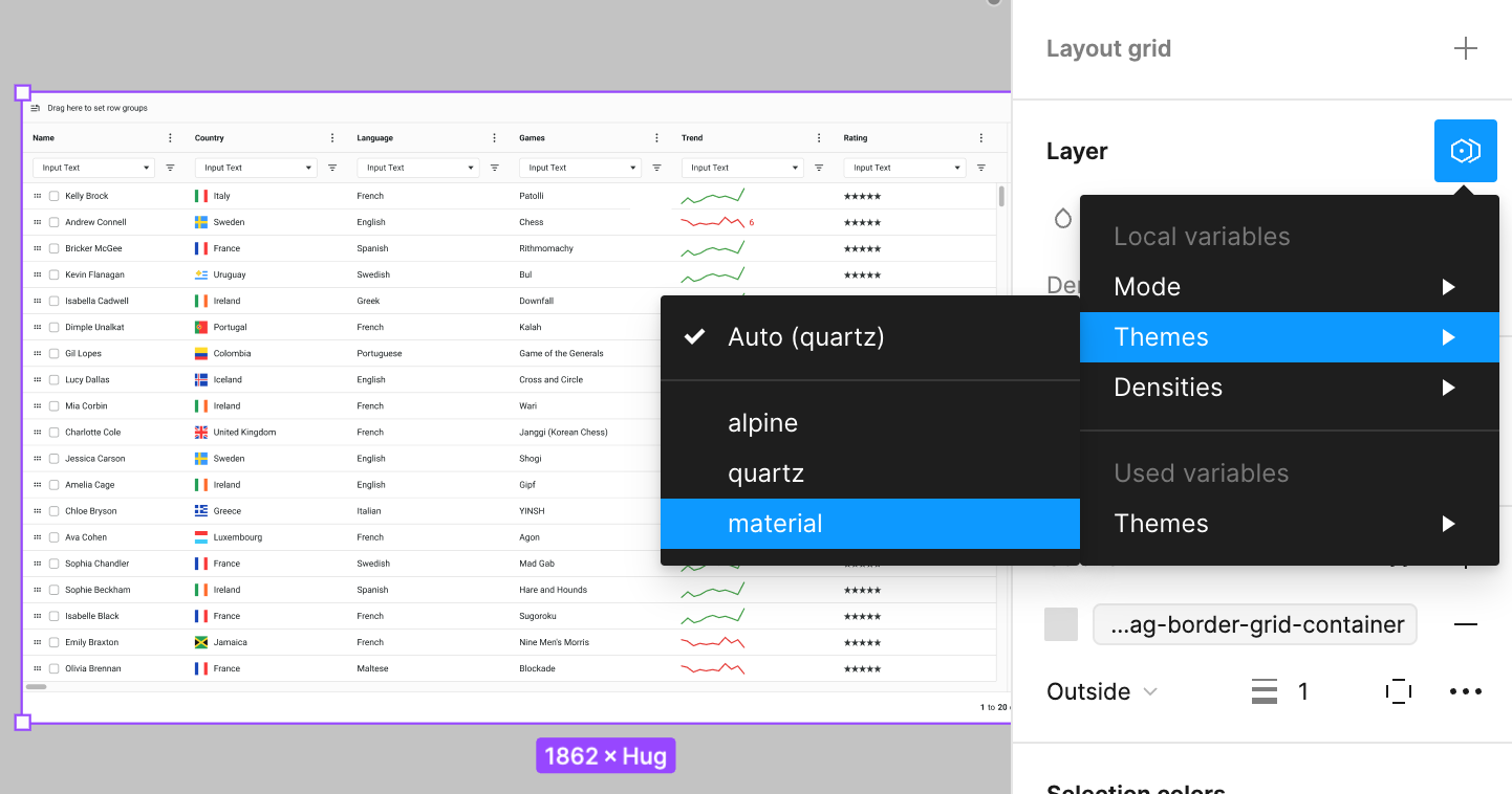
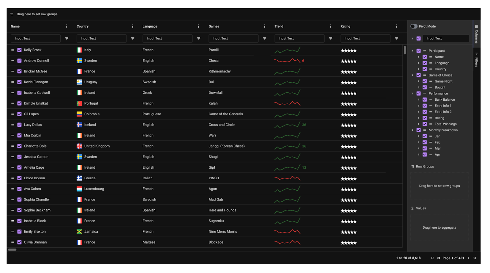
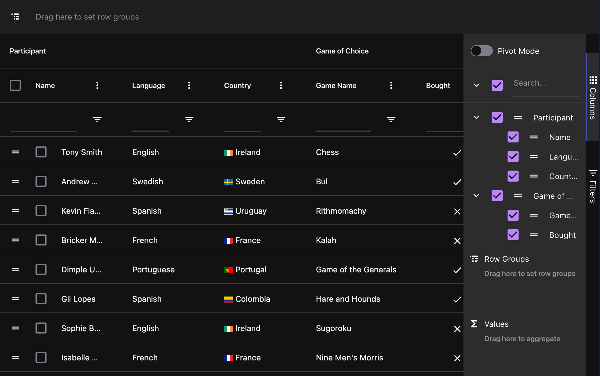
As we mentioned, the Design System contains a replica of every AG Grid theme so the Material Light theme was an obvious place to start for us. To do this we simply had to pull the AG-Grid component from the Assets panel and set its “Themes” mode to “Material”:
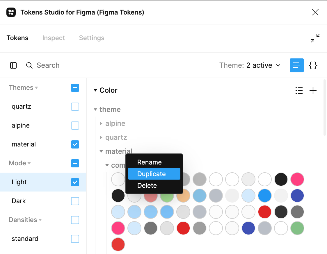
Tokens Studio
Next, we used a tool called Token Studio to duplicate the design tokens for the Light mode that already existed in our design system. This essentially gave us an identical set of tokens that we could then use to build our dark theme, by altering the key-value pairs:
Customising Colours
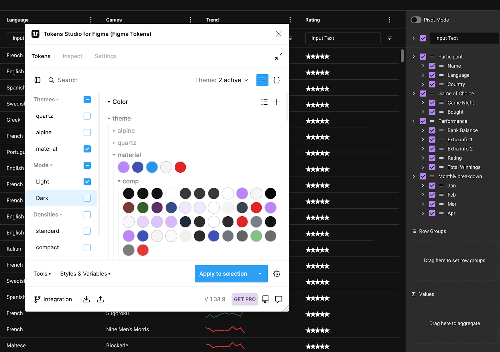
At this point we had a 1:1 copy of the Material Light theme in Figma, ready to start manipulating colours. The Design System maps the AG Grid CSS variables, such as: ag-border-color ag-background-color ag-header-background-color ag-active-color etc... So all we had to do was studiously iterate through each variable and update it to the appropriate value - time-consuming, but simple:
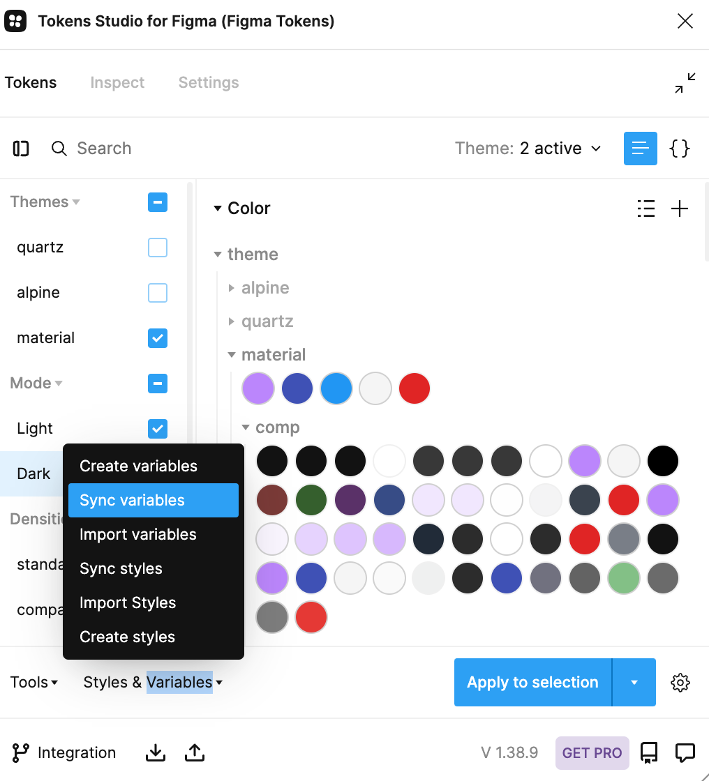
Verifying Design
Every so often we would make sure to "Sync Variables" (a feature of Token Studio) to see the changes reflected in the grid:
After a while, we were happy with the result (we're perfectionists here so it took a little while to settle on the right colours):
Exporting & Converting
With the theme ready to be shipped, the last step was to get it packaged up and ready for users to add it to their grid. To do this, we used another third-party plugin called “Design Tokens” to export the local variables out of Figma:
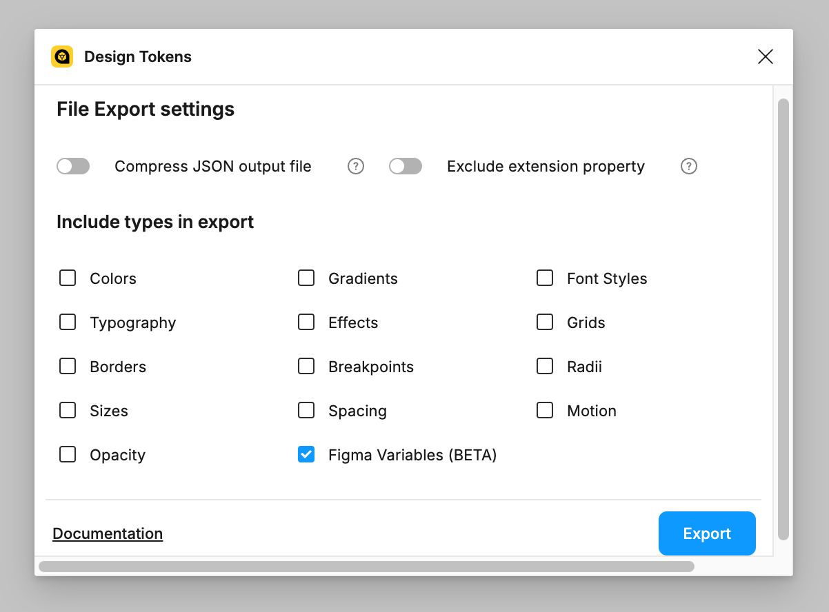
Design Tokens exported our variables into a JSON file which we could then pass through a script which parses the JSON into CSS variables, compatible with AG Grid.
This script is built & maintained by our AG Grid team and is available on GitHub (alongside a few extra utilities, too). You can review the source code to see exactly how this works, but essentially it uses Amazon's Style Dictionary library to map .json keys to CSS variables:
$ node tokensToCss.js PATH_TO_MY_TOKENS_JSON_FILE.tokens.json
...
✔︎ ./css/new-ag-grid-themes.css saved!
And that's it - the script produced the AG Grid Material Dark Theme which is now available via our docs and is already being used by 1000s of devs:
Summary
We've often heard the misconception that AG Grid is hard to customise, and we hope that this blog goes some way to dispelling that perception. If you want to learn more or get started with our Design System, take a look at our dedicated docs, or head over to our Figma Community page:
Bonus:
Last but not least, if you've made it this far, you may be interested in our new Theme Builder application. This new app, available at ag-grid.com/theme-builder, complements the Design System and lets people of all backgrounds - developers, users, and designers - easily customise and create new AG Grid themes via an intuitive web interface: