
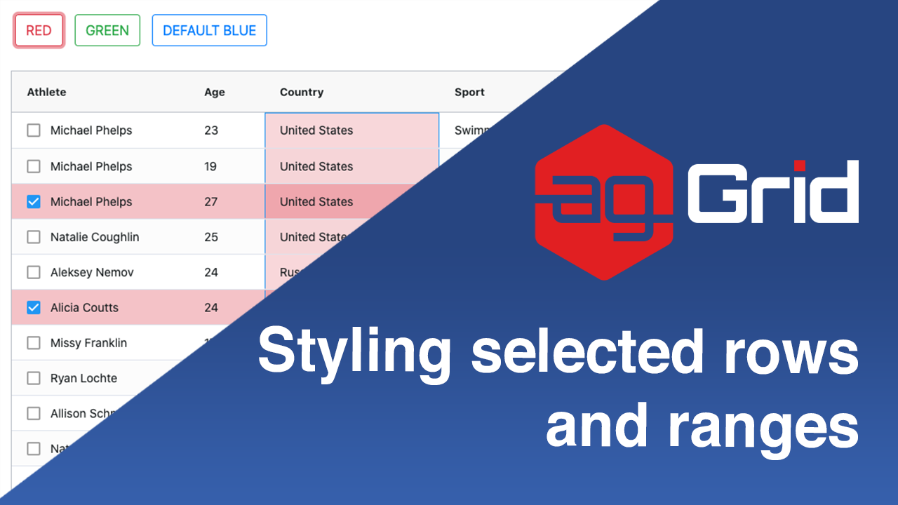
This post will show you how to style selected rows and cell ranges in ag-Grid using plain CSS. You will also see how to dynamically switch between styles after pressing a button. We hope this will help you make your applications using ag-Grid better styled and more user friendly.
We have demonstrated this approach in live samples in JavaScript, Angular, React and Vue.js.
Please see the illustration below showing the sample in action:
See the live sample in JavaScript below and links to the same sample in other frameworks just below it.
Open the live example in all the major frameworks using the links below:
• Angular
• React
• Vue
• JavaScript
Contents
- Applying different themes
- Declaring styles for the themes
- Declaring styles for selected rows
- Declaring styles for range selected cells
- Addition approaches to styling ag-Grid
Applying different themes
In order to modify the style of the selected rows and cell range we wrap ag-Grid in a div with a class name that will be used to target the ag-Grid row and cell styles. This way we can target different CSS rules based on the wrapping div's class name. You can see this approach implemented below - we have a wrapping div with class name "red-theme".
	<div id="grid-theme-wrapper" class="red-theme" style="height: 100%">
		<div id="myGrid" class="ag-theme-alpine" style="height: 500px"></div>
	</div>
We also add buttons that when clicked will replace the wrapping div's class name with a new name ("red-theme" or "green-theme", etc.) and thus change the style applied to ag-Grid selected rows and cell ranges.
	<button
      onclick="replaceClassName('red-theme')"
      type="button"
      class="btn btn-outline-danger">
      RED
    </button>

	<button
      onclick="replaceClassName('green-theme')"
      type="button"
      class="btn btn-outline-success">
      GREEN
    </button>

	<button
      onclick="replaceClassName('')"
      type="button"
      class="btn btn-outline-primary">
      DEFAULT BLUE
    </button>
Here the code to replace the wrapping div's class name in JavaScript:
function replaceClassName(newClass) {
  var gridDivThemeWrapperDiv = document.querySelector("#grid-theme-wrapper");
  gridDivThemeWrapperDiv.className = newClass;
}
Declaring styles for the themes
Now that we can apply different themes by adding a classes dynamically, we need to declare our CSS styles for our different themes.
See below how we've defined separate CSS rules for the green and red themes. This way if the wrapping class has the red-theme, the first style will be applied, and if the wrapping class has the green-theme the second style will be applied.
#grid-theme-wrapper.red-theme .ag-theme-alpine {
 // styles for red theme
}


#grid-theme-wrapper.green-theme .ag-theme-alpine {
 // styles for green theme
}
Declaring styles for selected rows
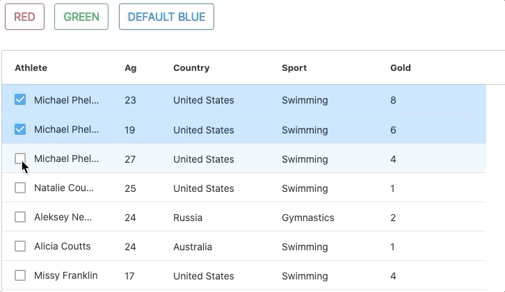
Now that we've declared selectors for the different themes, let's declare styles for selected rows. See the styling of the selected rows applied in the image below:
Here's the CSS rule to override the default selected rows styles and set the selected row color to red.
/* ROW SELECTION */
#grid-theme-wrapper.red-theme .ag-theme-alpine .ag-row-selected {
  background-color: rgba(220, 53, 69, 0.3); /* red */
}
Declaring styles for range selected cells
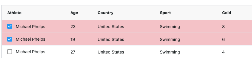
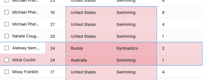
Let's now declare styles to be used for the selected cell range. See the styling of the selected cell range applied in the image below:
Range selection has more complex selectors as there are more use cases to cover. For example, when using multiple cell ranges that intersect with one another the intersection will be styled in a darker color. ag-Grid allows you to override styling for up to 4 intersecting range selections.
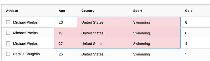
For example, see a screenshot showing the intersection of two cell ranges below. Notice how the intersection is styled darker then the rest of the cells.
There's many more selection use cases for example based on where focus is in the grid or outside of the grid. We will not cover each of these cases separately here. However, the code below covers these additional use cases. The top two rules cover use cases around selection and focus, while the rest of the rules cover the styles used for different levels of intersecting cell ranges.
You can easily reuse these selectors in your styling code - just modify the color values and the target theme selected (red-theme in the code below):
/* RANGE SELECTION */
#grid-theme-wrapper.red-theme
  .ag-theme-alpine
  .ag-cell-range-selected:not(.ag-cell-focus),
#grid-theme-wrapper.red-theme
  .ag-theme-alpine
  .ag-body-viewport:not(.ag-has-focus)
  .ag-cell-range-single-cell:not(.ag-cell-inline-editing) {
  background-color: rgba(220, 53, 69, 0.2);
}

/* RANGE SELECTION ITERSECTION LEVELS */

#grid-theme-wrapper.red-theme
  .ag-theme-alpine
  .ag-body-viewport:not(.ag-has-focus)
  .ag-cell-range-selected-1:not(.ag-cell-inline-editing) {
  background-color: rgba(220, 53, 69, 0.2);
}


#grid-theme-wrapper.red-theme
  .ag-theme-alpine
  .ag-cell-range-selected-1:not(.ag-cell-focus),
grid-theme-wrapper.red-theme
  .ag-theme-alpine
  .ag-body-viewport:not(.ag-has-focus)
  .ag-cell-range-selected-1 {
  background-color: rgba(220, 53, 69, 0.2);
}

#grid-theme-wrapper.red-theme
  .ag-theme-alpine
  .ag-cell-range-selected-2:not(.ag-cell-focus),
grid-theme-wrapper.red-theme
  .ag-theme-alpine
  .ag-body-viewport:not(.ag-has-focus)
  .ag-cell-range-selected-2 {
  background-color: rgba(220, 53, 69, 0.36);
}

#grid-theme-wrapper.red-theme
  .ag-theme-alpine
  .ag-cell-range-selected-3:not(.ag-cell-focus),
grid-theme-wrapper.red-theme
  .ag-theme-alpine
  .ag-body-viewport:not(.ag-has-focus)
  .ag-cell-range-selected-3 {
  background-color: rgba(220, 53, 69, 0.488);
}

#grid-theme-wrapper.red-theme
  .ag-theme-alpine
  .ag-cell-range-selected-4:not(.ag-cell-focus),
grid-theme-wrapper.red-theme
  .ag-theme-alpine
  .ag-body-viewport:not(.ag-has-focus)
  .ag-cell-range-selected-4 {
  background-color: rgba(220, 53, 69, 0.5904);
}
You can easily create a new theme using this one as a starting point. Just duplicate the same rules and change the "red-theme" with any other class you want and set the background color property value accordingly.
Addition approaches to styling ag-Grid
The approach we demonstrated in this post shows a quick way to build a theme by overriding the default styles of ag-Grid using CSS. However, there are many more ways you can style the grid to fit your needs.
Please see the Layout and Styling documentation to learn more.
What's next?
We hope that you find this article useful whenever you're looking to style row selections and cell range selections. Please use the samples below and modify them as you see fit.
If you would like to try out ag-Grid check out our getting started guides (JS / React / Angular / Vue)
Happy coding!