

ag-Grid gives great flexibility in the ways you can update cell content. In this post, we'll demonstrate a simple CRUD application written using React Hooks. We'll go over some frequently used configurations in custom editors and show you how to create and destroy rows using custom renderers. We'll also upgrade the ag-Grid default date filtering behaviour by integrating a third party Date Picker component.
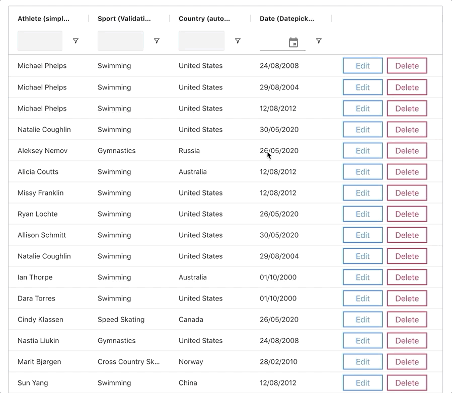
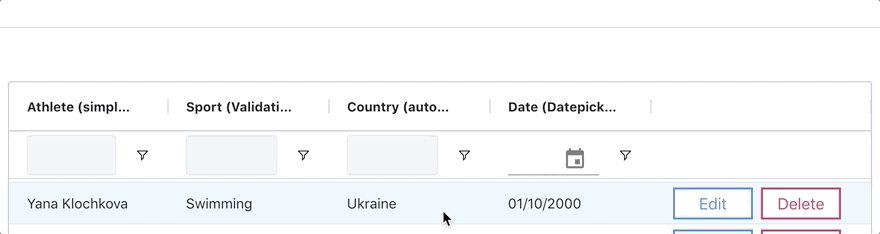
You can see the full application below.
We'll go over:
Custom Editors
ag-Grid provides a number of out of the box editors that will fulfill most simple use cases. However, In the case that you would like to extend the behaviour of an editor, ag-Grid allows you to create your own Custom Editors:
Simple Editor

This SimpleEditor component shows the bare bones configuration needed for a custom editor written using React Hooks.
// src/Components/Editors/SimpleEditor.jsx

export default forwardRef((props, ref) => {
    const inputRef = useRef();
    const [value, setValue] = useState('');

    function inputHandler(e) {
        setValue(e.target.value);
    }

    useImperativeHandle(ref, () => {
        return {
            getValue: () => {
                return value;
            },
            afterGuiAttached: () => {
                setValue(props.value);
                inputRef.current.focus();
                inputRef.current.select();
            }
        };
    });

    return (
        <input
            type="text"
            className="ag-input-field-input ag-text-field-input"
            ref={inputRef}
            onChange={inputHandler}
            value={value}
            placeholder={'Enter ' + props.column.colId}
        />
    )
})
The result of editing is returned to ag-Grid in the getValue(required) lifecycle method. We've also included the afterGuiAttached(optional) hook where we focus on and highlight the component after it has mounted.
It's important to note that when using React Hooks that all custom editors should be wrapped in React.forwardRef and all ag-Grid lifecycle methods should be returned in React.useImperativeHandle.
Learn more about ag-Grid Custom Editors
Learn more about using React Hooks with ag-Grid
Asynchronous Validation

This component demonstrates how asynchronous validation can be configured inside a custom editor.
We've mocked a server call using a Promise that gets resolved after a user has finished typing and updates the component's valid state variable:
// src/Components/Editors/AsyncValidationEditor.jsx

export default forwardRef((props, ref) => {
// [...]

const debouncedInputVal = useDebounce(inputValue, 1000);

    function inputHandler(e) {
        setTouched(true);
        setInputValue(e.target.value);
        setValidating(true);
    }

    useEffect(() => {
        // random time between 0 and 1000ms
        let timeout = Math.floor(Math.random() * 1000);

        new Promise((resolve, reject) => {
            if (inputValue === '') {
                resolve(false);
            } else {
                setTimeout(() => {
                    resolve(props.condition(inputValue));
                }, timeout);
            }
        })
            .then(valid => {
                setValid(valid);
                setValidating(false)
            })
            .catch(err => console.log(err));
    }, [debouncedInputVal]);

    // [...]
    })
The valid state variable then dictates whether or not the editor's updated value will be returned to the grid in the isCancelAfterEnd(optional) lifecycle hook:
// src/Components/Editors/AsyncValidationEditor.jsx

useImperativeHandle(ref, () => {
        return {
            // [...]
            isCancelAfterEnd: () => {
                return !valid || validating;
            },
        };
    });
Learn more about Editing Cells.
Autocomplete w/ Material-UI
The AutoComplete editor leverages a third party dropdown component, which is available for use via the Material-UI component library. Integration with ag-Grid is easily done:
// src/Components/Editors/AutoCompleteEditor.jsx

export default forwardRef((props, ref) => {
// [...]

return (
        <Autocomplete
            style={{ padding: '0 10px' }}
            options={props.options}
            value={value}
            onChange={onChangeHandler}
            inputValue={inputValue}
            onInputChange={onInputChangeHandler}
            disableClearable
            renderInput={(params) => (
                <TextField
                    {...params}
                    style={{ padding: '5px 0' }}
                    placeholder={'Select ' + props.column.colId} />
            )}
        />
    );
    })
Notice how the dropdown options are passed to the custom component via props. This allows for component reuse across columns:
// src/App.js

const columnDefs = [
    {
        headerName: "Country (autoComplete)",
        field: "country",
        cellEditor: 'autoCompleteEditor',
        cellEditorParams: {
            options: OLYMPIC_COUNTRIES
        },
    },
    // [...]
]
Learn more about Editing Cells.
Date Editor w/ Material-UI
The DateEditor component also leverages a third party datepicker component provided by Material-UI.
After the component has mounted, the underlying cell value is converted to a JavaScript Date Object and is set on the datepicker. The final result of editing is then converted back into a string in the format dd/MM/yyyy:
// src/Components/Editors/DateEditor.jsx

export default forwardRef((props, ref) => {
// [...]

useImperativeHandle(ref, () => {
        return {
            getValue: () => {
                let dateString = null;
                if (selectedDate) {
                    dateString = format(selectedDate, 'dd/MM/yyyy');
                }
                return dateString;
            },
            isCancelAfterEnd: () => {
                return !selectedDate;
            },

            afterGuiAttached: () => {
                if (!props.value) {
                    return;
                }
                const [_, day, month, year] = props.value.match(/(\d{2})\/(\d{2})\/(\d{4})/);
                let selectedDate = new Date(year, month - 1, day);
                setSelectedDate(selectedDate);
            }
        };
    });

   // [...]
   })
Learn more about Editing Cells.
Filtering using Date Pickers w/ Material-UI
Date pickers are used to filter the grid based on date values. Here we show how you can configure a custom Date Picker component:
// src/Components/DatePicker/MyDatePicker.jsx

export default forwardRef((props, ref) => {
// [...]

function handleDateChange(d) {
        if (d) {
            // set time to midnight
            d.setHours(0, 0, 0, 0);
        }
        setSelectedDate(d);
    }

    useEffect(props.onDateChanged, [selectedDate])

 useImperativeHandle(ref, () => {
        return {
            getDate: () => {
                return selectedDate;
            },
            setDate: d => {
                handleDateChange(d);
            }
        };
    });

    // [...]
   })
The getDate(required) and setDate(required) lifecycle methods are used to sync ag-Grid's date filter value with that of our components. Note that props.onDateChanged must be called after updating our component's internal state.
Learn more about ag-Grid Custom Date Pickers.
Creating Rows
Now that we've seen how to set up advanced editors to update the data, let's look at the code we need to create and delete rows in the data store.
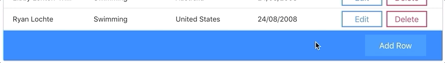
We're using a custom StatusBar component to render a button that adds an empty row to the grid:
// src/Components/StatusBar/AddRowStatusBar.jsx

export default props => {
	// [...]
function addRow() {
        let id = uuid();
        let emptyRow = { id };
        props.api.updateRowData({ add: [emptyRow] });
        let node = props.api.getRowNode(id);
        props.api.ensureIndexVisible(node.rowIndex);

        setTimeout(() => {
            props.api.startEditingCell({
                rowIndex: node.rowIndex,
                colKey: props.columnApi.getAllColumns()[0].colId
            });
        }, 300);
    }

    return (
        <div className="add-btn-container">
            <button
                variant={editing ? 'outlined' : 'contained'}
                color="primary"
                onClick={addRow}
                disabled={editing}>Add Row</button>
        </div>
    )
    }
To prevent multiple empty rows being added at the same time, the button is disabled while the grid is editing:
// src/Components/StatusBar/AddRowStatusBar.jsx

let [editing, setEditing] = useState(false);

    useEffect(() => {
        props.api.addEventListener('rowEditingStarted', onRowEditingStarted);
        props.api.addEventListener('rowEditingStopped', onRowEditingStopped);

        return () => {
            props.api.removeEventListener('rowEditingStarted', onRowEditingStarted);
            props.api.removeEventListener('rowEditingStopped', onRowEditingStopped);
        };
    }, []);

    function onRowEditingStarted() {
        setEditing(true);
    };

    function onRowEditingStopped() {
        setEditing(false);
    }
Learn more about ag-Grid Custom Status Bar Panels.
Learn more about Updating Data.
Deleting Rows
We are using a cell renderer in the right-most column to control actions on our rows. Below is the code that gets executed once the 'Delete' button in the cell renderer gets clicked.
// src/Components/Renderers/ActionsRenderer.jsx

export default (props) => {
	// [...]

    function deleteRow(force = false) {
        let data = props.data;
        let confirm = true;
        if (!force) {
            confirm = window.confirm(`are you sure you want to delete this row: ${JSON.stringify(data)})`)
        }
        if (confirm) {
            props.api.updateRowData({ remove: [data] });
            props.api.refreshCells({ force: true });
        }
    };

}
If an edited row is empty, it is automatically destroyed:
// src/Components/Renderers/ActionsRenderer.jsx

function onRowEditingStopped(params) {
        if (props.node === params.node) {
            if (isEmptyRow(params.data)) {
                deleteRow(true);
            } else {
                setEditing(false);
            }
        } else {
            setDisabled(false);
        }
    }

    function isEmptyRow(data) {
        let dataCopy = { ...data };
        delete dataCopy.id;
        return !Object.values(dataCopy).some(value => value);
    }
Learn more about ag-Grid Custom Cell Renderers.
Learn more about Updating Data.
What's next?
I hope you find this article useful when creating custom editors or when writing your components using React Hooks. Please check out our other blog posts and documentation for a great variety of scenarios you can implement with ag-Grid.
If you would like to try out ag-Grid check out our getting started guides (JS / React / Angular / Vue)
Happy coding!