
What is AG Grid?
AG Grid is a client-side JavaScript grid that can be integrated natively with any major framework.
This is one of many blog posts designed to prove why we call it "the best grid in the world".
- What is AG Grid?
- AG Grid Mail
- Summary of features used
- Cell Renderers
- Events/API
- Data updating
- Pagination
- Quick Filter
- Styling
- Row Selection
- Row Grouping
- What's Next
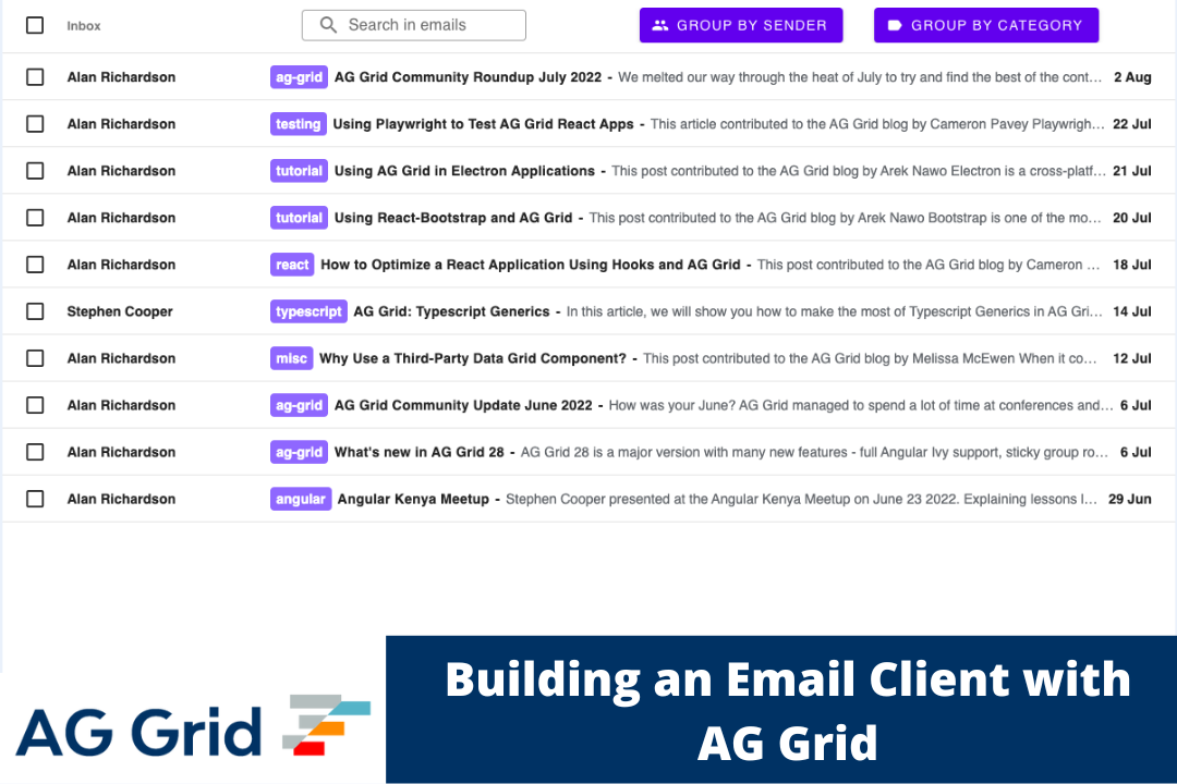
AG Grid Mail
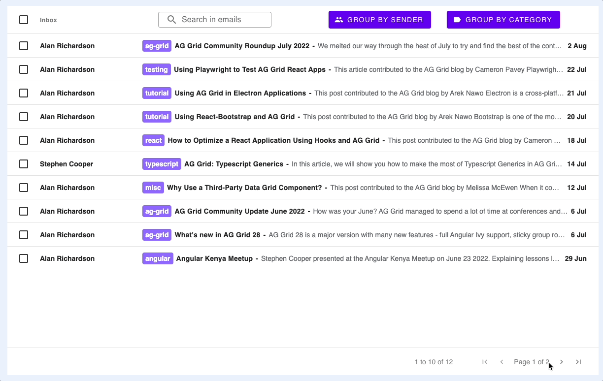
This example leverages some AG Grid features to produce an interface similar to the one you can see in Gmail. You can find a running example and its code below.
Open Source Code on Github
You can see the finished app in action hosted here.
Summary of features used
What follows are the list of features that have been used from AG Grid and how they have been used for this particular example. This blog post assumes that you know the basics to work with AG Grid, but if you don't you can find the following links helpful:
Documentation / Getting started (JS / React / Angular / Vue)
Cell Renderers
MIT/Free
Documentation: JS / React / Angular / Vue
More information on cell rendering: Cell Renderers / Cell Content
More information on registering components: Registering Components
More Cell Renderer Examples (available only to customers and trial users)
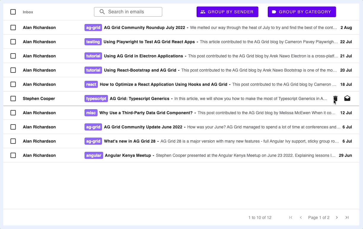
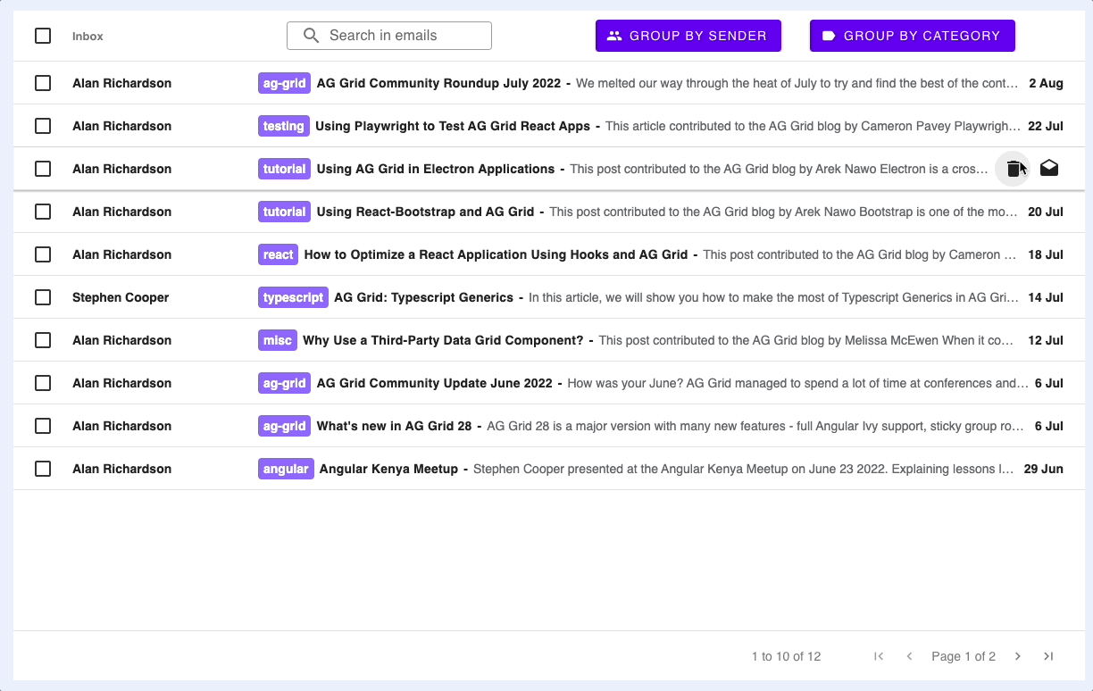
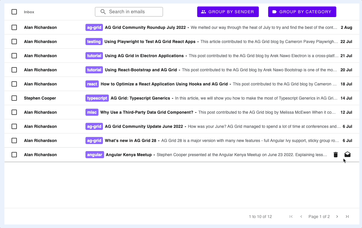
Cell Renderers are used in this example to fully customise the body of the row with a purple label component and to provide the hover effect showing the action icons.
Creating a Cell Renderer is very simple, you can see this in src/index.js. Below you can find the main highlights for the Cell Renderers:
// src/index.js

// applying a cell renderer only on ungrouped rows using a Cell Renderer Selector, you can read more about this in the above link 'Cell Renderers'
// referencing the Cell Renderer Component directly by its class
const columnDefs = [
    {
        field: 'title',
        cellRendererSelector: params => {
            return params.node.group ? undefined : { component: CustomCellRenderer }
        },
    },
    // ...
];


// src/customCellRenderer.js
class CustomCellRenderer {

    init(params) {
        this.params = params;
        this.eGui = document.createElement('div');
        // [...]

    }

    getGui() {
        return this.eGui;
    }

    // [...]

}

export default CustomCellRenderer;
Events/API
MIT/Free
Documentation: Grid Events, Grid API
More Grid Events Examples (available only to customers and trial users)
The application is listening to several Grid Events, for example to render the action icons as you hover over the rows, or to render the email in a popup when clicking on a a row.
The Grid Events are registered on the gridOptions as shown here:
// src/index.js

const gridOptions = {
    // [...]
    onCellMouseOver: onCellMouseOver,
    onCellMouseOut: onCellMouseOut,
    onRowClicked: onRowClicked,
    onGridReady: onGridReady
};
To look at an example, onCellMouseOver is fired when moving over the cell with the mouse, which will trigger the action icons to be rendered:
// src/index.js
const onCellMouseOver = params => {
    const instances = params.api.getCellRendererInstances({ rowNodes: [params.node], columns: [params.column] })
    if (instances.length > 0) {
        const instance = instances[0];
        instance.showRenderer();
    }
}
showRenderer is a method that exists on CustomCellRenderer objects:
// src/customCellRenderer.js
class CustomCellRenderer {
    // [...]

    showRenderer() {
        this.eActionContainer.style.display = '';
        this.eDateLabel.style.display = 'none';
    }
};
Data updating
MIT/Free
Documentation: Updating Data
More Updating Data Examples (available only to customers and trial users)
In several places in the example we update data, for instance, the data is updated when the delete icon is clicked so that the row is removed from the grid.
We've implemented getRowId which the grid uses the Row ID work out which rows to add/update/delete rather than changing the entire row data. This allows the grid to keep state such as Row Selection:
// gridOptions
const gridOptions {
    // [...]
    getRowId: ({ data }) => (data.id)
};
An example of how we are using the API to update the data in the grid, when a delete icon on a row is clicked:
// src/customCellRenderer.js
onClicked(ev) {
	const action = ev.currentTarget.dataset.action;

    switch (action) {
        case 'delete':
            this.params.api.applyTransaction({remove: [this.params.data]})
            break;
    }
}
Pagination
MIT/Free
Documentation: Pagination
Pagination can be enabled in the gridOptions:
// src/index.js
const gridOptions = {
    // [...]
    pagination: true,
    paginationPageSize: 10,
};
Quick Filter
MIT/Free
Documentation: Quick Filter
Quick Filter is enabled in this example to allow filtering on all the data based on data input.

The Quick Filter can be applied by calling the Grid's API setQuickFilter:
// src/index.js
const onGridReady = () => {
    // [...]
    const textField = new MDCTextField(document.querySelector('.mdc-text-field'));
    textField.listen('keyup', (ev) => {
        gridOptions.api.setQuickFilter(textField.value);
    });
};
Styling
MIT/Free
Documentation: Cell Styling, Row Styling, CSS Variables
More Styling examples (available only to customers and trial users)
Row Styling is used in this example to distinguish between which emails are read or unread, and if they are unread then the text is made bold and the background colour is changed.
There are several ways to style the grid, in this case we are using getRowStyle and Global CSS Variables:
// src/index.js
const gridOptions = {
    // [...]
    getRowStyle: ({ data, node }) => {
    if (!node.group) {
        return data.read ?
            { fontWeight: 'normal', backgroundColor: 'rgba(242, 245, 245, 0.8)' } :
            { fontWeight: 'bold', backgroundColor: 'rgb(255, 255, 255)' }
    }
};
}
/* styles.css */
.ag-theme-material {
--ag-font-size: 14px;
--ag-font-family: Roboto, RobotoDraft, Helvetica, Arial, sans-serif;
--ag-selected-row-background-color: rgb(194, 219, 255, 0.4);
--ag-material-accent-color: black;
}Row Selection
MIT/Free
Documentation: Row Selection, Range Selection
More Row Selection Examples (available only to customers and trial users)
As we are enabling checkboxes in this example, we also need to be able to select multiple emails. To achieve this, we enable Row Selection.
Row Selection can be enabled in the gridOptions as follows:
// index.js
const gridOptions = {
    // [...]
    rowSelection: 'multiple',
};
Row Grouping
Enterprise license users only
Documentation: Row Grouping
More Examples (available only to customers and trial users)
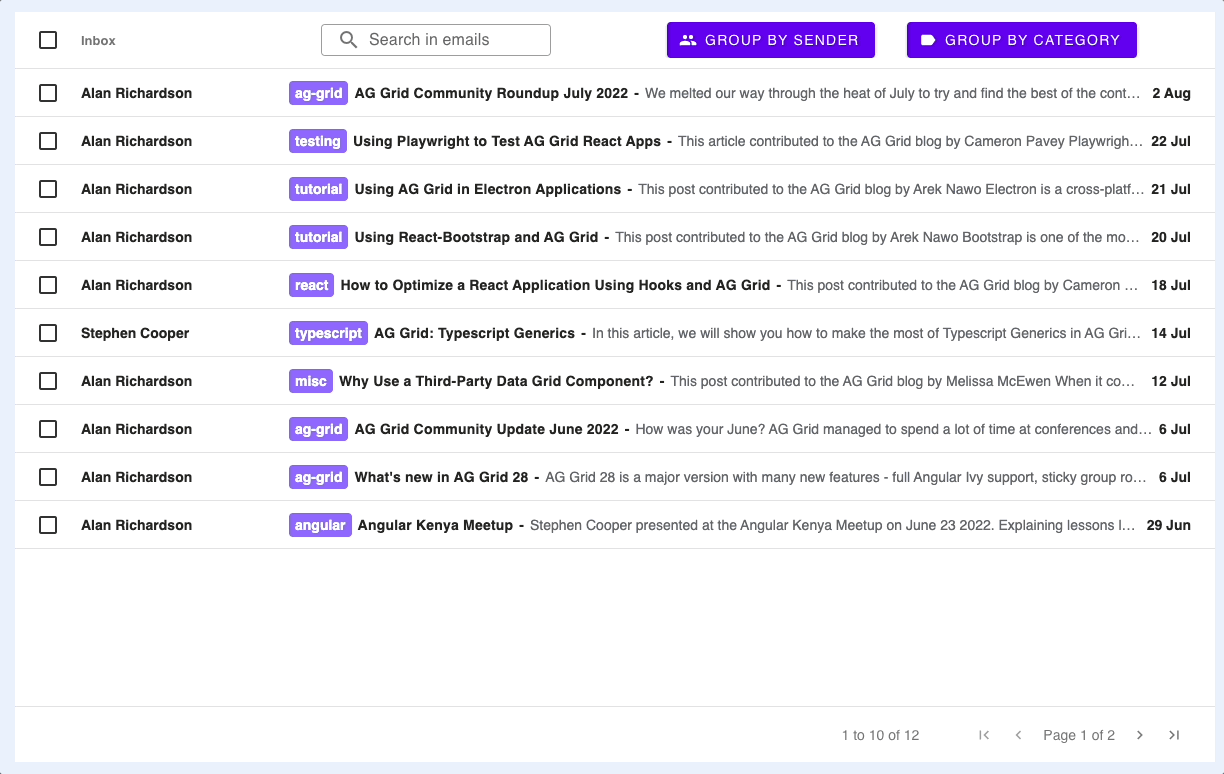
Row Grouping allows us to take all the data and group by a common property, in this example we have the button 'Group by Sender' which groups all the emails based on the sender.
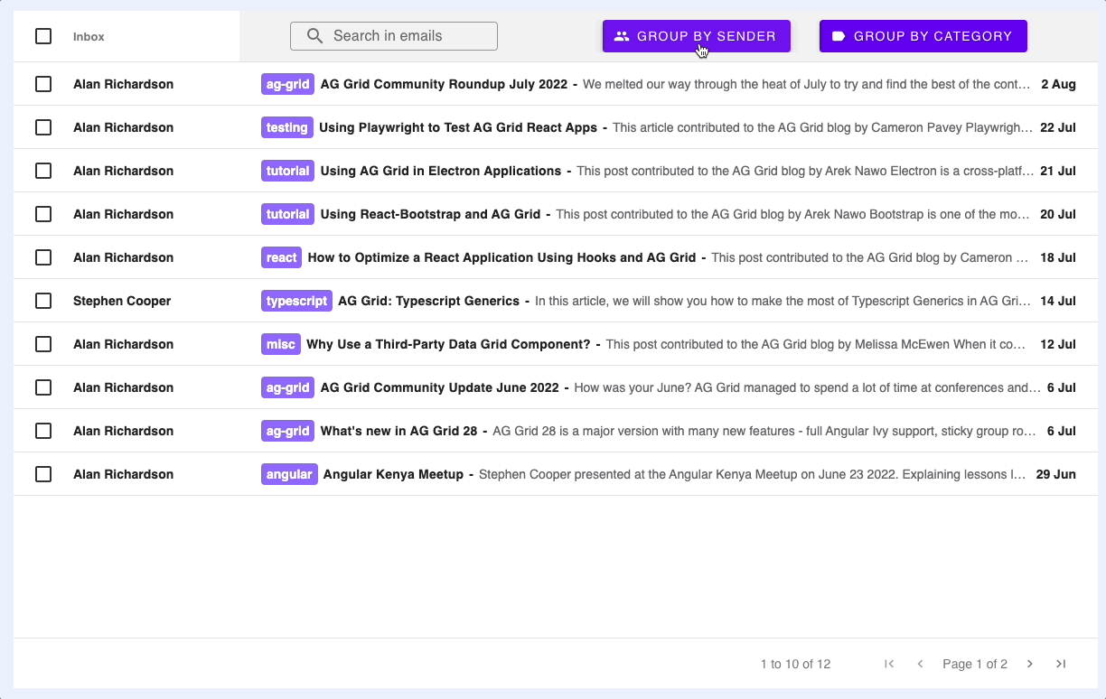
You may notice that the group row spans the entire row, this is because of Full Row Grouping, which can be enabled as follows:
// src/index.js
const gridOptions = {
    // [...]
    groupDisplayType: 'groupRows'
};
To dynamically group/ungroup, you can call columnApi.applyColumnState:
// src/index.js
const onGroupButtonClicked = event => {
    // [...]
    const rowGroup = gridOptions.columnApi.getColumnState().find(col => (col.colId === action)).rowGroup;

    gridOptions.columnApi.applyColumnState({ state: [{ colId: action, rowGroup: !rowGroup }], defaultState: { rowGroup: false } })
};
What's Next
If you want to try AG Grid, you will also find how in our getting started guides Getting started (JS / React / Angular / Vue)
Happy coding!