
What are we going to do?
This blog post is going to show you how to create charts using ag-Grid library. For our example, we will look at Game Of Thrones ratings gathered from IMDb and visualize it with ag-Grid charts.
What is ag-Grid?
ag-Grid is a JavaScript data grid that is packet with features, such as making charts that work seamlessly together with other features. To create a simple grid see our getting started guide.
Why chart with ag-Grid?
Charting with ag-Grid is easy. Unlike most grids, ag-Grid has its own charting library, which is deeply integrated with the grid. This allows you to generate charts with very little effort, whilst keeping the coding to a minimum.
Charts
There are two ways charts can be created from the data contained in ag-Grid.
User Created Charts where with a few simple properties the programmers can enable control over charting for the user to select data in the grid and render the data as a configurable chart.
Application Created Charts where the programmer is in control of the charts to create a more standard experience for the user.
In this post we will mainly look into how to create charts via the API.
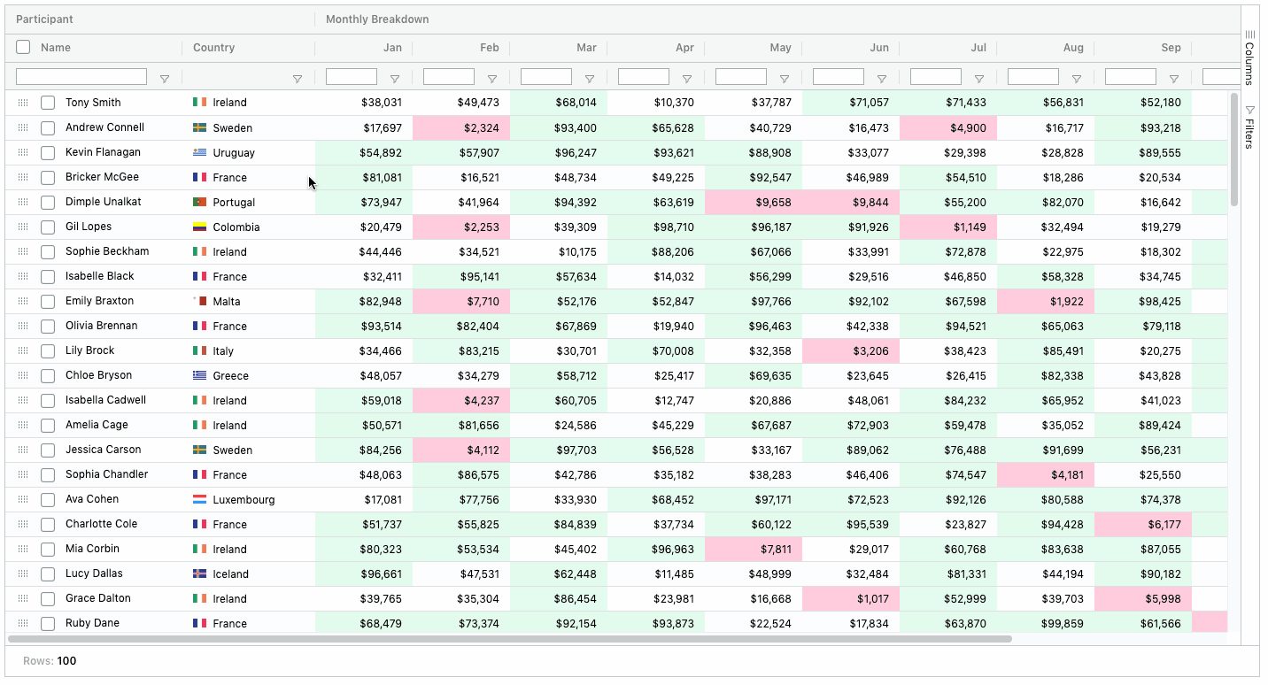
The image below shows User Created Charts in action.
Application Created Charts
Documentation: Application Created Charts, Chart Container
The Chart API is very powerful way to create charts programmatically. In our examples we show how to create a predefined chart on a button click.
The rest of the article showcases a few examples of very simple line, column and pivot charts using an online code editor. You can click on the "open code editor" links below to open the full running code inside the editor.
Line Chart: Rating across all episodes in descending order
Source Code: Open Code Editor
Documentation: Line Chart, General Customisation, Cartesian Customisation
Creating the Line Chart
We tell the grid to sort the rating in descending order by setting the columnDefs sort property to 'desc'
We've also added chartDataType to the columns to tell the grid how to treat these columns, A category can only contain cells from a single column, whereas a series can contain values from many columns. You can read more about this here.
var columnDefs = [
  { field: 'title', chartDataType: 'category' },
  { field: 'rating', chartDataType: 'series', sort: 'desc' },
  { field: 'season' },
  { field: 'episode' },
];
Next, we enable charts simply by setting enableCharts property to true.
var gridOptions = {
  columnDefs: columnDefs,
  enableCharts: true,
};
Then as you can see below, all the magic happens on this line:
gridOptions.api.createRangeChart(chartRangeParams)let cellRange = {
columns: ['title', 'rating'],
};
var chartRangeParams = {
cellRange: cellRange,
chartType: 'line',
processChartOptions: params => {
let options = params.options;
// add a title to the chart
options.title.enabled = true;
options.title.text = 'Game of Charts';
// add a subtitle to the chart
options.subtitle.enabled = true;
options.subtitle.text = 'Rating per Episode in Descending Order';
// add a title for the Y Axis
options.yAxis.title.enabled = true;
options.yAxis.title.text = 'Rating';
// add a title for the X Axis
options.xAxis.title.enabled = true;
options.xAxis.title.text = 'Episode';
// removes the labels from X Axis
options.xAxis.label.formatter = params => '';
// add a colour for a the bar
options.seriesDefaults.fill.colors = ['#15607A'];
options.seriesDefaults.stroke.colors = ['#15607A'];
return options;
},
};
// Creates a range chart with the given params
gridOptions.api.createRangeChart(chartRangeParams);This call takes an object with all the configuration for the chart. You can see all the documentation for this at the top of this section.
cellRange: The cellRange is used to select a specific range on the grid in our example we are selecting both 'title' and 'rating' columns entirely.
chartType: chartType is used by the grid to create a specific type of chart e.g. pie, column, line, scatter etc.
processChartOptions: processChartOptions is a callback which will be invoked before the chart is created. This callback gets all the options with the default values for the created chart, this allows you to fully customise and override default values.
Label Formatter: This is part of the processChartOptions and is used as a callback to customise x axis labels. In our case we are hiding them. To see how this would look different simply comment out the formatter.
Column Chart: Average Rating per Season
Source Code: Open Code Editor
Documentation: Column Chart
Creating the Column Chart
To show the average rating per season, we need to group by the season column by adding the rowGroup property and also aggregate on the rating column to calculate the averages by adding the aggFunc property:
var columnDefs = [
  { field: 'season', chartDataType: 'category', rowGroup: true, hide: true },
  { field: 'rating', chartDataType: 'series', aggFunc: 'avg' },
];
Now we simply add some styling and create the chart. The difference with the previous example is that we are providing the Auto Group Column ID in the cellRange as the one of the columns to chart on.
let cellRange = {
columns: ['ag-Grid-AutoColumn', 'rating'],
};
var chartRangeParams = {
cellRange: cellRange,
chartType: 'groupedColumn',
processChartOptions: params => {
let options = params.options;
// add a title to the chart
options.title.enabled = true;
options.title.text = 'Game of Charts';
// add a subtitle to the chart
options.subtitle.enabled = true;
options.subtitle.text = 'Average Rating per Season';
// add a title for the Y Axis
options.yAxis.title.enabled = true;
options.yAxis.title.text = 'Rating';
// add a title for the X Axis
options.xAxis.title.enabled = true;
options.xAxis.title.text = 'Season';
// add a colour for the column
options.seriesDefaults.fill.colors = ['#15607A'];
options.seriesDefaults.stroke.colors = ['#15607A'];
return options;
},
};
// Creates a range chart with the given params
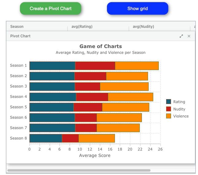
gridOptions.api.createRangeChart(chartRangeParams);Pivot Chart: Average Rating, Nudity and Violence per Season
Source Code: Click here to run the example
Documentation: Pivot Chart, Bar Chart
Creating the Pivot Chart
As we are charting to show the average rating, nudity and violence across all the seasons, we set these columns in our columnDefs:
// setting the columns

var columnDefs = [
  { field: 'season', chartDataType: 'category', rowGroup: true },
  { field: 'rating', chartDataType: 'series', aggFunc: 'avg' },
  { field: 'nudity', chartDataType: 'series', aggFunc: 'avg' },
  { field: 'violence', chartDataType: 'series', aggFunc: 'avg' },
];
We are setting rowGroup on the season column so all the data is grouped by their season. On top of this, we are aggregating on the rating, nudity and violence columns to calculate their averages to show on the grouped row for each season.
Next, in our gridOptions we have pivoting enabled:
// setting the gridOptions

var gridOptions = {
  columnDefs: columnDefs,
  enableCharts: true,
  pivotMode: true,
  autoGroupColumnDef: {
    headerName: 'Season',
  },
  rowData: data
};
For the Pivot Chart configuration, we specify that we creating a stacked bar chart by setting it to chartType.
processChartOptions is used to format the chart, in particular we've added a title and subtitle to the chart and also formatted the y axis labels to display the 'Season' beside the corresponding season. We've also changed the chart palette to our own custom colours as shown by seriesDefaults.fill.colors
var createPivotChartParams = {
    chartType: 'stackedBar',
    processChartOptions: function(params) {
      var options = params.options;

      options.title.enabled = true;
      options.title.text = 'Game of Charts';

      options.subtitle.enabled = true;
      options.subtitle.text = 'Average Rating, Nudity and Violence per Season';

      options.yAxis.label.formatter = function(params) {
        return 'Season ' + params.value;
      };

      options.xAxis.title.enabled = true;
      options.xAxis.title.text = 'Average Score';

      options.seriesDefaults.fill.colors = ['#15607A', '#C71E1D', '#FF8900'];
      return options;
    },
  };

  gridOptions.api.createPivotChart(createPivotChartParams);
We haven't specified the columns or rows for this chart configuration, this is because when charting on pivoted data, the grid charts on all columns and rows.
Happy coding!
Learn more about AG Grid — high performance JavaScript Data Grid. We write the code to visualise data in interactive tables so you can concentrate on writing the application code. We support multiple frameworks: Angular, Vue, React so you can pick the best framework for your needs.