
With the release of AG grid version 31 last month also comes the next iteration of AG Grid's Figma Design System. This release includes several new features and enhancements, such as support for both the Advanced Filter Builder and Master Detail view, as well as a number of new YouTube tutorials available in the Figma Design System YouTube playlist.
New to the Figma design system? Checkout our introductory blog post or visit our Figma community page to get started today.
Advanced Filter Builder Support
The Advanced Filter is a type ahead input which filters the entire grid. We recently enhanced this feature by introducing the Advanced Filter Builder which displays a hierarchical view of the filter, and allows the different filter conditions to be set using dropdowns and inputs. It also allows for filter conditions to be added, deleted and reordered:
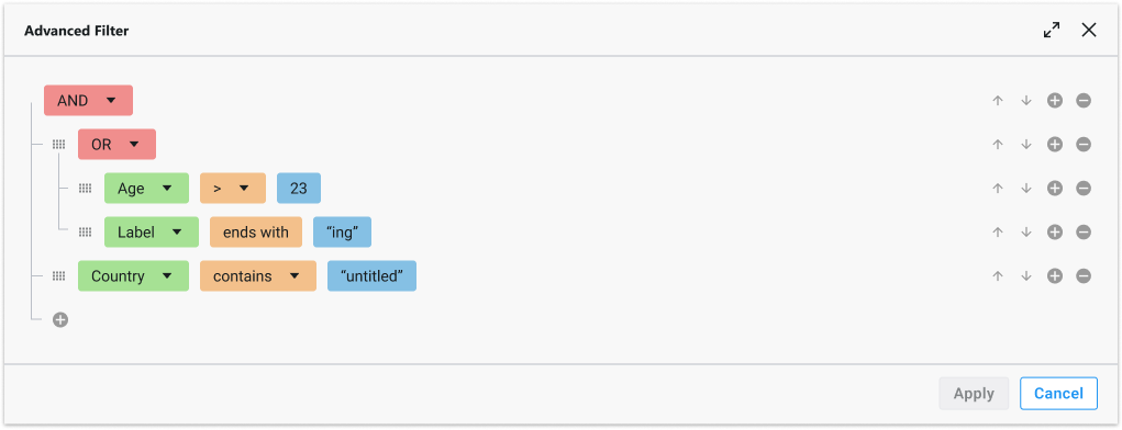
We've fully replicated this functionality within the Figma Design System allowing you to configure up to 10 rows (filter conditions), with nested child/parent indenting and full control over the position, drag handles, connectors and colours:
Master Detail
Master Detail refers to a top level grid called a Master Grid with rows that expand. When the row is expanded, another grid is displayed with more details related to the expanded row. The grid that appears is known as the Detail Grid:
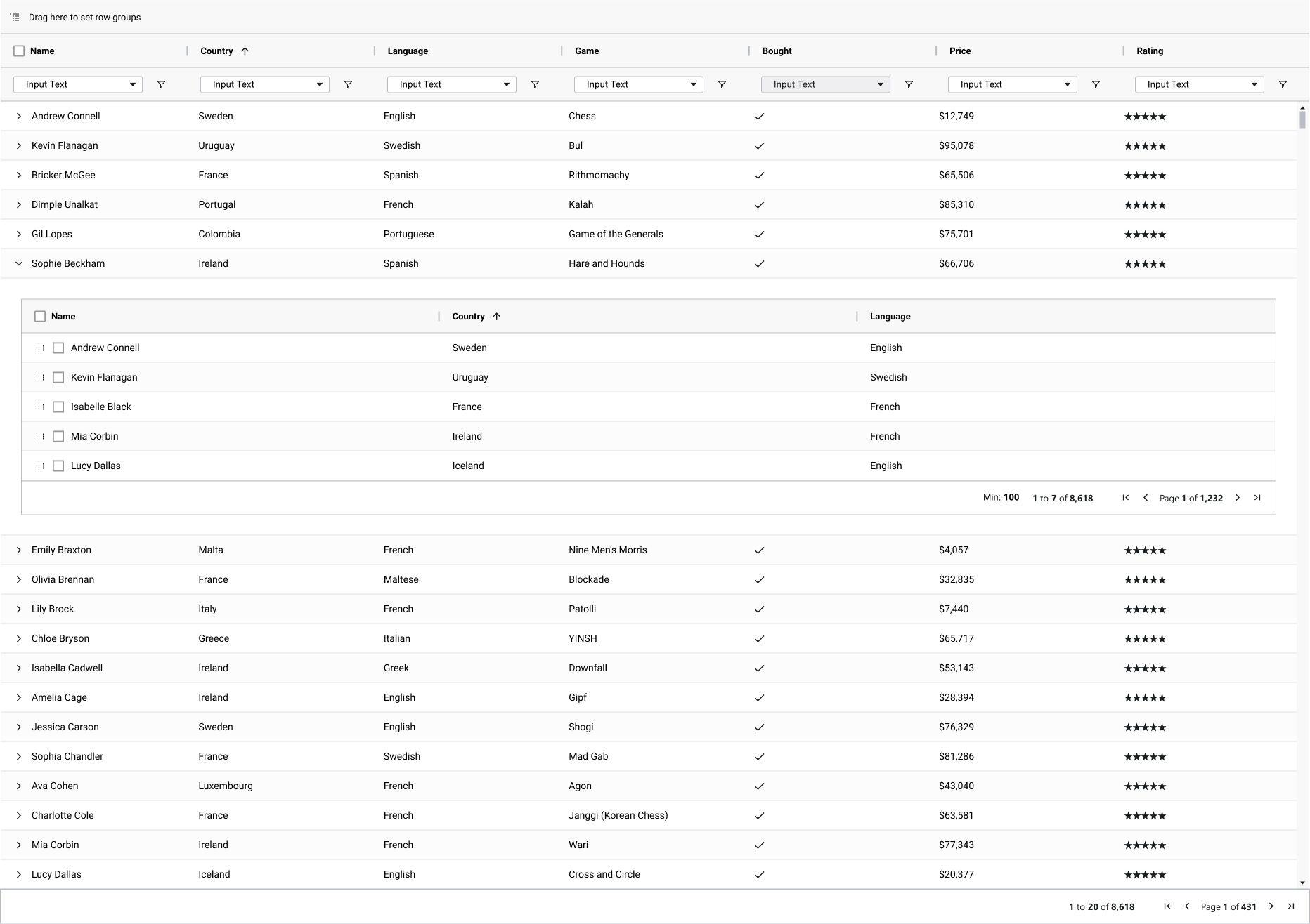
Version 31 of the Figma design system has added support for master detail grids by introducing the overlapping grid feature, which allows you to drag and drop your own detail grid inside of a larger master grid:
Pinning Rows and Columns
In the context of a data grid, pinning refers to the ability to keep certain elements or rows in a fixed position, preventing them from scrolling or moving out of view when the user interacts with the grid:
You can mimic this functionality within Figma to pin both rows and columns by clipping the content and configuring the scrollbars as required:
Theming with Local Variables
Local variables were introduced in the initial release of the Figma Design System to help simplify modifying theme colours. This has proved to be a very popular feature so we've taken the time to create a tutorial which walks through this relatively new feature within Figma and shows you how you can easily create a new theme using the Design System:
Pagination Control
Pagination allows the grid to paginate rows, removing the need for a vertical scroll bar to view more data. This can be enabled by developers in a single line of code, and can now be enabled figma design system as well with just the toggle of a button.
Row Based Grid
Lastly, in addition to these new features, we have also introduced a new option for the grid layout: the “Row” based grid. This option allows you to display your data in rows instead of columns, which can be useful for some scenarios where you need more horizontal space or want to emphasize the row grouping. You can switch between the column and row based layouts using a toggle button in the design system.
Summary
These are just some of the improvements we have made in this release. To see the full list of changes and updates, please check out the “Release Updates” section in the Figma file. We hope you enjoy using our Figma Design System and find it useful for your projects. As always, we welcome your feedback and suggestions on how we can continue to improve.