
ag-Grid provides a great editing experience out of the box. However, you may run into some limitations when performing validation on editing cells. This is because ag-Grid editors will always exit edit-mode if another cell is clicked.
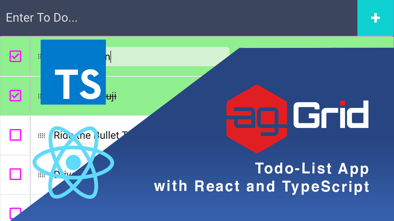
In case where you need extra flexibility in handling cell content, you can create a cell renderer and take control of the full editing lifecycle. We'll demonstrate this approach in a ToDo List application written in TypeScript and React. The app is documented using TypeDoc and is available on GitHub and StackBlitz.
package.json file).We'll be going through:
- Using Cell Renderers as Editors
- Entering Edit Mode
- Exiting Edit Mode
- Styling rows based on their selection status
Using Cell Renderers as Editors
ag-Grid provides a great editing experience out of the box. However, you may run into some limitations when performing validation on editing cells. This is because ag-Grid editors will always exit edit-mode if another cell is clicked.
In case where you need extra flexibility in handling cell content, you can create a cell renderer and take full control of the editing lifecycle.
Entering Edit Mode
Entering edit mode when using renderers as editors requires a flag that lets the renderers know whether they are in edit mode or read mode. You'll also have to update that flag accordingly.
React context
Our demo ag-Grid subscribes to a React Context object that holds the following variables:
-
mockEditingId- the id of the row node currently in edit mode. -
setMockEditingId- a function that takes an id and updatesmockEditingId.
// src/context/MockEditingContext.tsx
export interface IMockEditingContext {
    /** ID of the node in {@link Grid} in mock-edit mode */
    mockEditingId: string,
    /** function to update the mockEditingId */
    setMockEditingId: (id: string) => void
}Hooking renderers to the React context
When the pen icon on a row node is clicked, mockEditingId is set to the id of that row node (provided that there are no other nodes currently editing).
// src/components/ActionsRenderer/ActionsRenderer.tsx
private enterMockEditMode: React.MouseEventHandler<HTMLSpanElement> = (): void => {
	if (this.context.mockEditingId !== null) {
		alert('You can only edit one todo at a time');
		return;
	}
	const nodeId: string = this.props.node.id;
	this.context.setMockEditingId(nodeId);
}
The Grid component then invokes a refresh on the row node so that each renderer can be updated to reflect the updated editing state:
// src/components/Grid/Grid.tsx
public componentDidUpdate(prevProps: GridProps): void {
	if (prevProps.mockEditingId !== this.props.mockEditingId) {
		const idToUpdate: string = this.props.mockEditingId === null
			? prevProps.mockEditingId : this.props.mockEditingId;
	const nodeToUpdate: RowNode = this.gridApi.getRowNode(idToUpdate);
	const refreshCellsParams: RefreshCellsParams = { rowNodes: [nodeToUpdate], force: true };
	this.gridApi.refreshCells(refreshCellsParams);
	}
}
Each cell renderer reads the updated context and renders an input element if the row node is in edit mode or a span element displaying the cell value if the row node is in read mode:
// src/components/DescriptionRenderer/DescriptionRenderer.tsx
public render(): React.ReactElement {
	let component: React.ReactElement;
	const isSelected: boolean = this.props.node.isSelected();

	if (this.props.isMockEditing) {
		const inputStyles: React.CSSProperties =
	{ background: isSelected ? '#D5F1D1' : 'whitesmoke' };
		component =
			<input
				ref={this.inputRef}
				value={this.state.value}
				onChange={this.inputChangedHandler}
				style={inputStyles} />
	} else {
		component = <span className={isSelected ? "strike" : ''}> {this.state.value}</span>
	}

	return (
		<div className="todo-wrapper">
			{component}
		</div>
	);
}
Now let's take a look at how you can exit edit mode.
Exiting Edit Mode
After you've finished emending a ToDo item, you'll either want to commit the changes to the dataset or roll back all changes and revert each editor's new value back to its original value.
In either case you'll need to be able to iterate over the editors.
Getting the editors
Each editor implements the same interface:
// src/interfaces/mockCellEditor.ts
export interface IMockCellEditor extends ICellRenderer {
    /** returns a tuple with the colId and the updated value in the cell */
    getValue: () => [any, any],
    /** resets the cell value to that before editing */
    reset: () => void,
}
Knowing this, we can create a function that identifies whether a component implements the IMockCellEditor interface as follows:
// src/interfaces/mockCellEditor.ts
export const instanceOfIMockCellEditor = (component: any) => {
    return Object.getPrototypeOf(component).hasOwnProperty('getValue')
        && typeof component.getValue === 'function'
        && Object.getPrototypeOf(component).hasOwnProperty('reset')
        && typeof component.reset === 'function';
}
We can leverage the ag-Grid API to retrieve all cell renderer instances on the editing row node and then filter out the ones which aren't implementing the IMockCellEditor interface as shown below:
// src/components/Grid/Grid.tsx
private getMockEditors = (node: RowNode): IMockCellEditor[] => {
	const mockEditors: IMockCellEditor[] =
    	this.gridApi.getCellRendererInstances({ rowNodes: [node] })
		.map(cellRenderer =>
        	(cellRenderer as unknown as ReactComponent).getFrameworkComponentInstance())
		.filter(cellRenderer => instanceOfIMockCellEditor(cellRenderer));
	return mockEditors;
}
Committing changes
To commit changes, we're iterating over editors and generating an updated ToDo. The row node is then updated via a transaction update as shown below:
// src/components/Grid/Grid.tsx
private commitChanges = (): void => {
	const mockEditingNode: RowNode = this.gridApi.getRowNode(this.context.mockEditingId);
	const updatedToDo: ToDo = { ...mockEditingNode.data };

	const mockEditors: IMockCellEditor[] = this.getMockEditors(mockEditingNode);
	mockEditors.forEach(mockEditor => {
		const [field, updatedValue]: ['description' | 'deadline', any] = mockEditor.getValue();
		updatedToDo[field] = updatedValue;
	});
	this.gridApi.applyTransaction({ update: [updatedToDo] });
}
All we have to do after that is set mockEditingId to null, which will cause a refresh on the row node, allowing it to exit edit mode!
// src/components/ActionsRenderer/ActionsRenderer.tsx
private saveChanges: React.MouseEventHandler<HTMLSpanElement> = (): void => {
	this.props.commit();
	setTimeout(() => this.context.setMockEditingId(null), 0);
}
Rolling back changes
To roll back all changes, reset is invoked on each mock-editor, reverting the displayed values in the editors back to their pre-edited values using the code below:
// src/components/Grid/Grid.tsx
private rollbackChanges = (): void => {
	const mockEditingNode: RowNode = this.gridApi.getRowNode(this.context.mockEditingId);
	const mockEditors: IMockCellEditor[] = this.getMockEditors(mockEditingNode);
	mockEditors.forEach(mockEditor => {
		mockEditor.reset();
	});
}
Again, mockEditingId is set to null after rolling back the changes, causing the row node to refresh and exit mock-edit mode.
// src/components/ActionsRenderer/ActionsRenderer.tsx
private undoChanges: React.MouseEventHandler<HTMLSpanElement> = (): void => {
	this.props.rollback();
	setTimeout(() => this.context.setMockEditingId(null), 0);
}
Lastly, we'll show you how to style a row node according to its selection status.
Styling rows based on their selection status
Binding selection status to a checkbox
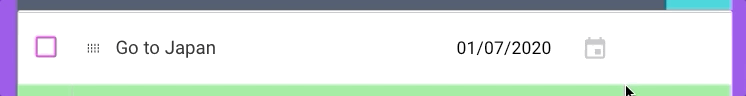
The CheckboxRenderer component renders a span element that resembles a HTML checkbox element. The renderer's state is bound to the row node's selection status as shown below:
// src/components/CheckboxRenderer/CheckboxRenderer.tsx
/** bind the completed state variable to the nodes selection status */
public componentDidMount(): void {
	const isNodeSelected: boolean = this.props.node.isSelected();
	this.setState({ completed: isNodeSelected });
}

/** update the nodes selection status upon checking and refresh the node */
private completeToDo: React.MouseEventHandler<HTMLSpanElement> = (): void => {
	this.props.node.setSelected(true);
	const refreshCellsParams: RefreshCellsParams = {
		rowNodes: [this.props.node],
		force: true
	};
	this.props.api.refreshCells(refreshCellsParams);
}

/** update the nodes selection status upon un-checking and refresh the node */
private uncompleteToDo: React.MouseEventHandler<HTMLSpanElement> = (): void => {
	this.props.node.setSelected(false);
	const refreshCellsParams: RefreshCellsParams = {
		rowNodes: [this.props.node],
		force: true
	};
	this.props.api.refreshCells(refreshCellsParams);
}

/** update the completed state variable after each refresh of the node */
public refresh(): boolean {
	const isNodeSelected: boolean = this.props.node.isSelected();
	this.setState({ completed: isNodeSelected })
	return true;
}
Using selection status to style editors
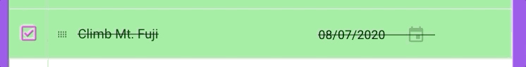
The editors in the application also use the row node's selected status for styling purposes - placing an animated strikethrough across the ToDo item property fields when the row node is selected to visually indicate that the ToDo item has been completed. This is show in the code below:
  // src/components/DescriptionRenderer/DescriptionRenderer.tsx
public render(): React.ReactElement {
        let component: React.ReactElement;
        const isSelected: boolean = this.props.node.isSelected();

        if (this.props.isMockEditing) {
            const inputStyles: React.CSSProperties =
				{ background: isSelected ? '#D5F1D1' : 'whitesmoke' };
            component =
                <input
                    ref={this.inputRef}
                    value={this.state.value}
                    onChange={this.inputChangedHandler}
                    style={inputStyles} />
        } else {
            component = <span className={isSelected ? "strike" : ''}> {this.state.value}</span>
        }

        return (
            <div className="todo-wrapper">
                {component}
            </div>
        );
    }
Customising the ag-Grid theme
You'll notice that the selected row nodes have a light green background colour instead of the default light blue used in the ag-Grid alpine theme. In this case, we're customizing the theme configuration of the ag-Grid SASS varaiables as shown below:
/* src/components/Grid/Grid.scss */
.ag-theme-alpine {
	@include ag-theme-alpine((
		odd-row-background-color: null,
		font-size: 16px,
		font-family: ("Roboto", sans-serif),
		row-hover-color: null,
		range-selection-border-color: rgba(0,0,0,0),
		cell-horizontal-padding: 10,
		selected-row-background-color: lightgreen,
	));
What's next?
We hope that you find this article useful if you ever need to use cell renderers as editors or style row nodes according to their selection status. Remember you can download the project from GitHub and experiment with it further.
If you would like to try out ag-Grid check out our getting started guides (JS / React / Angular / Vue)
Happy coding!