
- Introduction
- Integration and Installation
- Define configuration
- Set data dynamically
- Enabling features
- Optimising Grid for Flexibility
- Video Tutorial
- Build Your Own React App With ag-Grid!
Introduction
We’re all familiar with the paradigm of a data grid — a component used for displaying tabular data in a series of rows and columns. Excel is probably the most common example of a data grid on Desktop. For a long time grids have been a part of native platforms SDKs and have recently made their way into web app UIs.
Because of the modern grids complexity and the costs of development most companies and software engineers choose 3rd party products. Luckily, there’s an abundance of data grids on the market available for free or as paid subscriptions. But how do you choose one?
Well, if a grid meets the requirements for features and performance, developers than look at the ease of integration and configuration. Extensive documentation that covers all features and provides elaborate examples makes the choice even easier.
Our React data grid component is where you’ll find it all.
It’s based on the fastest and most feature rich react data grid out there. AG Grid was specifically designed to handle enterprise level data volumes and is packed with features required by most use cases. We’ve also put extra efforts into the documentation to ensure that every little detail is covered.
The React Data Grid UI interactions are based on familiar Excel functionality which makes it easy for your users to get started with the grid. Because of that mimicking the grid is also referred to as React DataGrid or React table component.
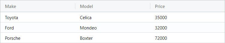
This article describes and shows you how easy it is to integrate and configure the React Data Grid component. It’s a 5 minute getting started guide with examples that you can copy/paste and hit the ground running. Once we’ve got our basic setup ready, I’ll show you a few features and configuration options that control them. Here’s a sneak peek of what the finished product will look like:
So let’s start the ball rolling!
Integration and Installation
ag-Grid and its React grid component are distributed as NPM packages, which means they’ll work with any common React project bundler setup. Integrating ag-Grid is a matter of simply importing AgGridReact class component and referencing <AgGridReact> in the container component’s template.
You can download the sample that we’ll be building in this article from this github repository in the integration-demo-classes directory.
To speed up things, we are going to scaffold a react app with create-react-app CLI tool so that you don’t need to worry about bootstrapping or tooling setup. So let’s run the following commands in your terminal:
npx create-react-app my-app
cd my-app
npm start
If everything goes well, npm start has started the web server and conveniently opened a browser pointing to localhost:3000.
As a next step, let’s add the ag-Grid NPM packages. Run the following command in my-app (you may need a new instance of the terminal):
npm install --save ag-grid-community ag-grid-reactWe now have a fully bootstrapped React app with React Data Grid component ready for use.
Add AgGridReact to a template
To access the component, we’re importing AgGridReact and the AgGridColumn:
import { AgGridColumn, AgGridReact } from 'ag-grid-react';and a few style sheets with ag-Grid theming:
import 'ag-grid-community/dist/styles/ag-grid.css';
import 'ag-grid-community/dist/styles/ag-theme-balham.css';
We can now use AgGridReact directly in JSX markup of the App container component. Open src/App.js in your favorite text editor and add the AgGridReact component to the markup:
class App extends Component {
    render() {
        return (
            <div
                className="ag-theme-balham"
                style={{ height: '200px', width: '600px' }}
            >
                <AgGridReact
                    rowData={this.state.rowData}>
                    <AgGridColumn field="make"></AgGridColumn>
                    <AgGridColumn field="model"></AgGridColumn>
                    <AgGridColumn field="price"></AgGridColumn>
                </AgGridReact>
            </div>
        );
    }
}
The JSX code above defines a wrapper DIV element which sets the grid dimensions and specifies the grid's theme by setting the className to ag-theme-balham. As you may have noticed, the CSS class matches the name of CSS file we imported earlier. The grid ships several different themes that can be further customized with exported SASS variables.
We are defining the grid to have three columns 'make', 'model' and 'price'. These will be automatically mapped on to fields of the same name in the rowData when the grid has data loaded.
Define configuration
To instantiate the grid, you need to define one essential configuration property — the data. In the markup above this is specified as rowData component property. So let’s add this property to the component’s state:
class App extends Component {
constructor(props) {
super(props);
this.state = {
rowData: [
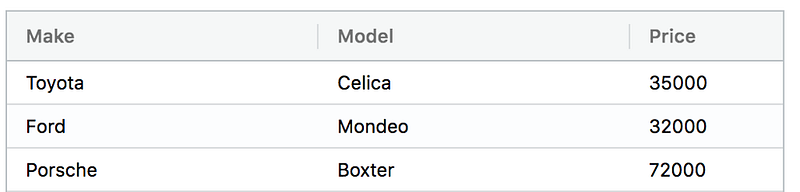
{make: "Toyota", model: "Celica", price: 35000},
{make: "Ford", model: "Mondeo", price: 32000},
{make: "Porsche", model: "Boxter", price: 72000}
]
}
}
render() { ... }
}
export default App;In our case, the column definitions contain three columns “Make”, “Model” and “Price”. The actual data is defined in the rowData as an array of objects. Notice that the fields of the objects match the field values in the AgGridColumn configuration. That’s the way to bind configuration and data in ag-Grid.
So here is a complete src/App.js for you to copy and paste into your local project:
import React, { Component } from 'react';
import './App.css';

import { AgGridColumn, AgGridReact } from 'ag-grid-react';
import 'ag-grid-community/dist/styles/ag-grid.css';
import 'ag-grid-community/dist/styles/ag-theme-balham.css';

class App extends Component {
    constructor(props) {
        super(props);

        this.state = {
            rowData: [
                {make: 'Toyota', model: 'Celica', price: 35000},
                {make: 'Ford', model: 'Mondeo', price: 32000},
                {make: 'Porsche', model: 'Boxter', price: 72000}
            ]
        }
    }

    render() {
        return (
            <div
                className="ag-theme-balham"
                style={{ height: '200px', width: '600px' }}
            >
                <AgGridReact
                    rowData={this.state.rowData}>
                    <AgGridColumn field="make"></AgGridColumn>
                    <AgGridColumn field="model"></AgGridColumn>
                    <AgGridColumn field="price"></AgGridColumn>
                </AgGridReact>
            </div>
        );
    }
}

export default App;
If you now run the example you should see the data shown:
And that’s it! You’ve just integrated our grid component into your React application. Let’s now see how easy it is to configure features in the grid.
Set data dynamically
In the real world, most of the time, we are dealing with data that resides on a remote server. So instead of hard coding a data set, we’ll need to update it dynamically. Thanks to React, implementing this is actually quite simple. We need to update a component property with data bound to AgGridReact. In our example it’s the rowData property in the component’s state. The actual data fetching is performed outside of the grid component.
So here’s an alternative setup:
class App extends Component {
    constructor(props) {
        super(props);

        this.state = {
            rowData: []
        }
    }

    componentDidMount() {
        fetch('https://www.ag-grid.com/example-assets/row-data.json')
            .then(result => result.json())
            .then(rowData => this.setState({rowData}))
    }

}
In the code above we’re requesting the data with the Fetch API and dynamically updating the rowData property. React will synchronize the new value of the property to the grid and we should see the new dataset rendered in the grid. If, instead of initializing the rowData property with an empty array, you don’t specify it at all, the grid will show the Loading... text until you set the property with a value and the rows are updated.
Enabling features
Among the most common features of the modern grids are Sorting, Filtering and Pagination. They allow a user to zoom in on a particular set of records out of the entire dataset that a real-world application may have. Our React grid also provides rich inline editing experience so your users can update any record in a dataset with just a few clicks.
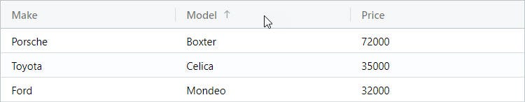
React Datagrid Sorting
Enabling sorting in ag-Grid is actually quite simple — all you need to do is set the sortable property to true on the AgGridColumn components:
<AgGridColumn field="make" sortable={ true }></AgGridColumn>
<AgGridColumn field="model" sortable={ true }></AgGridColumn>
<AgGridColumn field="price" sortable={ true }></AgGridColumn>
After adding the property, you should be able to sort the grid by clicking on the column headers. Doing so toggles through ascending, descending and no-sort states.
React Datagrid Filtering
As with sorting, enabling filtering is as easy as setting the filterproperty to true for any column we want to filter:
<AgGridColumn field="make" sortable={ true } filter={ true }></AgGridColumn>
<AgGridColumn field="model" sortable={ true } filter={ true }></AgGridColumn>
<AgGridColumn field="price" sortable={ true } filter={ true }></AgGridColumn>
With this property is set, the grid will display a small column menu icon when you hover over the header. Pressing it will display a popup with filtering UI which lets you choose the kind of filter and the text that you want to filter by.
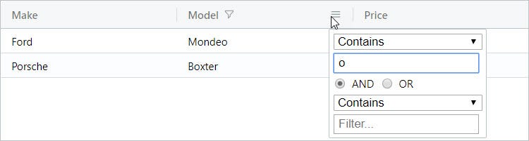
This filtering UI and logic can easily be customized to implement your use case.
React Datagrid Pagination
To enable pagination in our React grid, all you need to do is set the pagination property to true on the AgGridReact component.:
<AgGridReact
    pagination={true}
    rowData={this.state.rowData}>
    ...
</AgGridReact>
After adding the property, you should be able to move through the pages by using the controls at the bottom of the grid:
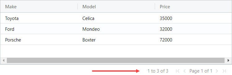
By default the grid uses the pages size of 100 records, but it can easily be changed through configuration options.
React Datagrid Editable Cells
To make the React grid editable you just need to specify editable=true for a particular column definition. All records in this column will become editable. For example, to enable inline editing of a car’s price, we need to make the following change:
<AgGridColumn
    field="price"
    sortable={ true }
    filter={ true }
    editable={true}>
</AgGridColumn>
And we are now able to edit the price:
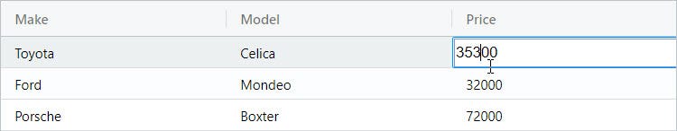
ag-Grid comes with a bunch of built-in cell editors but if required you can easily create your own to suit your business needs.
Default Columns
Rather than declare three columns with repeated attributes:
<AgGridColumn field="make"  sortable={ true } filter={ true }></AgGridColumn>
<AgGridColumn field="model" sortable={ true } filter={ true }></AgGridColumn>
<AgGridColumn field="price" sortable={ true } filter={ true }  editable= {true}></AgGridColumn>
We can create a default column definition using defaultColDef prop:
defaultColDef={{sortable: true, filter: true }}
And this is a prop on the AgGridReact:
<AgGridReact
    pagination={true}
    defaultColDef={{sortable: true, filter: true }}
    rowData={this.state.rowData}>

    <AgGridColumn field="make"></AgGridColumn>
    <AgGridColumn field="model"></AgGridColumn>
    <AgGridColumn field="price" editable= {true}></AgGridColumn>

</AgGridReact>
All the columns use the defaultcolDef and I add the additional editable prop only to the columns that are editable.
Optimising Configuration for Flexibility
Currently our grid has the column definitions defined declaratively:
    <AgGridColumn field="make"></AgGridColumn>
    <AgGridColumn field="model"></AgGridColumn>
    <AgGridColumn field="price" editable={true}></AgGridColumn>
This reduces our ability to customise the grid at run time.
We would be better off representing the column definitions as objects via state.
        this.state = {
            rowData: [],
            colDefs: [
                {field: 'make'},
                {field: 'model'},
                {field: 'price', editable: 'true'},
            ]
        }
Also amending the grid to use the state.
    <AgGridReact
        pagination={true}
        defaultColDef={{sortable: true, filter: true }}
        rowData={this.state.rowData}
        columnDefs={this.state.colDefs}
        >
   </AgGridReact>
This supports customisation at run-time with the grid automatically re-rendering due to the state change.
Video Tutorial for React Classes with AG Grid
Build Your Own React App With AG Grid
I hope that the examples above clearly demonstrated how easy it is to integrate and configure our React grid.
- Download the source code for this blog post from the repo:
- https://github.com/ag-grid/react-data-grid
- in the directory integration-demo-classes
Now take the next step and start using ag-Grid in your project!
Learn about AG Grid React Support here, we have a React Data Grid Quick Start Guide and all our examples have React versions.
Additional Blog Posts To Help Get Started with AG Grid's React Data Grid: