
- Visualising Enterprise Data Talk
- Data Visualisation helps users gain more insights
- Investigating Data Through Data Grid Groups and Filters
- Data Visualisation Application Architecture
- Data Visualisation examples
- An Overview of D3
- Conclusion
Visualising Enterprise Data Talk
This article is based on a talk I gave at ngVikings in March 2018 called “Visualising Enterprise Data with Angular and D3”. You watch the full talk on YouTube. The application demonstrated can be found on GitHub.
Data Visualisation is something I’m really passionate about. I’ve worked in large financial institutions for the majority of my career and during that time I’ve repeatedly encountered user requirements to display raw data in tabular format.
Data Visualisation helps users gain more insights
Being able to view the raw data is not only useful for people, but can often be a regulatory requirement, so this step is not optional in most cases.
They say that Data is King, and this is true, but when faced with increasingly large amounts of data, it’s difficult if not impossible to make sense of what you’re looking at.
I believe we can offer so much more when it comes to allowing our users to gain useful insights into their data, and the best way to do this is to provide alternative (or additional) visualisations of the underlying data.
Being able to distil useful information that can be understood at a glance is priceless — my favourite example of this are road signs:

At a glance (and often while moving at speed) a huge amount of information is conveyed in a simple snapshot.
The aim of this article is to provide an introduction to how you can add visualisations to your application using Angular and Data Visualisation tools such as D3.
Investigating Data Through Data Grid Groups and Filters
Using the 2018 Winter Olympics as inspiration, we’ll be taking a look at all Olympic data from 2000 to 2012.
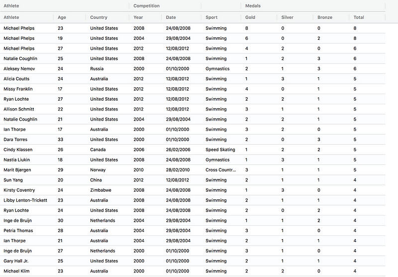
Using ag-Grid to display our data, we can group our columns to logically organise the data. This is still just a view on the raw data, with not much of interest yet. Let’s try improve this by making use of aggregation.
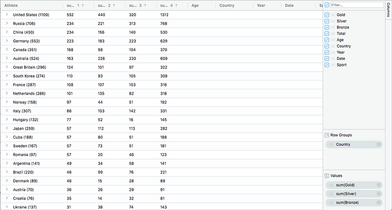
This is a huge improvement — based on this we can see far more about the distribution of medals by country. The United States having twice as much as the next closest country, Russia.
We could take this further to slice and dice the data in all sorts of ways. This allows your users to do the analysis themselves, meaning they’re less likely to want to leave the application for those insights.
So far so good . Let’s take a look at how we can use Data Visualisation Techniques to allow a user to get these same insights quicker.
Data Visualisation Application Architecture
Our application is a fairly simple one, consisting of a Grid Component and a number of Chart Components, with a Chart Data Service acting as a go-between to provide selected data from the Grid to the current Chart.
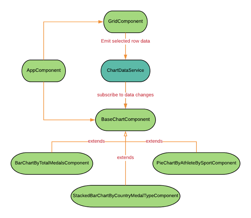
We’ll have two main panes in our application. On the left hand side, we’ll have our raw data in tabular format and on the right we’ll display the selected visualisation.
Data Visualisation examples
We’ve already pre-grouped the data by country. Now let’s get into some Data Visualisation examples.
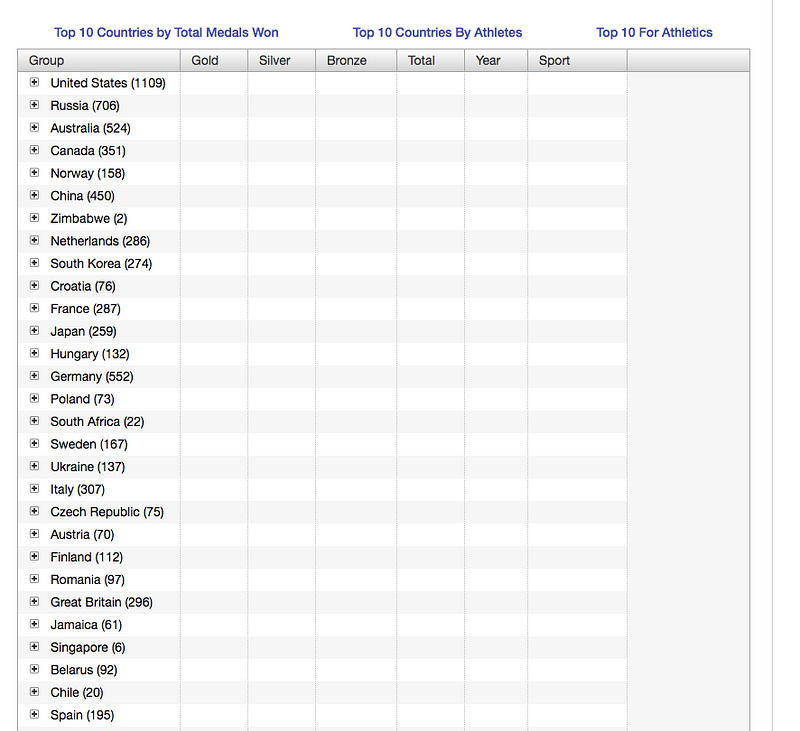
Grouping Data for Bar Chart Visualisation
For our first visualisation, let’s try list the Top 10 Countries by Total Medals Won:
With one simple visualisation, we can see that the United States has almost double the number of medals to the next closest country, and over three times more than about half of the top 10 listed here.
What’s amazing about this is that we were able to derive at least two insights at a simple glance. We could get this same information by grouping/aggregating/sorting, and this is still necessary and important, but we were able to do so at a glance.
Imagine being able to gain similar insight into a business critical activity? Or zooming in on a sub-set of data from a visual outlier to focus on for a business decision. This format highlights these outliers that are simply invisible in the raw, tabular layout.
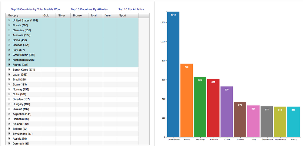
Grouping and Aggregating Data Visualisation
Let’s take this visualisation a step further. We can break down the medals by the medal types, gold, silver and bronze:
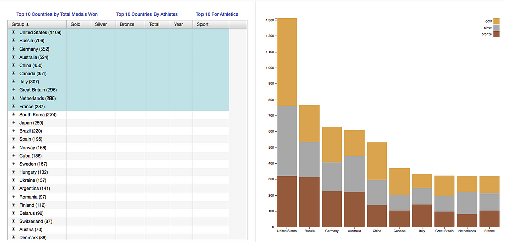
This is probably my favourite visualisation here — this shows that not only is the United States ahead by some margin, but they’ve won more than three times the number of gold medals to everyone else, about double the number of silver medals and slightly more bronze than the next closest country.
All that, from a single glance, from a single visualisation!
Data Visualisation as Pie Chart
As our final example, let’s focus on the Top 10 Medals for Athletics:
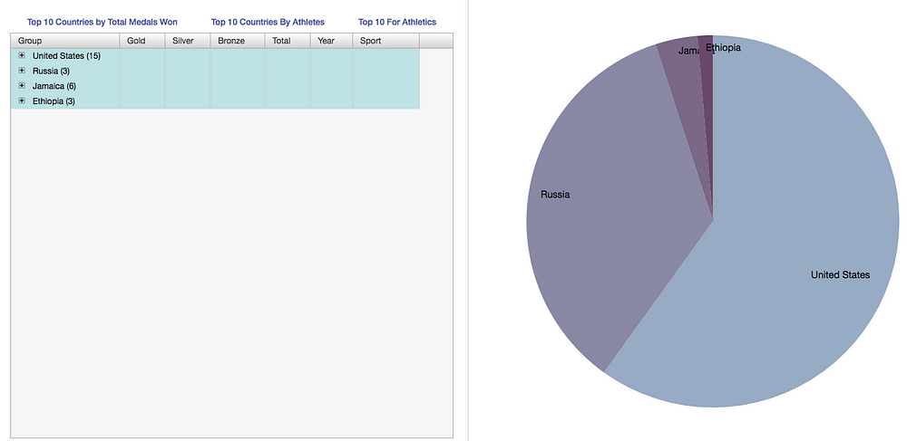
This final visualisation simply re-enforces the insights made above: the United States dominates here, with Russia being second, and the remaining countries being a small remainder of the total.
There are many more insights we could derive from this data set. I’d imagine if we looked closer we’d find some small countries punching far above their weight (or relative population size) for example.
The options are almost limitless — I’d strongly encourage you take a look at the D3 Gallery for an idea of the types of visualisations on offer.
An Overview of D3
D3 is a very powerful JavaScript library for producing dynamic, interactive data visualisations in web browsers. It offers a huge amount of graphing options that can almost be overwhelming if you’re new to it.
Additionally, the way in which you use D3 can be intimidating at first.
In this section I’ll provide a high level overview of some core concepts D3js Data Visualisations that should hopefully ease you into using it for the first time.
Selection
Like jQuery, D3js allows for selection of DOM elements. The .data method associates data with the currently selected elements.
Using the following code snippet we can illustrate how selection works:
<!--suppress ALL -->
<html>
<head>
  <script src="https://cdnjs.cloudflare.com/ajax/libs/d3/4.13.0/d3.min.js"></script>
  <style>
    body {
      margin: 0;
    }
    .row {
      display: flex;
      justify-content: space-between;
    }
    .circle {
      width: 150px;
      height: 150px;
      border-radius: 150px;
      background-color: green;
      margin-left: 100px;
      margin-right: 100px;
    }
  </style>
</head>
<body>
<div class="row">
  <div id="first" class="circle"></div>
  <div class="circle"></div>
  <div class="circle"></div>
  <div class="circle"></div>
</div>

<script>
  var numbers = [2, 4, 6, 8, 10];
  d3.selectAll(".circle")
    .data(numbers);
</script>
</body>
</html>
D3 Selection Snippet
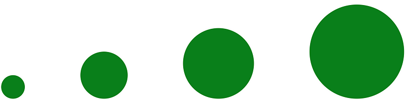
The result of which will be:

If we run this and inspect nodes in the DOM we can see that each circle now has a new __data__ attribute associated, with the corresponding number value assigned:

We can take this one step further and check the value associated to each circle:

D3 will use this associated data in subsequent operations, but it’s important to understand that under the hood this association is happening.
Again as with jQuery, D3 allows (and in fact encourages) chaining of calls. D3 can also manipulate DOM elements.
Note: When drawing on the screen top left is (0,0), so when drawing lines etc you draw “down” and to the “right”. This requires a slight mental shift when rendering as users will assume (for example) bar charts start at the bottom and go “up”.
Let’s update our example to adjust the size of the circles — let’s scale them according to their corresponding data value.
<!--suppress ALL -->
<html>
<head>
  <script src="https://cdnjs.cloudflare.com/ajax/libs/d3/4.13.0/d3.min.js"></script>
  <style>
    /*body {*/
    /*margin: 0;*/
    /*}*/
    .row {
      display: flex;
      justify-content: space-between;
    }
    .circle {
      width: 150px;
      height: 150px;
      border-radius: 150px;
      background-color: green;
    }
  </style>
</head>
<body>
<div class="row">
  <div id="first" class="circle"></div>
  <div class="circle"></div>
  <div class="circle"></div>
  <div class="circle"></div>
</div>

<script>
  var numbers = [2, 4, 6, 8, 10];
  d3.selectAll(".circle")
    .data(numbers)
    .style("height", (data) => {
      return (data * 50) + "px";
    })
    .style("width", (data) => {
      return (data * 50) + "px";
    })
    .style("border-radius", (data) => {
      return (data * 50) / 2 + "px";
    })
    .style("margin-top", (data) => {
      return (500 - (data * 50)) + "px";
    })</script>
</body>
</html>
Here we’re setting the height, width and border radius according to each circles data value (2, 4, 6 etc, from the numbers array).
Note too that we’re offsetting each circle from the top so that the circles are horizontally aligned, so that their height is scaled “up”, not “down”.
enter
enter is useful for when you have more data that you have corresponding items in the DOM. In other words, you’d use enter when you want to add items to the DOM.
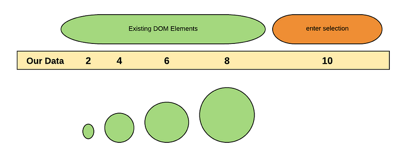
There are three main types of selection with D3. Existing DOM elements, the enter selection and finally the exit selection (not covered here, but this is used when you want to remove items from the DOM).
The above diagram documents the first two types. In our data array, we have 5 values, but only 4 existing DOM element (the circles). We’ll use the enter selection to add a fifth circle to the DOM.
<!--suppress ALL -->
<html>
<head>
  <script src="https://cdnjs.cloudflare.com/ajax/libs/d3/4.13.0/d3.min.js"></script>
  <style>
    /*body {*/
    /*margin: 0;*/
    /*}*/
    .row {
      display: flex;
      justify-content: space-between;
    }
    .circle {
      width: 150px;
      height: 150px;
      border-radius: 150px;
      background-color: green;
    }
  </style>
</head>
<body>
<div class="row">
  <div id="first" class="circle"></div>
  <div class="circle"></div>
  <div class="circle"></div>
  <div class="circle"></div>
</div>

<script>
  var numbers = [2, 4, 6, 8, 10];
  let circles = d3.select(".row")
    .selectAll(".circle")
    .data(numbers)
    .style("height", (data) => {
      return (data * 50) + "px";
    })
    .style("width", (data) => {
      return (data * 50) + "px";
    })
    .style("border-radius", (data) => {
      return (data * 50) / 2 + "px";
    })
    .style("margin-top", (data) => {
      return (500 - (data * 50)) + "px";
    })
  circles.enter()
    .append("div")
    .attr("class", "circle")
    .style("height", (data) => {
      return (data * 50) + "px";
    })
    .style("width", (data) => {
      return (data * 50) + "px";
    })
    .style("border-radius", (data) => {
      return (data * 50) / 2 + "px";
    })
    .style("margin-top", (data) => {
      return (500 - (data * 50)) + "px";
    })
</script>
</body>
</html>
In this snippet we make use of the enter method — for each data item that’s not in the existing selection, D3 will add a new div, add the circle class and then set height, width, radius and margin according to the corresponding datum.
Running this we’ll see:
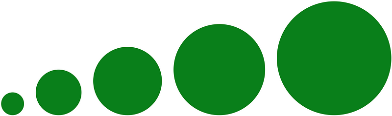
We have the first four circles as before, but now we also have a fifth circle which D3 created for us.
D3 Scales - Ordinal Scales
Ordinal scales will map discrete values in an array to discrete values also in an array.
The values will repeat if it’s shorter than the domain array.
let myData = ['R', 'G', 'B']

let ordinalScale = d3.scaleOrdinal()
  .domain(myData)
  .range(['red', 'green', 'blue']);

ordinalScale('R');    // red
ordinalScale('G');    // green
ordinalScale('B');    // blue
ordinalScale('Apr');  // red
Here we’re using an ordinal scale with our domain having ‘R’, ‘G’ and ‘B’, with our desired output range being ‘red’, ‘green’ and ‘blue’,
The output of using the ordinal scale will be that ‘R’, ‘G’ and ‘B’ will map to ‘red’, ‘green’ and ‘blue’, with any values not in the domain repeating on ‘Apr’ (as it’s not covered by our defined range).
D3 Scales - Band Scales
Band scales are similar to ordinal scales, but use a continuous range. Band scales will split the range into the number of values in the domain array.
let bandScale = d3.scaleBand()
  .domain(['R', 'G', 'B'])
  .range([0, 200]);

bandScale('R');   // 0
bandScale('G');   // 66.666...
bandScale('B');   // 133.333...
Here we’re using an ordinal scale with our domain having ‘R’, ‘G’ and ‘B’, with our desired output range going from 0 to 200.
The band scale will split the range supplied into 3 (in our example), scaling the value’s accordingly.
D3 Scales - Linear Scales
Linear scales encompass a continuous domain, i.e. numbers or dates.
Linear scales are are the Y axis of a graph, and is one of the most commonly used scale in D3.
We often use a linear scale for converting values into screen positions or lengths/widths from our original values.
let linearScale = d3.scaleLinear()
  .domain([0, 10])
  .range([0, 1000]);

linearScale(0);     // 0
linearScale(2.5);   // returns 250
linearScale(7);     // returns 700
We’ve defined a domain of 0 to 10, which we want to scale to 0 and 1000. Looking at the output we can see that the input values scale according to the specified output range.
Conclusion
Although we’ve barely scratched the surface of what you can do with Angular, D3 and visualisations I hope that this has inspired you to at least investigate offering your users an additional way to view their data, and possibly gain insights they might not otherwise see.
If nothing else visualisations look cool, so what have you got to lose! :-)
Learn about AG Grid Angular Support here, we have an Angular Quick Start Guide and all our examples have Angular versions.