
A little more than a month has passed since our last major release and we’re already rolling out a new version of ag-Grid. We’ve taken this time to work on the number of handy features that make our grid even more customizable, fixed over 100 bugs, worked on the grid’s events functionality and made significant performance improvements in rows processing with Client-Side Row Model. The most interesting features that we’ve added include the possibility to add custom filter options to the provided Text, Number and Date filters, custom tooltips and allow a custom loading component for the Server Side Row Model.
Besides that, we’ve put together a new easy-to-understand guide on the Server-side Row Model that uses a very simple Node.js setup on the backend. This guide is intended as a starting point when learning how to use the Server-side Row Model, as it provides a simple grid implementation that uses a limited set of features and grid configurations.
For a complete list of changes see our changelog.
- Custom filters
- Custom tooltips for column entries
- Custom loading component
- Events
- Performance improvements
- Improved API to update column definitions
Custom filters
As you know, ag-Grid has built-in column filters. Depending on whether you use a text, number or date filter you’ll have a bunch of comparison operators in the filter dropdown:
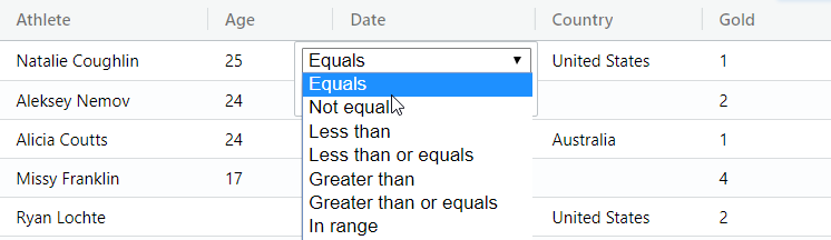
To enable filtering for a column, we simply add the filter configuration option to column definitions. We can also limit the set of comparison operators that will appear in the dropdown using filterParams option:
let columnDefs = [
    {
        field: "age",
        width: 90,
        filter: 'agNumberColumnFilter',
        filterParams: {
            filterOptions: [
                'lessThan',
                'greaterThan'
            ]
        }
    },
    ...
]
For applications that have bespoke filtering requirements, in this release, we’re adding the possibility to add new operators with custom filtering logic to the number, text and date filters. For example, a custom Greater than with Nulls filter operator could be included alongside the built-in Greater than option:
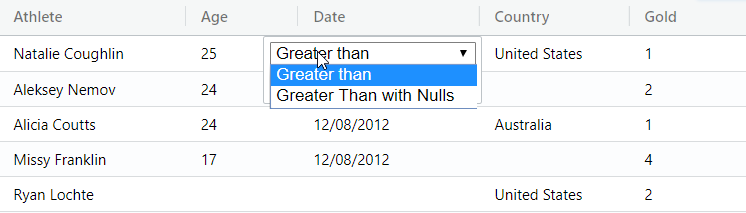
The Greater than with Nulls is a modified version of the Greater than operator that also allows Null values in the filtering results. Here’s what the implementation looks like:
let columnDefs = [
    {
        field: "age",
        width: 90,
        filter: 'agNumberColumnFilter',
        filterParams: {
            filterOptions: [
                'greaterThan',
                {
                    displayKey: 'greaterThanWithNulls',
                    displayName: 'Greater Than with Nulls',
                    test: function(filterValue, cellValue) {
                        return cellValue == null || cellValue > filterValue;
                    }
                }
            ]
        }
    },
    ...
]
The custom filter logic is implemented through the test function, which receives the filterValue that a user typed into the filtering input along with the cellValue from the grid, and returns true or false.
You can read more about it in the documentation.
Custom tooltips for column entries
New tooltip components that we’ve added in this release allow you to add custom tooltips to ag-Grid’s column header and cells. Before you could only configure ag-Grid to show a simple text as a tooltip:
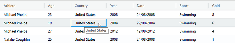
To do that you would use tooltipField configuration option:
let columnDefs = [
{
headerName: 'Athlete',
field: 'athlete',
tooltipField: 'athlete'
},
...
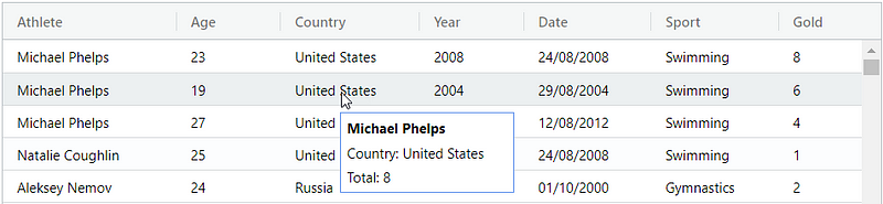
]In this release, we’ve added the possibility to implement a custom column tooltip. Here is, for example, a tooltip that shows both the name of an athlete, a county and a total medals count:
To implement it you need to define a component class that corresponds to the Tooltip Component Interface with two methods that create and return the DOM to render:
class CustomTooltip {
    init(params) {
        var eGui = this.eGui = document.createElement('div');
        var color = params.color || 'white';
        var data = params.api.getRowNode(params.rowIndex).data;

        eGui.classList.add('custom-tooltip');
        eGui.style['background-color'] = color;
        eGui.innerHTML =
            '<p><span class"name">' + data.athlete + '</span></p>' +
            '<p><span>Country: </span>' + data.country + '</p>' +
            '<p><span>Total: </span>' + data.total + '</p>';
    }

    getGui() {
        return this.eGui;
    }
}
Once you have the class ready, similarly to the standard customization workflow you need to register the component in the configuration:
let gridOptions = {
    defaultColDef: {
        ...
        tooltipComponent: 'customTooltip'
    },
    components: {
        customTooltip: CustomTooltip,
    },
    ...
};
The examples above use pure JavaScript grid setup but they the loading component is also available in any of the supported frameworks including React, Angular or Vue.
You can read more about the customization options in the documentation.
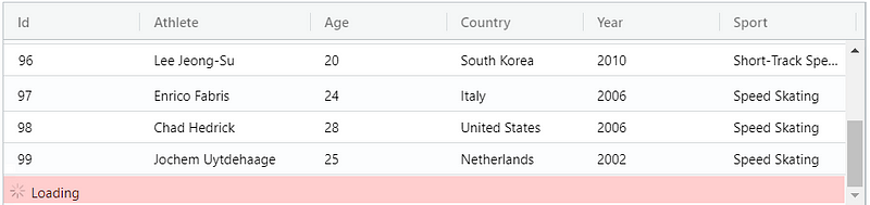
Custom loading component
Our customers with very large datasets regularly use Server-Side Row Model to lazy-load data in batches. As loading can take a while, using a loading spinner is a common solution to denote to a user that content is currently being loaded. A good use-case for the loading indicator is infinite scrolling functionality. Before this release ag-Grid provided a very basic loading indicator:
However, once you start using the newest version you’ll be able to implement a very sophisticated UI for the loading indicator. This can be achieved using a new customization component type called Loading Cell Renderer. This is an example of a custom loading indicator that shows an arbitrary icon and some text:
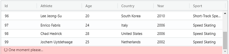
To add to ag-Grid, you simply define a component class that implements the LoadingCellRenderer interface with two methods:
class CustomLoadingCellRenderer {
    init(params) {
        const text = 'One moment please...';
        this.eGui = document.createElement('div');
        this.eGui.innerHTML =
            '<div class="ag-custom-loading-cell">' +
            '   <i class="fas fa-spinner fa-pulse"></i> <span>' + text + ' </span>' +
            '</div>';
    }

    getGui() {
        return this.eGui;
    }
}
and then register it using loadingCellRenderer configuration property:
let gridOptions = {
    loadingCellRenderer: 'customLoadingCellRenderer',
    components: {
        customLoadingCellRenderer: CustomLoadingCellRenderer,
    },
    ...
}
The examples above use pure JavaScript grid setup but they the loading component is also available in any of the supported frameworks including React, Angular or Vue.
You can read more about it in the documentation.
Events
Have you ever wanted to add your own handling for use cases involving a user pressing certain keys while the focus is inside the grid? For example, customizing the default browser behavior when a user presses Ctrl+C combination inside the grid. Well, in this release we’ve made such customizations possible.
To enable that, we’ve added two new events cellKeyPress and cellKeyDown to grid events that you can use to intercept user’s interaction with a keyboard:
let gridOptions = {
    onCellKeyPress() {}
    onCellKeyDown() {},
    ...
};
And we’ve introduced a possibility to suppress keyboard actions from the grid. To do that, grid now takes the suppressKeyboardEvent callback in the configuration options which gets called for each event. Once the callback is executed, a user can then decide to suppress the action by inspecting the event. Here’s an example of how to suppress any actions from the grid on the arrow keys:
let gridOptions = {
    suppressKeyboardEvent: function(params) {
        const KEY_LEFT = 37;
        const KEY_UP = 38;
        const KEY_RIGHT = 39;
        const KEY_DOWN = 40;

        const event = params.event;
        const key = event.which;

        const keysToSuppress = [KEY_LEFT, KEY_UP, KEY_RIGHT, KEY_DOWN];
        const suppress = keysToSuppress.indexOf(key) >= 0;

        return suppress;
    },
    ...
};
Using this functionality you can either turn off some default behavior or implement your own customized versions instead.
Performance improvements
In this release as always, we’ve also worked to improve our already impressive performance. Here’s one particular use case that we’ve worked on. It involves the grid configured to use the Client Side Row Model and displaying tens of thousands of rows grouped by arbitrary criteria. Once the dataset changes, e.g. a record is added, updated or deleted, the grid has to process changes and update grouping results with regards to sorting, filtering, aggregation etc.
Previously, regardless of the change, all groups were processed which could sometimes cause lagging behavior. With the new improved architecture changes to the dataset are streamlined to only visit the changed groups. It means that if you remove one row, only the group the row belongs to gets re-sorted, filtered, aggregated etc. This gives massive performance improvement for large datasets with small localized data changes.
Another significant improvement in performance you’ll notice in the use cases where the grid needs to calculate row height dynamically. Before this release, the grid was calculating row heights for all rows in the grid when the data was set. For large datasets, this was a performance bottleneck as calculating row heights can be a time consuming operation. Now the grid only calculates the heights of rows that are visible on the screen. For example, if there are 10000 rows in the grid, but only 20 are visible due to vertical scrolling, the grid calculates the height of the 20 visible rows only, and calculates heights of other rows as the user scrolls down.
Improved API to update column definitions
Sometimes you may need to update columns setup after the grid has been initialized, e.g. add or remove columns, change their width etc. This can be done by updating the list of column definitions. When new columns are set, the grid will compare column definitions and figure the differences.
However, some properties like width or columnOrder are ignored. This is done on purpose to avoid unexpected behavior for the application user, like resetting width or changing column order when a new column is added or removed programmatically.
In this release, we’ve added the option to override this behavior. If you set the configuration option deltaColumnMode to true the grid will apply changes for all column attributes each time the application updates the column.
You can read more about it in the documentation.
Learn more about AG Grid — an Enterprise JavaScript Data Grid used by the Fortune 500. Support for multiple frameworks: Angular, Vue, React so you can use the best technology for your business.