
- Introduction
- Customization through components
- Custom cell renderer
- Custom cell editor
- Custom column filter
- Filter presets
- Complete implementation
- Register the component
- Build Your Own Angular App With ag-Grid
Implement custom filtering logic, cell editor and renderer
Introduction
We believe that developers should be able to customize the grid easily and implement the functionality to meet their business requirements. ag-Grid is very flexible due to its component-based architecture. You can extend the default functionality by creating new Angular components and integrating them into the datagrid.
In the previous article on how to get started with Angular grid we’ve integrated ag-Grid into an Angular application. If you haven’t worked through our previous tutorial and don’t have a sample application now, you can download it from this GitHub repository.
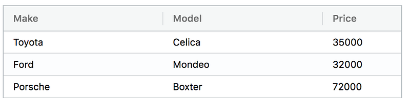
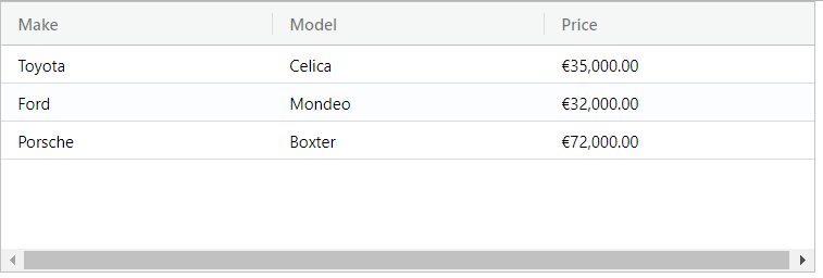
Our sample application displayed the following data on the screen:
In this tutorial, we’ll provide more options for a user to work with data in the “Price” column. To do that, we’ll implement a custom filter, cell renderer, and cell editor. This exercise won’t take you longer than 10 minutes.
Custom cell renderer
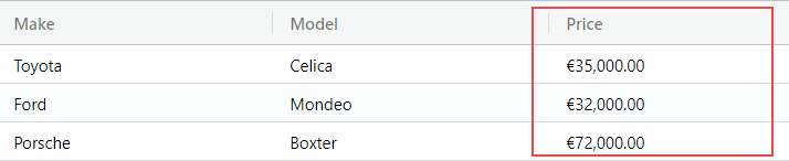
First, we’re going to implement a custom cell renderer to show the price formatted according to a user’s locale. Here’s how the numbers are displayed on my computer:
Custom cell editor
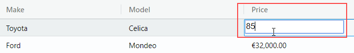
Since the “Price” field is numeric, it can’t contain non-numeric characters. By default, when a cell is being edited, users can type in any character. So we’ll implement a custom cell editor to restrict the input only to numbers:
Custom filter
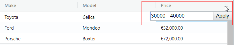
And we’ll finish this tutorial by implementing a custom filter. Our new filter will provide UI to type in the price range and filter out cars that fall out of that range:

So let’s see how we can do that.
You can download the sample that we’ll be building in this article from GitHub repository.
Customization through components
Our Angular grid is customized by implementing custom Angular components. The UI part is implemented using Angular templates. There are also some methods that need to be implemented by a component to work with ag-Grid. For example, a cell editor should implement the getValue method that ag-Grid uses to request the value from our component and update the data. A custom column filter should implement the doesFilterPass method that processes values and so on. These required methods are defined by interfaces described in the documentation.
All custom components used by ag-Grid should be listed in the AgGridModule.withComponents method imported into the main application module. We will implement three custom components, and add them like this:
@NgModule({
  imports: [
    BrowserModule,
    AgGridModule.withComponents([
      NumberFormatterComponent,
      NumericEditorComponent,
      RangeFilterComponent]
    )
  ],
  ...
})
export class AppModule {}
Custom cell renderer
The job of the grid is to lay out the cells. By default, the grid will create the cell values using simple text. If you want more complex HTML inside the cells, this can be achieved using cell renderers. We want to format our number according to a user’s locale, so we need to create a custom component. The component will take advantage of the Angular’s currency pipe to format values.
Define custom component
The first task is going to be to implement an Angular component. It will receive the value of a cell through the agInit method. To show the formatted value, we’ll use a simple span element. So, create a new file number-formatter.component.js and put the code for our component inside:
@Component({
  selector: 'app-number-formatter-cell',
  template: `
    <span>{{params.value | currency:'EUR'}}</span>
  `
})
export class NumberFormatterComponent {
  params: any;

  agInit(params: any): void {
    this.params = params;
  }
}
It’s a simple component with just one method agInit that is used to receive parameters from ag-Grid.
Register the component
Now that we have our component, we need to tell ag-Grid about it. All custom components should be listed in frameworkComponents configuration option. So let’s import our custom cell renderer and specify it in the configuration:
export class AppComponent implements OnInit {
  ...
  frameworkComponents = {
    numberFormatterComponent: NumberFormatterComponent,
  };
}
and pass the option to the ag-Grid in the template
<ag-grid-angular
  ...
  [rowData]="rowData"
  [columnDefs]="columnDefs"

  [frameworkComponents]="frameworkComponents"
>
</ag-grid-angular>
Specify the renderer for the column
We’re almost done. The only thing that’s left is to specify our component as a cell renderer for the “Price” column. We can do that in the column definition:
export class AppComponent implements OnInit {
  columnDefs = [
    {headerName: 'Make', field: 'make'},
    {headerName: 'Model', field: 'model'},
    {
      headerName: 'Price',
      field: 'price',
      editable: true,

      /* specify custom cell renderer */
      cellRenderer: 'numberFormatterComponent',
    }
  ];
Now if you run the application you should see the price formatted:
Custom cell editor
Our Angular datagrid provides rich editing capabilities. It resembles a spreadsheet allowing you to edit data inline. Just press F2 or double-click on a cell and ag-Grid activates the edit mode. You don’t need to provide a custom editor for simple string editing. But when we need to implement a custom logic, like restricting input to numbers, we need to create our cell editor.
Enabling editing
Before we start working on a custom component that will act as an editor, we need to enable editing for the Price column:
export class AppComponent implements OnInit {
  columnDefs = [
    {headerName: 'Make', field: 'make'},
    {headerName: 'Model', field: 'model'},
    {
      headerName: 'Price',
      field: 'price',

      /* enable editing */
      editable: true,
    }
  ];
Define custom component
Similar to a custom cell renderer, we need to define an Angular component to act as a cell editor. Let’s start with the basic implementation that will render an input element that will pop up when a user activates the edit mode:
@Component({
  selector: 'app-numeric-editor-cell',
  template: `
    <input/>
  `
})
export class NumericEditorComponent AfterViewInit {}
Now we need to implement some required methods.
Once editing is finished by pressing Enter or removing the focus from the input, ag-Grid needs to get a value from our editor. To do that, it calls the getValue method on our Angular component that should return the result of the editing.
We want to return the value that a user typed into the input. So we need to access that input to read its value. In Angular we can use the @ViewChild mechanism to accomplish that:
@Component({
  selector: 'app-numeric-editor-cell',
  template: `
    <input #i [value]="params.value"/>
  `
})
export class NumericEditorComponent {
  @ViewChild('i') textInput;
  params;

  agInit(params: any): void {
    this.params = params;
  }

  getValue() {
    return this.textInput.nativeElement.value;
  }
}
Notice that we’re getting the cell value from the grid in the agInit method and returning the value in the getValue method.
Now we’re ready to implement the functionality to filter out non-numeric characters. To do that, we need to add an event listener to the input and check each item typed in by the user. We also need to add the keyDown listener to prevent losing focus when the user presses navigation keys.
Here’s how we do it:
@Component({
  selector: 'app-numeric-editor-cell',
  template: `
    <input (keypress)="onKeyPress($event)" (keydown)="onKeyDown($event)"/>
  `
})
export class NumericEditorComponent {
  ...
  onKeyPress(event) {
    if (!isNumeric(event)) {
      event.preventDefault();
    }

    function isNumeric(ev) {
      return /\d/.test(ev.key);
    }
  }

  onKeyDown(event) {
    if (event.keyCode === 39 || event.keyCode === 37) {
      event.stopPropagation();
    }
  }
}
All right, now we’ve got almost everything set up. The last thing we need to do is to set focus to the input in our custom cell editor as soon as the user activates the edit mode. Conveniently, to do that we can use the ngAfterViewInit lifecycle hook provided by Angular:
export class NumericEditorComponent implements AfterViewInit {
  @ViewChild('i') textInput;

  ...
  ngAfterViewInit() {
    setTimeout(() => {
      this.textInput.nativeElement.focus();
    });
  }
}
So here is the full code for you to copy/paste it:
@Component({
  selector: 'app-numeric-editor-cell',
  template: `
    <input #i [value]="params.value" (keypress)="onKeyPress($event)" (keydown)="onKeyDown($event)"/>
  `
})
export class NumericEditorComponent implements AfterViewInit {
  @ViewChild('i') textInput;
  params;

  ngAfterViewInit() {
    setTimeout(() => {
      this.textInput.nativeElement.focus();
    });
  }

  agInit(params: any): void {
    this.params = params;
  }

  getValue() {
    return this.textInput.nativeElement.value;
  }

  onKeyPress(event) {
    if (!isNumeric(event)) {
      event.preventDefault();
    }

    function isNumeric(ev) {
      return /\d/.test(ev.key);
    }
  }

  onKeyDown(event) {
    if (event.keyCode === 39 || event.keyCode === 37) {
      event.stopPropagation();
    }
  }
}
Register the component
Similarly to a custom cell renderer, we need to register our cell editor in the frameworkComponents and specify it as an editor for the “Price” column:
export class AppComponent implements OnInit {
  columnDefs = [
    {headerName: 'Make', field: 'make'},
    {headerName: 'Model', field: 'model'},
    {
      headerName: 'Price',
      field: 'price',
      editable: true,

      /* custom cell editor */
      cellEditor: 'numericEditorComponent',
    }
  ];

  frameworkComponents = {
    /* custom cell editor component*/
    numericEditorComponent: NumericEditorComponent,
  };
And that’s it. We’re all good now to start working on our last task of implementing a custom filter.
Custom column filter
Filtering is one of the most useful features of data grids. It allows users to zoom in on a particular set of records. Our Angular grid provides a simple string filtering out of the box. When you need your custom filter types, you can easily implement the logic with a custom filter component. The component we will be working on filters out cars based on a price range.
Enabling filtering
Before we start working on our custom filter component, we need to enable filtering in the grid:
In app.component.ts add the default column definitions:
  defaultColDef = {
    sortable: true,
    filter: true
  };
And in app.component.html make sure we use the default column definitions.
<ag-grid-angular
  ...

  [defaultColDef]="defaultColDef"

  [rowData]="rowData"
  [columnDefs]="columnDefs"
  [frameworkComponents]="frameworkComponents"
>
</ag-grid-angular>
Define custom component
To implement a custom filter, we follow the familiar customization approach and define an Angular component. Our filter will be rendered as an input with a button to apply the filter. Let’s put this HTML into component’s template:
@Component({
  selector: 'app-range-filter-cell',
  template: `
    <form>
      <input name="filter"/>
      <button>Apply</button>
    </form>
  `
})
export class RangeFilterComponent  {}
Our filter allows users to specify a range for a car price in the form of lower boundary — upper boundary:
We’ll define the filter property to store the current filter condition in the component’s state. When the input is shown, we want to pre-fill it with the current filter condition in the component’s state. We’ll do that using the value input binding. Here’s the code that implements this:
@Component({
  selector: 'app-range-filter-cell',
  template: `
    <form>
      <input name="filter" [value]="filter"/>
      <button>Apply</button>
    </form>
  `
})
export class RangeFilterComponent implements AfterViewInit {
  filter = '';
}
Then we need to process user input and save it to the component’s state. To do that, we’ll register an event listener on the form and process input when the form is submitted using the Apply button:
@Component({
    selector: 'app-range-filter-cell',
    template: `
        <form (submit)="onSubmit($event)">
            <input name="filter" [value]="filter"/>
            <button>Apply</button>
        </form>
    `
})
export class RangeFilterComponent {
    filter = '';

    onSubmit(event) {
        event.preventDefault();

        const filter = event.target.elements.filter.value;

        if (this.filter !== filter) {
            this.filter = filter;
        }
    }
}
Whenever there’s a change in the filtering condition, we not only need to update the state but also notify ag-Grid about the change. We can do that by calling the filterChangedCallback that ag-Grid provides for us through the parameters in the agInit method. Let’s add the agInit method and modify the onSubmit handler a little bit to notify the grid:
export class RangeFilterComponent {
  filter = '';
  params: any;

  agInit(params: any): void {
    this.params = params;
  }

  onSubmit(event) {
    event.preventDefault();

    const filter = event.target.elements.filter.value;

    if (this.filter !== filter) {
      this.filter = filter;

      /* notify the grid about the change */
      this.params.filterChangedCallback();
    }
  }
}
We’re done now with the user interface.
Next, we need to implement the doesFilterPass function that performs filtering. It’s called by ag-Grid to determine whether a value passes the current filtering condition or not. The other function called by ag-Grid that we need to implement is isFilterActive. It determines whether the filter has any filtering condition to apply.
Let’s implement this functionality on our component:
export class RangeFilterComponent implements AfterViewInit {
  filter = '';
  params: any;

  agInit(params: any): void {
    this.params = params;
  }

  isFilterActive() {
    return this.filter !== '';
  }

  doesFilterPass(params) {
    const filter = this.filter.split('-');
    const gt = Number(filter[0]);
    const lt = Number(filter[1]);
    const value = this.params.valueGetter(params.node);

    return value >= gt && value <= lt;
  }

  ...
}
Notice that we also receive the valueGetter function through parameters from ag-Grid. In the code below we use it to retrieve the current value of a cell.
Filter presets
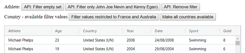
ag-Grid implements an API that can be used to activate and deactivate filters on demand. Usually, this API is triggered by some UI element, like a button:
For this functionality to work, our custom component should implement two methods — setModel and getModel. ag-Grid calls them to provide the current filtering condition for a component or to obtain it from the component. Here’s how we implement these methods in code:
export class RangeFilterComponent {
  filter = '';

  ...
  getModel() {
    return {filter: this.filter};
  }

  setModel(model) {
    this.filter = model ? model.filter : '';
  }
}
We’re almost ready. The last thing we need to do is bring focus to input. To do that we’ll use the familiar ngAfterViewInit lifecycle hook:
@Component({
    selector: 'app-range-filter-cell',
    template: `
        <form (submit)="onSubmit($event)">
            <input #i name="filter" [value]="filter"/>
            <button>Apply</button>
        </form>
    `
})
export class RangeFilterComponent implements AfterViewInit {
    @ViewChild('i') textInput;

    ...
    ngAfterViewInit() {
        setTimeout(() => {
            this.textInput.nativeElement.focus();
        });
    }
}
Complete implementation
So here is the full code for our component:
@Component({
  selector: 'app-range-filter-cell',
  template: `
    <form (submit)="onSubmit($event)">
      <input #i name="filter" [value]="filter"/>
      <button>Apply</button>
    </form>
  `
})
export class RangeFilterComponent implements AfterViewInit {
  @ViewChild('i') textInput;
  filter = '';
  params: any;

  agInit(params: any): void {
    this.params = params;
  }

  isFilterActive() {
    return this.filter !== '';
  }

  ngAfterViewInit() {
    setTimeout(() => {
      this.textInput.nativeElement.focus();
    });
  }

  doesFilterPass(params) {
    const filter = this.filter.split('-');
    const gt = Number(filter[0]);
    const lt = Number(filter[1]);
    const value = this.params.valueGetter(params.node);

    return value >= gt && value <= lt;
  }

  getModel() {
    return {filter: this.filter};
  }

  setModel(model) {
    this.filter = model ? model.filter : '';
  }

  onSubmit(event) {
    event.preventDefault();

    const filter = event.target.elements.filter.value;

    if (this.filter !== filter) {
      this.filter = filter;
      this.params.filterChangedCallback();
    }
  }
}
Register the component
Once we have our component ready, we need to register it in the frameworkComponents and specify it as an editor for the “Price” column:
export class AppComponent implements OnInit {
  columnDefs = [
    {headerName: 'Make', field: 'make'},
    {headerName: 'Model', field: 'model'},
    {
      headerName: 'Price',
      field: 'price',
      editable: true,
      cellRenderer: 'numberFormatterComponent',
      cellEditor: 'numericEditorComponent',

      /* custom filter */
      filter: 'rangeFilterComponent'
    }
  ];

  frameworkComponents = {
    /* custom filtering component */
    rangeFilterComponent: RangeFilterComponent,
  };
Build Your Own Angular App With ag-Grid
I hope that the examples above clearly demonstrated how easy it is to customize and configure our Angular grid.
Learn about AG Grid Angular Support here, we have an Angular Quick Start Guide and all our examples have Angular versions.