

AG Charts 13.3 introduces colour scales, organisation charts, data selection, and tooltip improvements focused on improving interactivity and visualisation flexibility:
Key Features
- Colour Scale - Map numeric values to colour ranges for more expressive and data-driven visualisations.
- Organisation Chart - Visualise hierarchical structures with a dedicated organisation chart series.
- Data Selection - Select and interact with chart data points through user interaction and programmatically.
- Tooltip Improvements - Enhanced tooltip customisation, positioning, and interaction behaviour across chart types.
Colour Scale
AG Charts 13.3 introduces colour scales, enabling charts to map numeric values directly to colour ranges. This makes it easier to communicate magnitude, density, or intensity visually across datasets.
Colour scales are particularly useful in Heatmaps, Treemaps, and other visualisations where colour can communicate additional dimensions of data without increasing chart complexity.
To use a Colour Scale, set the series colorKey property to a data field containing numeric values:
const options = {
  series: [
    {
      type: 'heatmap',
      xKey: 'month',
      yKey: 'region',
      colorKey: 'sales',
    },
  ],
};
Visit the Colour Scale docs for more information.
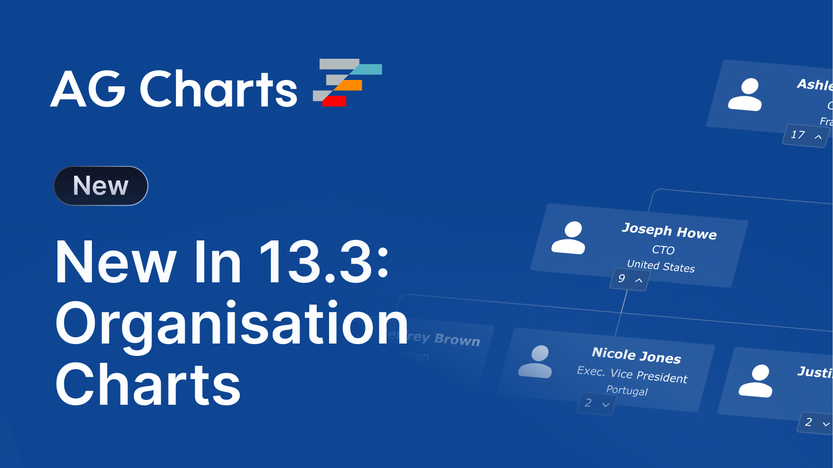
Organisation Chart
AG Charts 13.3 adds support for Organisation charts, enabling applications to visualise hierarchical relationships such as company structures, reporting lines, or tree-based datasets.
Organisation charts provide a structured way to display parent-child relationships while supporting styling and interaction and accessibility features consistent with the rest of AG Charts.
The Org Chart is designed to display a single series and is created using the organization series type:
const options = {
    series: [
        {
            type: 'organization',
            idKey: 'id',
            parentIdKey: 'parentId',
            node: {
                title: { key: 'name' },
                subtitle: { key: 'job' },
                image: { key: 'avatar' },
                labels: [{ key: 'location' }],
            },
        },
    ],
}
Visit the Organisation Chart docs for more information.
Data Selection
Data Selection introduces interaction capabilities and APIs for selecting chart elements directly, enabling richer chart interactions and tighter integration with surrounding application state.
Data Selection allows users to click or drag on the chart to mark individual datums as selected - selected datums receive a distinct visual treatment and can be read back, set, or cleared programmatically.
To enable data selection, set selection.enabled to true:
const options = {
  selection: {
    enabled: true,
  },
};
Visit the Data Selection docs for more information.
Tooltip Improvements
This release also includes a range of tooltip enhancements across AG Charts, including support for tooltips on legend items, chart titles, subtitles, and footers, making it easier to provide additional context throughout the chart UI.
In addition, directional offsets can now be applied to tooltip positioning, allowing applications to fine-tune tooltip placement for dense or highly interactive visualisations.
Summary
AG Charts 13.3 focuses on richer visualisation capabilities and improved interactivity. This release:
- Introduces colour scales for data-driven visual styling
- Adds organisation charts for hierarchical data visualisation
- Enables interactive and programmatic data selection
- Improves tooltip behaviour and customisation across chart types
As always, we welcome feedback. Enterprise customers can contact us via Zendesk; Alternatively, please submit a GitHub issue or complete our contact form.
Next steps
New to AG Charts? Get started in minutes, for free, with your favourite framework:
Considering AG Grid Enterprise? Request a free 30-day trial licence to test your application in production and get direct access to our support team.
Happy coding!