
This articles continuous the series of explaining datagrids features and comparing their implementation in enterprise JavaScript datagrids. In my previous article I looked at column pinning functionality and showed how the implementation in ag-Grid gives the most flexibility to developers and end users among all JavaScript datagrids.
In this article I want to explore the datagrids capabilities when it comes to the customization of cell content. This mechanism is commonly known as cell templating or cell rendering. Here at ag-Grid a developer experience working on complex scenarios has always been the top priority for us and this article is meant to show it to you.
Why customize cells?
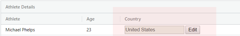
When rendering the contents of cells all datagrids take values and render them inside the cells as plain strings wrapped in a block level DOM element, typically HTMLDivElement. This is enough if you just want to show the value. However, sometimes you need to customize appearance of a cell by tweaking styles or adding extra HTML elements like buttons or inputs:
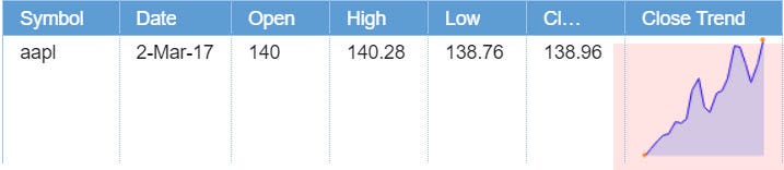
Or you might need to implement a full-blown stateful component that renders complex UI, e.g. sparkline:
Cell rendering or templating is a feature that allows you to render completely arbitrary DOM inside the cell. Most datagrids that target enterprise have this functionality, however the way they implement it differs significantly. And as I’ll show you in a minute, only ag-Grid provides capabilities required to implement complex stateful components in a performance optimized way.
Implementation in datagrids
Just as in the previous article, we’ll be comparing implementations against these guys:
- Ignite UI grid component by Infragistics
- KendoUI grid component by Telerik
- DataGrid by DevExtreme
- DataGrid by Syncfusion
- DataTable by Webix
In general, cell customization can be implemented using one of the following:
- cell templates with custom syntax for loops and conditionals
- functions that return HTML strings or DOM
- stateful components
In general, cell customization can be implemented using one of the following:
- cell templates with custom syntax for loops and conditionals
- functions that return HTML strings or DOM
- stateful components
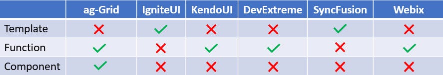
Here’s the table that shows which functionality each datagrid implements:
Now let’s look at advantages and disadvantages of each method and where you’ll need stateful components that only ag-Grid provides.
Cell templates
This feature enables you to define a presentation using a built-in template mechanism. Cell templates have one advantage — they can be compiled and later reused multiple times with different data which has a positive effect on performance. However, this comes at a cost. First, you need to learn the syntax. For example, the datagrid by IgniteUI requires you to memorize the syntax for conditionals and loops provided by their templating engine. Here’s an example of the configuration that uses a template:
let grid = Grid({
    columns: [
        {
            title: 'disc',
            template: `
                <div class="template_checkbox">
                  ${if(disc)}
                    <input type="checkbox" checked> ${else}
                    <input type="checkbox">
                  ${/if}
                </div>
            `
        }
    ],
    ...
})
By itself, syntax isn’t a big problem. The bigger problem is that it limits flexibility and hence is only suitable when you need to render simple static HTML. When you need to have an elaborate logic that defines the presentation, a function that returns an HTML string or DOM is a better choice. That’s why most datagrids in our comparison table opt for that option.
Functions that define the view
Using functions to define presentations adds flexibility by allowing logic in the function body that calculates the resulting DOM. This removes the need for redundant syntax to define conditionals and loops. The customization through function is supported by most datagrids, including ag-Grid. Here’s an example of a function that implements the same logic as in the previous example without the need for the ${if}…${/if} template construction:
let grid = Grid({
  columns: [
    {
      title: 'disc',
      function: (item) => {
        return `
          <div class="template_checkbox">
            <input type="checkbox" ${item.disc ? 'checked' : ''}>
          </div>
        `
      }
    }
  ]
})
However, this approach isn’t very suitable for cases when you need to render a component that does something more complex than simply calculating and displaying the static data. That’s when you want a datagrid to support real components with state and lifecycle methods. As it turns, ag-Grid is the only datagrid that provides that capability. Let’s take a look at how it works.
Stateful components
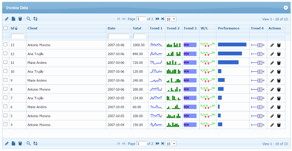
If you’ve been working on enterprise data heavy applications, then you must know how complex requirements sometimes can get. Here’s an example of one pretty advanced configuration of a JavaScript datagrid:
A big challenge for any grid with such elaborate presentations is that complex UI elements like sparklines or widgets with animations define a DOM structure that is expensive to create and destroy. This is when a component state and lifecycle methods come very handy.
For example for animation to happen, a component should have state to define transition from the previous state to the the updated one. Without state a cell would be just deleted and a new one drawn which makes animation very difficult to implement.
On the other hand, lifecycle methods allow you preserve the cell and the DOM rendered by a component inside the cell when the data changes. All you need to do is to update the presentation. In case of sparklines, when the data changes you can just adjust the chart — rather than having to wipe the cell and start from scratch each time when changes take place. This can have a dramatic positive impact on performance.
Lastly, if your component has side effects, you need a lifecyle method to get notification about a cell being destroyed so you can perform a necessary cleanup.
You get that all by using components in ag-Grid.
Here’s an interface for a cell renderer component that describes the shape of a component including lifecycle methods:
interface ICellRendererComp {
    // Optional - Params for rendering. The same params that are passed to the cellRenderer function.
    init?(params: ICellRendererParams): void;

    // Mandatory - Return the DOM element of the component, this is what the grid puts into the cell
    getGui(): HTMLElement;

    // Optional - Gets called once by grid after rendering is finished - if your renderer needs to do any cleanup,
    // do it here
    destroy?(): void;

    // Mandatory - Get the cell to refresh. Return true if the refresh succeeded, otherwise return false.
    // If you return false, the grid will remove the component from the DOM and create
    // a new component in it's place with the new values.
    refresh(params: ICellRendererParams): boolean;
}
Implementing your own renderer component in ag-Grid can be accomplished with just a few simple steps. Here’s an example of a custom cell renderer that formats numbers so that they are shown according to a user’s locale:
class NumberCellFormatter {
    init(params) {

        const text = params.value.toLocaleString(...);

        this.eGui = document.createElement('span');
        this.eGui.innerHTML = text;
    }

    getGui() {
        return this.eGui;
    }
}
Once defined, all you need to do is just register it for the column:
const gridOptions = {
    columnDefs: columnDefs,
    components: {
        /* custom cell renderer component */
        numberCellFormatter: NumberCellFormatter,
    }
};
If you’re interested to learn more about customizations, I’ve written an article on how to customize rendering, editing and filtering in ag-Grid in less than 10 minutes.
That’s not all. When it comes to cell customizations we go even further. Besides simply using components, with ag-Grid you can also do the following:
- define the presentation and logic inside a cell using a component from your favorite framework
- define different renderers for different rows in the same column
- and even define cell renderers for groups
We have no doubt with all these possibilities you’ll be able to implement any business requirement in no time. And the best part is that you can get that functionality absolutely for free in the community edition of ag-Grid. How do you like that? 😃
Build Your Own JavaScript App With ag-Grid
I hope that this article clearly demonstrated how powerful our JavaScript grid is. Now take the next step and give it a try with our “Get started in 5 minutes” guide.
Learn more about AG Grid — an Enterprise JavaScript Data Grid used by the Fortune 500. Support for multiple frameworks: Angular, Vue, React so you can use the best technology for your business.