In previous blog posts we have shown how to use classes in React: get started in 5 minutes and customising react data grid, in this post we will cover Getting Started using Hooks and how to optimise components which use the React Data Grid.
Hooks let us use React features from functions so you won't see any classes in this Getting Started Guide.
- Example Code
- Creating Project From Scratch
- Optimising React Data Grid for Hooks
- Video: Getting Started
- Video: Optimising for Hooks
- Learn More React Data Grid
Example Code
If you want to run the example from this blog post then you can find the repository on Github:
- download examples repo from react-data-grid
Then run the example in the getting-started-5-mins-hooks directory:
cd getting-started-5-mins-hooks
npm install
npm start
Creating Project From Scratch
Since this is a getting started post I'll summarise the absolute basic steps to getting started, I assume you have npm installed.
- use npx create-react-app to create the project
npx create-react-app getting-started-5-mins-hooks
- change directory into the project
cd getting-started-5-mins-hooks
- install AG Grid and the AG React Library
npm install --save ag-grid-community ag-grid-react
- then start the project running so we can view it in a browser
npm start
Create a Grid Component
Rather than add all the code into my App.js I'm going to create a component to render data using AG Grid. I'll use our basic cars data set so I'll amend my App.js to us a CarsGrid.
function App() {
  return (
    <CarsGrid />
  );
}
I'll write my CarsGrid in a carsgrid.js file and import it.
import {CarsGrid} from `./carsgrid`
carsgrid.js
The content of carsgrid.js is as basic as it gets.
I import the React and AG Grid features I will use:
import React, {useState} from 'react';
import {AgGridColumn, AgGridReact} from 'ag-grid-react';

import 'ag-grid-community/dist/styles/ag-grid.css';
import 'ag-grid-community/dist/styles/ag-theme-alpine.css';
Then I will create the data that I will load into the grid. Initially I'll create this as a simple array and we'll consider alternatives later in the post.
const InitialRowData = [
    {make: "Toyota", model: "Celica", price: 35000},
    {make: "Ford", model: "Mondeo", price: 32000},
    {make: "Porsche", model: "Boxter", price: 72000}
];
Finally I'll create a JavaScript function for my React Component which:
- sets the data to render use state as
rowData - returns the JSX that renders data using AG Grid.
export function CarsGrid() {

    // set to default data
    const [rowData, setRowData] = useState(InitialRowData);

   return (
       <div className="ag-theme-alpine" style={{height: 400, width: 600}}>
           <AgGridReact
                rowData={rowData}
                >
                <AgGridColumn field="make"></AgGridColumn>
                <AgGridColumn field="model"></AgGridColumn>
                <AgGridColumn field="price"></AgGridColumn>
           </AgGridReact>
       </div>
   )
};
This gives me a very basic grid that will render the data.

Since AG Grid offers a lot of features out of the box, I'll enable some of those like:
- in cell editing
- sorting
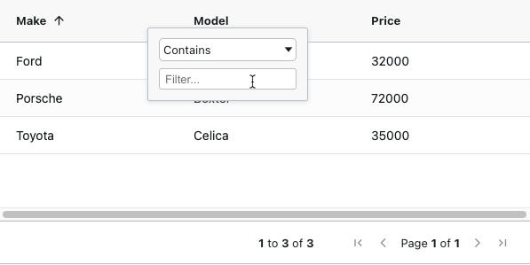
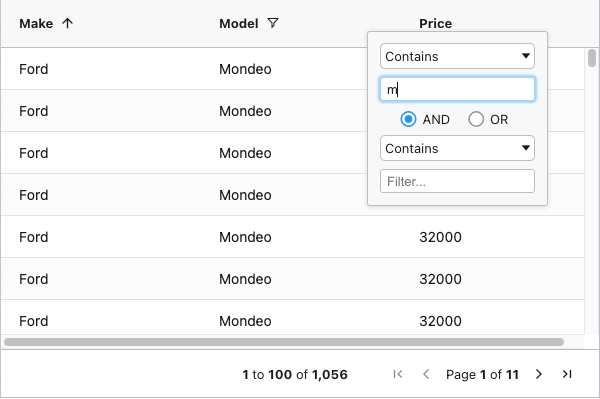
- filtering
- pagination
In Cell Editing
To enable a cell as editable, I change the column definition to have an additional attribute: editable={true}
e.g.
<AgGridColumn field="price" editable={true}></AgGridColumn>
This will make the price cells editable.
Sorting and Filtering
To make a column sortable or filterable I again add an attribute to the column e.g.
- Sortable
<AgGridColumn field="make" sortable={true}></AgGridColumn>
- Filterable
<AgGridColumn field="model" filter={true}></AgGridColumn>
I can control each column via individual attributes.
But I'd rather configure all the columns to be sortable and filterable at the same time, and I can do that by adding a default column definition on the grid itself.
   <AgGridReact
        defaultColDef={{sortable: true, filter: true }}

Data Grid Pagination
If I want to add pagination to the grid then I can enable this with a single attribute on the grid pagination={true}.
   <AgGridReact
        defaultColDef={{sortable: true, filter: true }}
        pagination={true}
But, there is really no point in having a pagination, sorting and filtering on a grid with such a small amount of data.
As soon as I load data into the grid we can then see some of the benefits of using a React Data Grid like AG Grid.
  React.useEffect(() => {
        fetch('https://www.ag-grid.com/example-assets/row-data.json')
            .then(result => result.json())
            .then(rowData => setRowData(rowData))
    }, []);
By loading a lot of data into the grid we can see that:
- the grid maintains is position on the page
- pagination and rendering happens automatically
- sorting and filtering are fast with no additional programming required

There is another feature that we get free with AG Grid.
If I amend the initial state to be unassigned, then AG Grid will display a loading... message while we load data into the grid from the server.
const [rowData, setRowData] = useState();

Optimising React Data Grid for Hooks
At this point the blog post has covered most of the same ground as the class based getting started post.
We should learn a few ways to optimise the component:
- make it easier to amend by using state and objects
- reduce rendering cycles
Column Definitions as Objects
At the moment our grid has the column definitions defined declaratively:
    <AgGridColumn field="make"></AgGridColumn>
    <AgGridColumn field="model"></AgGridColumn>
    <AgGridColumn field="price" editable={true}></AgGridColumn>
This reduces the flexibility available to me to customise the grid at run time.
If I want to adjust the column definitions then I would be better off setting them as objects via state.
    const [colDefs, setColDefs] = useState([
        {field: 'make'},
        {field: 'model'},
        {field: 'price', editable: 'true'},
    ]);
And amending my grid to use the state.
   <AgGridReact
        defaultColDef={{sortable: true, filter: true }}
        pagination={true}
        rowData={rowData}
        columnDefs={colDefs}>
   </AgGridReact>
This way I can add or remove columns from the state, or adjust their attributes to make them editable or have custom rendering, and the component would automatically re-render to accomodate the changes to the state.
This way our complete initial functional component using hooks looks as follows:
import React, {useState} from 'react';
import {AgGridColumn, AgGridReact} from 'ag-grid-react';

import 'ag-grid-community/dist/styles/ag-grid.css';
import 'ag-grid-community/dist/styles/ag-theme-alpine.css';

export function CarsGrid() {

    const [rowData, setRowData] = useState();

    const [colDefs, setColDefs] = useState([
        {field: 'make'},
        {field: 'model'},
        {field: 'price', editable: 'true'},
    ]);

    React.useEffect(() => {
        fetch('https://www.ag-grid.com/example-assets/row-data.json')
            .then(result => result.json())
            .then(rowData => setRowData(rowData))
    }, []);

   return (
       <div className="ag-theme-alpine" style={{height: 400, width: 600}}>
           <AgGridReact
                defaultColDef={{sortable: true, filter: true }}
                pagination={true}
                rowData={rowData}
                columnDefs={colDefs}
                >
           </AgGridReact>
       </div>
   )
};
Reducing Rendering by Memoizing
If we didn't want to update the column definitions at run time, that doesn't mean we should go back to declarative definitions.
We still make the code easier to maintain longer term by using objects. But we should memoize them to make sure we don't unnecessarily add more render cycles than we need to.
The AG Grid React Data Grid is already well optmised for rendering, but in typical real world usage, we will wrap AG Grid in our own components for common styling and configuration.
I would memoize the colDefs as follows:
    const colDefs = useMemo( ()=> [
    	{field: 'make'},
    	{field: 'model'},
    	{field: 'price', editable: 'true'},
    ], []);
The Column Definitions are constant and won't trigger a re-render should the parent component change.
Example Tutorial Video
Optimising For Hook Components
Learn More React Data Grid
We have a longer Getting started guide in our documentation which also covers selection, grouping and changing themes.
We also have some React examples to study which show more use cases of AG Grid.
The code for this post is in the react-data-grid repo in the getting-started-5-mins-hooks folder.
