
- Introduction
- Integration and Installation
- Define configuration
- Set data dynamically
- Enabling features
- Getting Started Video Tutorial
- Build Your Own Angular App With ag-Grid
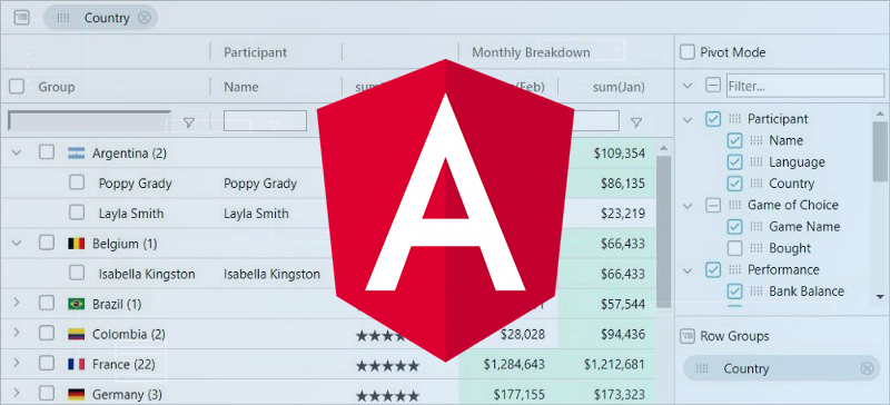
The fastest and most feature-rich Angular grid component from ag-Grid
Introduction
The paradigm of a data grid should be familiar to most developers. It’s a component used for displaying tabular data in a series of rows and columns. Perhaps the most common example of a data grid on Desktop is Excel. Grids have been present on native platforms for a long time and have recently made their way into web app UIs.
Modern grids are complex. The costs of development in-house solutions are quite high. That’s why most companies and software engineers choose data grids available on the market. Unsurprisingly, there’s a variety of the grids available for free or as paid subscriptions. But how do you choose one? Simple.
If a grid meets the requirements for features and performance, developers than look at the ease of integration and configuration. The availability of the fully fledged documentation covering all features and providing examples significantly simplifies the choice.
Our Angular grid component is where you’ll find that all.
It’s based on the fastest and most feature rich grid out there — ag-Grid. The grid has no 3rd party dependencies and was specifically designed to deliver outstanding performance right out-of-the box. It has full-blown solution with features to meet most of the requirements. We’ve also put extra efforts into the documentation to ensure that every feature and customization option is described.
We base all our Angular grid UI interactions on familiar Excel functionality to make it easy for your users to get started with the grid. Because of that resemblance the grid is also referred to as Angular Table or Angular Data Table.
This article features an Angular grid example and demonstrates you how easy it is to integrate and configure the grid. It’s a 5 minute getting started guide with examples that you can copy/paste and get off to a fast start. Once we go over the basic setup, I’ll show you a few features and configuration options that control them. Here’s a preview of what the finished product will look like:
So let’s get started!
Integration and Installation
ag-Grid and its Angular grid component can be easily integrated into any Angular project bundler setup. Since they are are distributed as NPM packages, integrating ag-Grid is a matter of simply importing AgGridModule class into the main application and referencing <ag-grid-angular> in the container component’s template.
You can download the sample that we’ll be building in this article from this github repository.
To ramp things up, we are going to generate an Angular app with Angular CLI so that we don’t need to worry about configuration and tooling setup. Install the CLI globally if you don’t have it and then run the following commands in your terminal:
npm install -g @angular/cli
ng new my-app
cd my-app
ng serve
If everything works as expected, ng serve has started the web server. You can open your app at localhost:4200 and check it.
Now we’re ready to add the ag-Grid NPM packages. Run the following command in my-app (you may need a new instance of the terminal):
npm install --save ag-grid-community ag-grid-angularWe now have a fully bootstrapped Angular app with Angular Data Grid component available for integration.
Import dependencies
Angular grid component is distributed as part of the AgGridModule. In order to use the component, we first need to import this module into the main application module in src/app/app.module.ts:
import { AgGridModule } from 'ag-grid-angular';

@NgModule({
  ...
  imports: [AgGridModule.withComponents(null), ...],
})
export class AppModule {}
The withComponents method that you call on the AgGridModule is used to declare Angular components used inside ag-Grid. This is a common case if you extend default ag-Grid’s functionality with your custom logic.
We also need to import a few style sheets with ag-Grid theming into the src/styles.css:
@import "ag-grid-community/dist/styles/ag-grid.css";
@import "ag-grid-community/dist/styles/ag-theme-balham.css";
Add Angular Grid component to a template
We can now use Angular Grid component directly in the App container component’s template. Open src/app/app.component.html in your favorite text editor and add the ag-grid-angular component to the markup:
<ag-grid-angular
    style="width: 700px; height: 500px;"
    class="ag-theme-balham"
    [rowData]="rowData"
    [columnDefs]="columnDefs">
</ag-grid-angular>
The HTML above includes a wrapper DIV element which sets the grid dimensions and specifies the grid's theme by setting the className to ag-theme-balham. As you may have noticed, the CSS class matches the name of CSS file we imported earlier. The grid ships several different themes that can be further customized with exported SASS variables.
Define configuration
To instantiate the grid, you need to define two essential configuration properties — the column definitions and the data. In the markup above they are specified as columnDefs and rowData component properties. So let’s add these properties to the App component class:
import {Component} from '@angular/core';
@Component({
selector: 'app-root',
templateUrl: './app.component.html',
styleUrls: ['./app.component.css']
})
export class AppComponent {
columnDefs = [
{headerName: 'Make', field: 'make'},
{headerName: 'Model', field: 'model'},
{headerName: 'Price', field: 'price'}
];
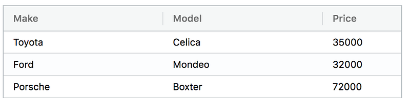
rowData = [
{make: 'Toyota', model: 'Celica', price: 35000},
{make: 'Ford', model: 'Mondeo', price: 32000},
{make: 'Porsche', model: 'Boxter', price: 72000}
];
}In the code above, the column definitions contain three columns “Make”, “Model” and “Price”. Each column entry specifies the header label and the data field to be displayed in the body of the table. The actual data is defined in the rowData as an array of objects. Notice that the fields of the objects match the field values in the columnDefs configuration object. That’s the way to bind configuration and data in ag-Grid.
If you now run the example you should see the data shown:
And that’s it! You’ve just integrated our grid component into your Angular application. Let’s now see how easy it is to configure features in the grid.
Set data dynamically
In the configuration above we used a hard-coded dataset. But in the real world, most of the time, we are working with data that resides on a remote server. So once we get the data from a server, we need to update the configuration of the grid dynamically. Thanks to the data-binding mechanism of Angular, implementing it is straightforward. We simply need to update a component property that is bound to the rowData property of <ag-grid-angular>. In our setup it’s the identically named property of the App component. Note that the actual data fetching is performed outside of the grid component.
So here’s an alternative setup:
import {Component} from '@angular/core';

@Component({
  selector: 'app-root',
  templateUrl: './app.component.html',
  styleUrls: ['./app.component.css']
})
export class AppComponent {
  columnDefs = [
    {headerName: 'Make', field: 'make'},
    {headerName: 'Model', field: 'model'},
    {headerName: 'Price', field: 'price', editable: true}
  ];

  rowData = [];

  ngOnInit() {
    fetch('https://www.ag-grid.com/example-assets/row-data.json')
      .then(result => result.json())
      .then(rowData => this.rowData = rowData);
  }
}
In the code above we’re requesting the data with the Fetch API and dynamically updating the rowData property. Angular will pass down the new value of the property to the grid and the new dataset rendered will be rendered in the grid.
If, instead of initializing the rowData property with an empty array you don’t specify it at all, the grid will show the Loading... text until you update the property with a value.
Enabling features
Sorting, Filtering and Pagination are among the most commonly used features of the modern grids. They allow a user to zoom in on a particular set of records instead of working with the entire dataset of the real-world applications. Our Angular grid also provides rich inline editing experience so your users can update any record in a dataset with just a few clicks.
Angular Grid Sorting
Enabling sorting in ag-Grid is actually quite simple — all you need to do is set the sortable property on a column definition to true and since all our columns are going to be sortable I will add this to the default column definition.
In app.components.ts:
defaultColDef = {
    sortable: true
  };
And in the app.component.html add the defaultColDef:
<ag-grid-angular
style="width: 700px; height: 500px;"
class="ag-theme-balham"
[rowData]="rowData"
[columnDefs]="columnDefs"
[defaultColDef]="defaultColDef"
>
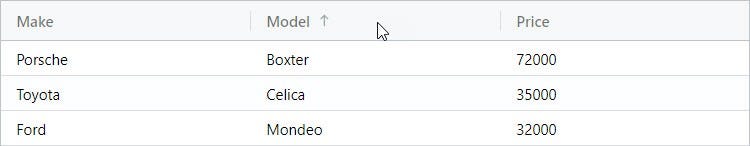
</ag-grid-angular>Once the property is added, you should be able to sort the grid by clicking on the column headers. Each clicks toggles through ascending, descending and no-sort states.
Angular Grid Filtering
As with sorting, enabling filtering is as easy as setting the filter property to true:
defaultColDef = {
    sortable: true,
    filter: true
  };
With this property is set, the grid will display a small column menu icon when you hover over the header. Pressing it will show a popup with the UI for filtering which lets you choose the kind of filter and the text that you want to filter by.
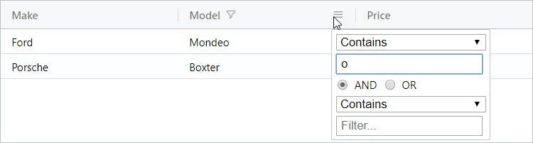
ag-Grid allows easy customization of the default filtering UI and logic to implement your custom use case.
Angular Grid Pagination
To enable pagination in our Angular grid, all you need to do is set the pagination property to true on the <ag-grid-angular> component:
<ag-grid-angular
style="width: 700px; height: 500px;"
class="ag-theme-balham"
[rowData]="rowData"
[columnDefs]="columnDefs"
[defaultColDef]="defaultColDef"
[pagination]="true"
>
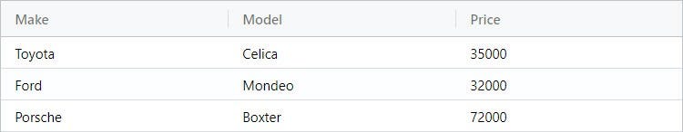
</ag-grid-angular>After adding the property, you should be able to move through the pages by using the controls at the bottom of the grid:
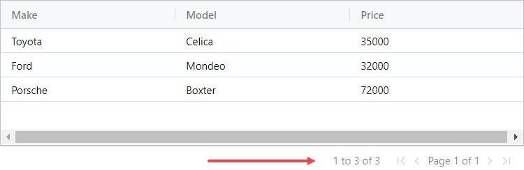
By default the grid uses a page size of 100 records, but it can easily be changed through configuration options.
Angular Grid Editable Cells
To make the Angular grid editable simply specify editable=true for a particular column definition in the configuration. All records in this column will become editable. For example, to enable inline editing of a car’s price, we need to make the following changes:
columnDefs = [
    {headerName: 'Make', field: 'make'},
    {headerName: 'Model', field: 'model'},
    {headerName: 'Price', field: 'price', editable: true}
];
And we are now able to edit the price:
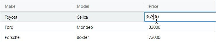
ag-Grid comes with a bunch of built-in cell editors but if required you can easily create your own to suit your business needs.
Video Tutorial for Getting Started with Angular Data Grid
Build Your Own Angular App With ag-Grid
My hope is that this “getting started” guide clearly showed you how easy it is to integrate and configure our Angular grid.
Now take the next step and start using ag-Grid in your project.
Learn about AG Grid Angular Support here, we have an Angular Quick Start Guide and all our examples have Angular versions.