
- Introduction
- Integration and Installation
- Define configuration
- Video Tutorial Getting Started
- Build Your Own JavaScript App With ag-Grid
The fastest and most feature-rich JavaScript datagrid component from ag-Grid
Introduction
A Data Grid is something you’ve probably encountered multiple times in user interfaces. It’s a component that displays data in the form of a table. Each item in the data is displayed as a row divided into columns for the item’s fields. Grids have been around for a long time, mostly on Desktops, but are no less common now in the web app UIs.
Today most companies and software engineers choose existing solutions, because of the complexity and high costs associated with custom implementations. It’s no wonder that a great deal of 3rd party JS data grids are available as free or paid versions. Choosing which one to use is often a challenge in itself. How do you do that?
After developers make sure that a grid meets the requirements for features and performance, than they look at how easy it will be to integrate and configure it. Also, if the widget comes with elaborate documentation that breaks down all features and gives examples than developers are inclined to use it in their applications.
ag-Grid is where you’ll find that all.
It is a fully-featured and highly customizable JavaScript data grid. It delivers outstanding performance, has no 3rd party dependencies and integrates smoothly with all major JavaScript frameworks. We’ve also worked hard on the documentation to make sure we’ve got every feature and customization option explained with examples.
This article features a JavaScript grid example and demonstrates you how easy it is to integrate and configure the ag-Grid. It’s a getting started guide designed to be completed in less than 5 minutes by copy/pasting. Once we’re done with the basic setup, we’ll take a look at a few features and configuration options that control them. Here’s a preview of what the demo will look like:
So let’s start!
Integration and Installation
During the last couple of years, we are witnessing a Cambrian Explosion of JavaScript project setup configurations. It seems like everyday someone comes up with a new, better way for JavaScript developers to build and distribute their apps. However, for the purposes of this setup, we are going to stick to simplest no-build, single HTML file setup which loads the ag-Grid scripts from CDN.
You can download the sample that we’ll be building in this article from this github repository. The code is in the integration-demo folder.
Let’s start from this basic html file:
<!DOCTYPE html>
<html>
    <head></head>
    <body>
        <h1>Hello from ag-grid!</h1>
    </body>
</html>
Add ag-Grid to Your Project
We are going to load the necessary scripts and styles from the unpkg CDN. Add the following to the headelement:
<script src="https://unpkg.com/ag-grid-community/dist/ag-grid-community.min.noStyle.js"></script>
<link rel="stylesheet" href="https://unpkg.com/ag-grid-community/dist/styles/ag-grid.css">
<link rel="stylesheet" href="https://unpkg.com/ag-grid-community/dist/styles/ag-theme-balham.css">
The lines above import the agGrid component, the ag-grid.css stylesheet that defines the structure of the grid, and one of the available grid themes ag-theme-balham.css.
Add ag-Grid placeholder to HTML
Our JavaScript grid should always be rendered in a wrapping HTML element. This element acts as a container that defines the grid dimensions and specifies the grid's theme. So let’s add the wrapping DIV element to the HTML markup.
<div id="myGrid" style="height: 500px; width:500px;" class="ag-theme-balham"></div>
As you can see it restricts the height and width of the grid and defines the class ag-theme-balham that matches the name of CSS file we imported earlier.
Define configuration
To instantiate the grid, you need to define two required configuration properties — the column definitions that determines the grid structure and the data. So let’s add these properties to the script tag:
<script type="text/javascript" charset="utf-8">
    const columnDefs = [
        {headerName: 'Make', field: 'make'},
        {headerName: 'Model', field: 'model'},
        {headerName: 'Price', field: 'price'}
    ];
    const rowData = [
        {make: 'Toyota', model: 'Celica', price: 35000},
        {make: 'Ford', model: 'Mondeo', price: 32000},
        {make: 'Porsche', model: 'Boxter', price: 72000}
    ];
    const gridOptions = {
        columnDefs: columnDefs,
        rowData: rowData
    };
</script>
In our case, the column definitions contain three columns; each column entry specifies the header label and the data field to be displayed in the body of the table. The actual data is defined in the rowData as an array of objects. Notice that the fields of the objects match the field values in the columnDefs configuration object.
We’re now ready to instantiate the grid:
<script type="text/javascript" charset="utf-8">
    ...
    const gridOptions = {
        columnDefs: columnDefs,
        rowData: rowData
    };
    const eGridDiv = document.querySelector('#myGrid');
    new agGrid.Grid(eGridDiv, gridOptions);
</script>
So here is a complete index.html for you to copy and paste into your local project:
<!DOCTYPE html>
<html>
<head>
<script src="https://unpkg.com/ag-grid-community/dist/ag-grid-community.min.noStyle.js"></script>
<link rel="stylesheet" href="https://unpkg.com/ag-grid-community/dist/styles/ag-grid.css">
<link rel="stylesheet" href="https://unpkg.com/ag-grid-community/dist/styles/ag-theme-balham.css"
</head>
<body>
<h1>Hello from ag-grid!</h1>
<div id="myGrid" style="height: 500px; width:500px;" class="ag-theme-balham"></div>
<script type="text/javascript" charset="utf-8">
const columnDefs = [
{headerName: 'Make', field: 'make'},
{headerName: 'Model', field: 'model'},
{headerName: 'Price', field: 'price', editable: true}
];
const rowData = [
{make: 'Toyota', model: 'Celica', price: 35000},
{make: 'Ford', model: 'Mondeo', price: 32000},
{make: 'Porsche', model: 'Boxter', price: 72000}
];
const gridOptions = {
columnDefs: columnDefs,
rowData: rowData
};
const eGridDiv = document.querySelector('#myGrid');
new agGrid.Grid(eGridDiv, gridOptions);
</script>
</body>
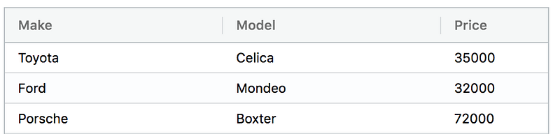
</html>If you now run the example you should see the data shown:
And that’s it! You’ve just integrated our grid component into your application. Let’s now see how easy it is to configure features in the grid.
Set data dynamically
In the real world, most of the time, we are dealing with data that resides on a remote server. So we need to request the data and feed it to the grid. Implementing this is quite easy.
To update data dynamically in the grid we need to use its API. When you create an instance of the grid, you define the options as the object and pass it as a parameter:
const gridOptions = { ... };new agGrid.Grid(eGridDiv, gridOptions);agGrid then mutates the options object and adds the api property that exposes a plethora of methods that allow us to implement complex scenarios with the grid.
To update data dynamically, we need to call the setRowData method.
gridOptions.api.setRowData(data);So here’s an alternative setup:
<script type="text/javascript" charset="utf-8">
    const columnDefs = [
        {headerName: 'Make', field: 'make'},
        {headerName: 'Model', field: 'model'},
        {headerName: 'Price', field: 'price'}
    ];
    const gridOptions = {
        columnDefs: columnDefs,
        enableSorting: true,
        enableFilter: true
    };
    const eGridDiv = document.querySelector('#myGrid');
    new agGrid.Grid(eGridDiv, gridOptions);
    fetch('https://www.ag-grid.com/example-assets/row-data.json').then(function (response) {
        return response.json();
    }).then(function (data) {
        gridOptions.api.setRowData(data);
    })
</script>
Here, we replaced the rowData assignment with a data fetched from a remote service.
Enabling features
Sorting, Filtering and Pagination are among the most commonly used features of the modern grids. Our application doesn’t have too many rows, so finding data is fairly easy. But it’s not difficult to imagine how a real-world application may have hundreds (or even hundreds of thousands!) of rows, with many columns. In a data set of that size these features help you zoom in on a particular set of records.
Our JavaScript datagrid also provides rich inline editing experience so your users can update any record in a dataset with just a few clicks. Let’s see how we can enable these features.
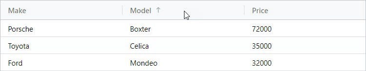
JavaScript Grid Sorting
Enabling sorting in ag-Grid is actually quite simple — all you need to do is set enableSorting to true in the gridOptions:
const gridOptions = {
columnDefs: columnDefs,
rowData: rowData,
enableSorting: true
};
Once the property is added, you should be able to sort the grid by clicking on the column headers. Each clicks toggles through ascending, descending and no-sort states.
JavaScript Grid Filtering
As with sorting, enabling filtering is as easy as setting the enableFilter property to true:
const gridOptions = {
columnDefs: columnDefs,
rowData: rowData,
enableSorting: true,
enableFilter: true
};
With this property set, the grid will display a small column menu icon when you hover over the header. Pressing it will show a popup with the UI for filtering which lets you choose the kind of filter and the text that you want to filter by.
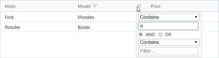
ag-Grid allows easy customization of the default filtering UI and logic to implement your custom use case.
JavaScript Grid Pagination
To enable pagination in our JavaScript datagrid, all you need to do is set the pagination property to true in the gridOptions:
const gridOptions = {
columnDefs: columnDefs,
rowData: rowData,
enableSorting: true,
enableFilter: true,
pagination: true
};
After adding the property, you should be able to move through the pages by using the controls at the bottom of the grid:
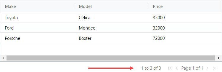
By default the grid uses a page size of 100 records, but it can easily be changed through configuration options.
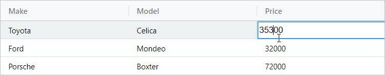
JavaScript Grid Editable Cells
To make the grid editable simply set the editable property to true for a particular column definition in the configuration. All records in this column will become editable. For example, to enable inline editing of a car’s price, we need to make the following changes:
const columnDefs = [
{headerName: 'Make', field: 'make'},
{headerName: 'Model', field: 'model'},
{headerName: 'Price', field: 'price', editable: true}
];
And we are now able to edit the price:
ag-Grid comes with a bunch of built-in cell editors but if required you can easily create your own to suit your business needs.
Play With It Here
Video Tutorial Getting Started with JavaScript and AG Grid
Build Your Own JavaScript App With ag-Grid
My hope is that this “getting started” guide clearly showed you how easy it is to integrate and configure our JavaScript datagrid.
See also this JavaScript Getting Started Guide in the documentation.
You can download the sample that we’ll be building in this article from this github repository. The code is in the integration-demo folder.
Learn more about AG Grid — a high performance JavaScript Data Grid. We write the code to visualise data in interactive tables so you can concentrate on writing the application code. We support multiple frameworks: Angular, Vue, React so you can pick the best framework for your needs.