
Introduction
Last month saw the initial release of our AG Grid Figma Design System, created to help Product Designers prototype and customise AG Grid applications within Figma. If you haven't heard about this yet, check out our introductory blog post.
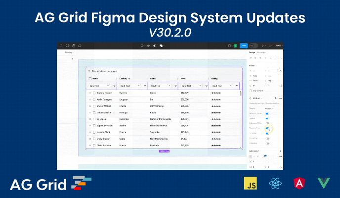
Our latest release, v30.2.0, builds on our initial offering with a number of new features, as well as content created specifically to help get you up and running with our design system. Read on to find out more, or jump straight in and download our latest release:
Tutorial Content
Every product needs documentation and supporting content to guide its users. Our Figma Design System is no different which is why we have been hard at work creating a series of tutorials designed to help you get the most out of our latest release:
Full playlist available on YouTube.
We've also handily included links to specific videos throughout our documentation (included within the .fig download) where appropriate, so you can access the information you need as seamlessly as possible.
New Features
Of course, we haven't just been working on content, but we've delivered a number of new features, too:
- Advanced Filter support
- Added tree list UI pattern
- Full colour reference for Variables
- Various bug fixes
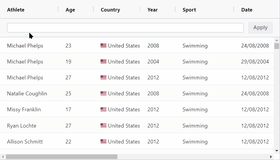
Advanced Filter Support
AG Grid's Advanced Filter allows users to easily filter that data within the grid using a typeahead input:
This addition into the Figma Design System allows you to easily toggle off our Floating Filters and replace these with the Advanced Filter, like so:
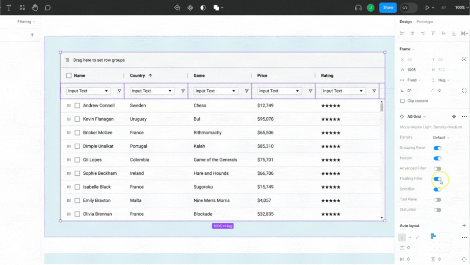
We've also added this as a standalone component, so you can easily use the advanced filter input wherever you like within your application, not just within our grid.
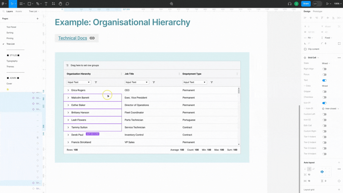
Tree List UI Pattern
The Tree List UI Pattern allows users to group values within a filter in a tree-list structure. We currently support up to four levels of indentation, as well as support for toggling/switching chevron icons from their open/close state, as appropriate:
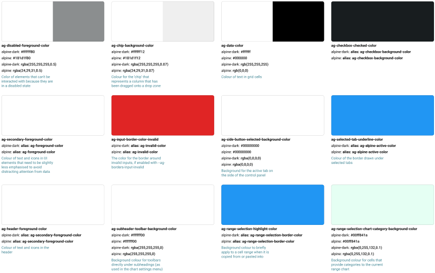
Full Colour Reference for Variables
Our Figma Design System supports the new Local Variables feature within Figma, which is a convenient and easy way to customize and build your own themes by swapping out various colours and having these apply globaly to our various components. To make this even simpler, we have included a full reference for all of our colour variables:
If you want to learn more about how to use Local Variables within our Design System, checkout our full tutorial.
Conclusion
For a full list of our changes & updates, you can check-out the release notes section of our latest Design System release, available via our Figma community page.
If you have any feedback for us, or you'd like to report a bug, please submit these via GitHub issues or, if you're an enterprise customer, you can submit a ZenDesk ticket instead.