

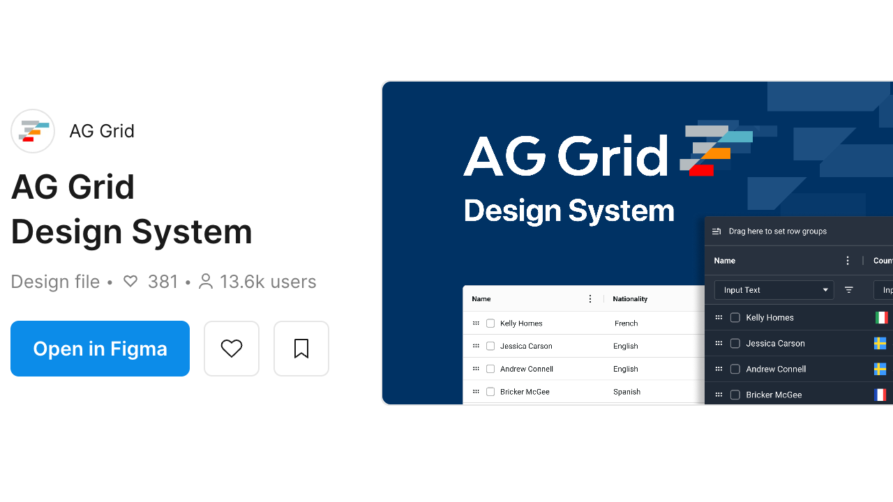
The latest release of our Figma Design System aims to simplify and automate the hand-off between designers and developers when creating custom themes by bringing all of our Figma variables in line with our Theming API parameters.
This change means every variable within the design system now maps 1:1 to our Theming API parameters, so that when a designer changes any variable in Figma, developers know exactly which theme parameter to modify in their code - eliminating any confusion between design and development teams.
We've also updated our 'Tokens to AG Grid Theme' example to demonstrate how you can export these variables from Figma and automatically convert them into production-ready AG Grid themes.
The rest of this post will walk you through how to create a custom theme in Figma and automatically transform it into a production-ready theme for your AG Grid applications.
Get the Latest Design System File
Head over to our Figma Community page to open the latest version of our design system within Figma.
For comprehensive theming guidance, check out our Customising the Design System documentation and Theme Parameters reference.
Creating Your Custom Theme in Figma
Every colour, spacing value, and visual parameter you see in the design system is now controlled by Figma variables that directly correspond to AG Grid's theme parameters.
The variables for each theme are controlled within the AG Themes collection, and the values for those variables in light and dark modes are controlled within the AG Modes collection. You can learn more about variables, collections and modes in the Figma Design Systems documentation.
Create a Custom Theme
To create a new theme, open the Figma variables panel and use the collections drop-down in the top-left of the panel to select the AG-Theme collection.
By default, this collection includes our Quartz and Alpine themes. You'll notice each theme has a long list of variable names, which map exactly to our Theming API parameters; any changes to these variables has the same effect across Figma, Code and the Theme Builder.
Duplicate whichever theme you want to use as your starting point, and give it an appropriate name, e.g. my-theme.
Handling Light & Dark Modes
Next, navigate to the AG-Mode collection. This collection contains groups for the Quartz and Alpine themes; each group contains the values for variables in both light and dark modes.
Create a new group by duplicating the existing group of the theme you want to use as your starting point and renaming it to match your custom theme name, e.g. my-theme.
Modifying Variables
Next, update the variable you want to customise in your theme in the AG-Theme collection and point it to the corresponding variable in your custom group in the AG-Mode collection.
Finally, navigate to your custom group in the AG-Mode collection, locate the variable you want to customise, and modify the values of the variables in light and/or dark modes to customise your theme.
Using your Custom Theme within Figma
By default, the grid in Figma uses the Quartz theme. To preview your changes using grids within Figma, navigate to the Appearance group in the sidebar, open the Apply Variable Mode drop-down, and select your theme.
Once you've applied your theme, you should see your changes reflected in the grid examples.
Additional Resources
- Create your own theme - YouTube tutorial explaining the complete process.
- Figma Theming Playground - Hands-on exploration of theming features.
- Theming with Figma Variables - Deep dive into variable-based theming.
- Customising the Design System - Detailed docs on using the Design System.
Exporting Your Theme: From Figma to JSON
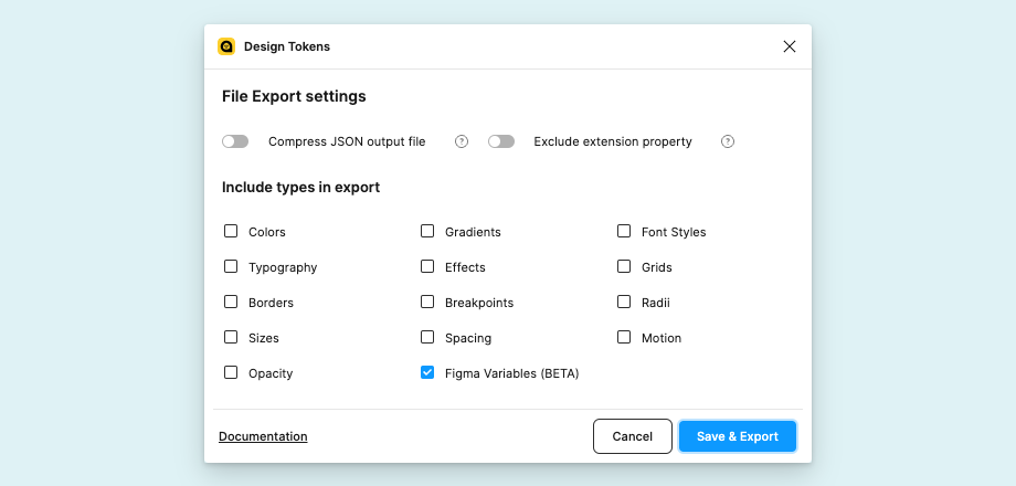
Once you've created your theme in Figma, you need to use the Design Tokens plugin to export your Figma variables as structured JSON.
While there are multiple ways to extract data from Figma, our transformation tools are specifically optimised for this plugin's output format. The exported JSON contains all your variable definitions in a structure that maps directly to AG Grid's theming system.
Assuming you have already installed the Design Tokens plugin, to export your theme as JSON you need to:
- Navigate to the Plugins tab in the Resources panel.
- Search for the Design Tokens Figma plugin.
- In the Design Tokens plugin settings, enable the options "Add mode to design token name (if 2 or more modes)" and "Add mode to design token value".
- Click Run for the Design Tokens and select the 'Export Design Tokens File' option.
- Deselect all ‘include types...’ except for "Figma Variables"
- Click the 'Save & Export' button and save the JSON file.
For complete instructions on the export process, see our Generating AG Grid Themes From Figma Variables documentation section.
Transforming JSON into Production Themes
We've created an example project that demonstrates how to automatically convert the JSON exported from the Design Systems plugin into an AG Grid theme. This example uses Style Dictionary, the industry standard for design token transformation, to convert the tokens in the JSON into an AG Grid compatible theme object.
After cloning the repository, the script can be executed with the following command:
node tokens-to-ag-grid-theme.js --tokens ./tokens/custom-tokens.json --theme my-theme --mode lightThe script accepts the following command-line args:
--tokens: Path to the design tokens JSON file (default:./tokens/example-tokens-14-07-25.json)--theme: The theme name to extract from the tokens (default:quartz)--mode: The colour mode to use (default:light)
Once complete, the script generates JavaScript files in the /themes/ directory. Each file exports a theme object that can be directly used with the AG Grid Theming API. The output will look something like:
export const myExportedDarkTheme = {
  accentColor: "#2196f3ff",
  backgroundColor: "#ffffffff",
  borderColor: "#181d1f26",
  // ... more theme parameters
};
At this point, all that's left to do is add the generated theme to your application.
The Style Dictionary foundation makes it straightforward to modify the transformation logic for your team's specific needs.
Using your Custom Theme in AG Grid
To use the generated themes in your AG Grid application, refer to the AG Grid Theming API documentation.
A basic implementation may look something like this:
// Exported Theme Properties
export const myExportedDarkTheme = {
  //...
};

// Create new theme
const myTheme = themeQuartz.withParams(myExportedDarkTheme);

// Apply theme to Grid
const gridOptions = {
  theme: myTheme,
  //...
};
The Complete Workflow in Action
To summarise, the end-to-end process of creating a theme with our Figma Design System looks like this:
- Design in Figma: Use Figma variables to create your custom theme, seeing changes reflected instantly across all components.
- Export to JSON: Use the Design Tokens plugin to generate JSON, knowing the structure matches our theming API.
- Transform automatically: Run the example project to convert Figma variables into AG Grid theme parameters.
- Deploy immediately: Apply your generated theme in your application using our Theming API.
Getting Started Today
Ready to get started? Download our updated design system from the Figma Community page and start exploring how Figma variables can transform your team's approach to custom theming.
We're continually improving and refining our design system, and we're always keen to hear your feedback. If you're an enterprise customer and have any questions or issues, please raise a ticket in Zendesk. Alternatively, you can raise an issue on our GitHub repo, or leave a comment on our design system community page.
Happy theming!