This post contributed to the AG Grid blog by Tharaka Hewavitharana
In the past few years, React has dominated in the world of frontend libraries, introducing a new method of thinking about UI components by breaking them down into small elements. However, developing and maintaining these small elements/components becomes complicated over time due to their increasing complexity.
Storybook is an open-source tool for building UI components and pages in isolation. It allows teams to design, build, and organize these small elements more efficiently by minimizing the gap between design and code. Additionally, Storybook lets you visualize your components and makes it easy to share and reuse them. Here are a few of its specific benefits:
- The ability to build a component in isolation means that you can test and observe how it behaves under different resolutions and properties.
- The isolated environment, where you build your components on a separate development server, also means that you don’t have to worry about the dependencies and configuration of your project.
- Storybook allows you to create and maintain documentation for your components—that is, each story acts as documentation on how that component behaves under different conditions. When you write a story for a component, Storybook will go through the component’s source code, types, and JSDoc comments to generate well-organized documentation. You can then embed that information in a workspace like Confluence or Notion using a tool like Chromatic, which makes it easy to access all your documentation in one place.
Developing and managing data tables is one of the most challenging tasks in almost all UI frameworks and libraries. Enter AG Grid, a library that allows developers to plug a rich data-grid experience into their applications. It’s said to be the best JavaScript grid in the world due to its rich and framework-agnostic features that require no dependencies. AG Grid is a particularly helpful tool for the following reasons:
- It allows you to develop complex data tables with filtering, cell editing, and custom cell-rendering features to help you visually display different kinds of data.
- It allows you to lazy load data into your data tables, reducing the total amount of data that loads to your application. As you can imagine, this feature can have a massive impact on data loading time.
- It supports live streaming of data, allowing you to display values that change from time to time quickly, without worrying about lifecycle methods.
Considering all of these use cases, it’s easy to see how developing AG Grid data tables with Storybook will provide a good developer experience. In this article, you’ll learn how to create AG Grid components by installing, configuring, and writing stories using Storybook.
More on Storybook
Again, the beauty of Storybook is that it provides an isolated or separate environment where you can develop and play around with your components, meaning that you don’t need to do any configurations or even start your frontend/react development server. This feature allows frontend developers to build and showcase their components with documentation with greater ease and speed.
A Storybook consists of stories for different components that describe your component’s various states. A story can be considered as the atomic unit or the smallest component. You can write a story for a component with different parameters or props and see how your component behaves.
Storybook has introduced a new concept called pages, which lets you write stories to a page that consists of several components with their own stories. Writing stories for a page is tricky as it requires different data and states/properties to render a page. However, Storybook allows you to define default args (values/states/properties) so you can see how your page behaves in different instances, such as when there is no data, missing data, responsive breakpoints, etc.
Storybook also has a cool feature that allows you to mimic user events like clicking a button, selecting options, or ticking checkboxes through play functions that enable you to simulate scenarios requiring user interaction through a set of player controls.
Integrating Storybook.js with AG Grid
Now let’s explore some step-by-step instructions for how you can build the AG Grid component via Storybook. If you’d like to follow along in your own editor, you can find the GitHub repo here.
Prerequisites
Before starting the project, make sure you have the latest version of Node.js 14 or above. This demo project will use npm as the package manager, but you can use Yarn if you prefer. You can also use any IDE or code editor of your choice.
Creating the Storybook App
First, this tutorial will make use of a React project to create components. Start by creating one yourself using create-react-app—the easiest way to start a React project. Execute the following command in your terminal to do so:
npx create-react-app react-storybook-ag-grid --template typescript
This code will generate a React project with TypeScript called react-storybook-ag-grid.
Next, initiate a Storybook app by executing the following command inside the root of your React project.
npx sb init
This code will go through the project files and identify the project type (whether it’s a React, Vue, or Svelte project). It also generates a few directories—.storybook/ (in the project root) and stories (under the src/ directory)—to hold your Storybook instance’s configurations and stories. Finally, it adds a couple of new scripts to your package.json file.
These two scripts, which are responsible for starting and building the Storybook app, are added automatically by the npx sb init command:
"scripts": {
	"storybook": "start-storybook -p 6006 -s public",
	"build-storybook": "build-storybook -s public"
}
Finally, you can start the Storybook app using the following command:
npm run storybook
Your Storybook application should open in a new tab on your browser:
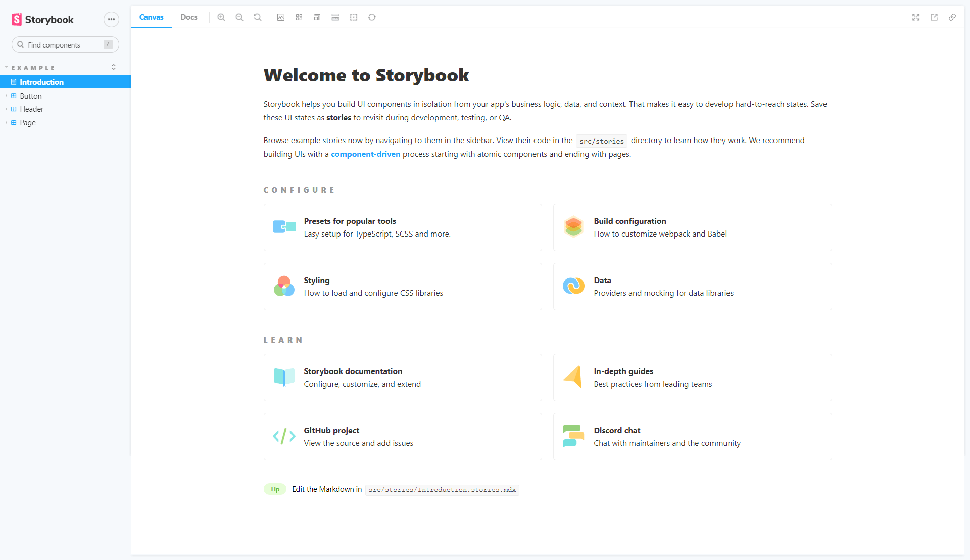
Notice that this is a separate application that by default runs on http://localhost:6006.
As pictured, Storybook generates several components (Button, Header, Page) and Stories under the src/stories/ directory. You can create new stories and components under this directory or create your own directory structure. These stories are also available in the left-side panel in the Storybook application.
Next, install AG Grid to your React project. For this demo application, you can use the community version of AG Grid, which is free and open source. Install it using the following command:
npm install ag-grid-react ag-grid-community
Now it’s time to create the first AG Grid component. First, change the directory structure by deleting the stories/ directory under src/ and creating a new directory called components/, which can store components, styles, and stories for the React application. This directory change will improve the project structure as you will have separate directories/modules for each component.
You will have to change the Storybook settings to reflect this directory change. Edit the main.js file under the .storybook directory in the project root to allow Storybook to identify the location of your components and stories:
module.exports = {
	"stories": [
	"../src/**/**/*.stories.mdx",
	"../src/**/**/*.stories.@(js|jsx|ts|tsx)"
	],
	//rest of the configurations
}
Next, create a React component called Table.tsx inside a directory called Table under the components directory. Add the following code inside Table.tsx:
import React, { useState } from "react";
import { AgGridReact } from "ag-grid-react";
import "ag-grid-community/dist/styles/ag-grid.css";
import "ag-grid-community/dist/styles/ag-theme-alpine.css";

const Table = (props:any) => {

	const [rowData] = useState([
		{ make: "Toyota", model: "Celica", price: 35000, type:"sedan" },
		{ make: "Nissan", model: "KDH", price: 32000, type:"van" },
		{ make: "KIA", model: "Sorento", price: 72000, type:"jeep" },
	]);

	const [columnDefs] = useState([
		{ field: "make" },
		{ field: "model" },
		{ field: "price" },
	]);

	return (
		<div className="ag-theme-alpine" style={{ height: 400, width: 850 }}>
			<AgGridReact rowData={rowData} columnDefs={columnDefs}></AgGridReact>
		</div>
	);
};

export default Table;
Now that you have your first AG Grid table component, you can start to write your first story. Name it Table.stories.tsx and add the following code:
import React from "react";
import { ComponentStory, ComponentMeta } from "@storybook/react";
import Table from "./Table";
export default {
title: "Ag-Grid/Table",
component: Table,
argTypes: {},
} as ComponentMeta<typeof Table>;
const Template: ComponentStory<typeof Table> = (args) => <Table {...args} />;
export const Primary = Template.bind({});
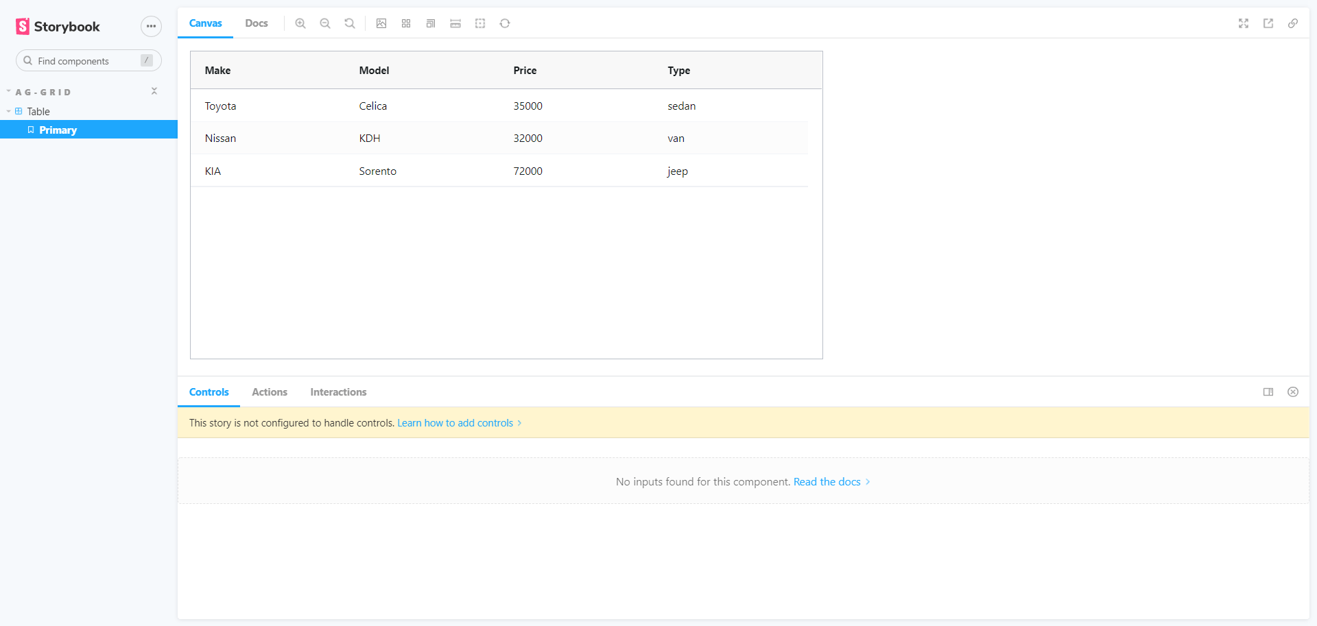
Primary.args = {};
In your Storybook app, you will notice that there will be a new entry in the left-side panel called Table. When you click on it, it will display the AG Grid component that you have built:
There may be instances in which Storybook does not reflect changes or crashes upon saving them. You can try refreshing the Storybook page or restarting Storybook to overcome this.
Now let’s explore how to build some additional features for AG Grid and preview them via Storybook.
First, you should define which props your component will accept. These types will serve as the basis of some of Storybook’s customization functionality. Since you’re working with a React TypeScript project, define your prop types in a file called Table.types.ts, which will hold the type definitions for the table component’s props:
// You can import this type from the ag-grid library, and use it to extract the type for columnDefs
import { AgGridReactProps } from 'ag-grid-react'

// This is the shape of the data your table is expecting
export type row = {
  make: string
  model: string
  price: number
  type?: string
}

// This type will be used by storybook to define which controls are available
export interface TableType {
  isDark?: boolean
  pagination?: boolean
  perPage?: number
  rowData?: Array<row>
  columnDefs?: AgGridReactProps['columnDefs']
  filter?: boolean
  sortable?: boolean
  resizable?: boolean
}
With these types defined, you can now update your Table component to use them. In particular, you have defined a prop called isDark in the code above. This prop can be used to determine which theme the table will apply, as AG Grid comes with a few different themes out of the box. In addition to this, there are now props for the rowData and columnDefs values. Providing this data from props, rather than directly in the component itself, means that each usage of your table—each story in this case—can have different data and configurations. Update the content of Table.tsx to be as follows. Note the key changes, as indicated by the code comments:
import React from "react";
import { AgGridReact } from "ag-grid-react";
import "ag-grid-community/dist/styles/ag-grid.css";
import 'ag-grid-community/dist/styles/ag-theme-alpine.css';

// import the different themes from ag-grid
import "ag-grid-community/dist/styles/ag-theme-dark.css";
import "ag-grid-community/dist/styles/ag-theme-balham.css";

// import the types you defined for this component
import { TableType } from "./Table.types";

// assign variables for each of the props defined in your types
const Table = ({ isDark, rowData, pagination = false, perPage = 10, columnDefs, sortable = false, filter = false, resizable = false }: TableType) => {

	// This will generate a string that changes each time one of the pagination props changes
	const key = React.useMemo(() => {
    	const prefix = pagination ? 'paginated' : 'not-paginated';
    	return `${prefix}:${perPage}`;
	}, [pagination, perPage]);

	// This will use some of your props to create a default column definition for all columns
	const defaultColDef = React.useMemo(() => {
    	return {
        	editable: true,
        	sortable: sortable,
        	flex: 1,
        	minWidth: 100,
        	filter: filter,
        	resizable: resizable,
    	};
	}, [sortable, filter, resizable]);

	return (
    	<div
        	// the theme can be dynamically assigned based on the `isDark` prop
        	className={`ag-grid-default-table ${isDark ? "ag-theme-dark" : "ag-theme-balham"}`}
        	style={{ height: 400, width: 850 }}>
        	<AgGridReact
            	// the variables can be passed in here, moving the data and configuration out of this component
            	key={key} // using this value as the key forces the table to re-render when the pagination props change
            	rowData={rowData}
            	columnDefs={columnDefs}
            	pagination={pagination}
            	paginationPageSize={perPage}
            	defaultColDef={defaultColDef}
        	/>
    	</div>
	);

};

export default Table;
You may have noticed the key prop here and wondered whether it is neccesary. The AgGridReact component treats some props as “fixed” after it renders, and changing them after the initial render will seemingly have no effect. This is the case for the pagination and paginationPageSize props. To allow these to be changed in Storybook on the fly, you can use the combination of these props to compute a value for the key prop. When this value changes, React will force the component to re-render, allowing you to see how this prop affects the component in Storybook. An alternative approach that would avoid the use of the key prop could involve having discrete stories to specifically show how the component works with or without pagination. However, for the purposes of this tutorial, the key prop is sufficient.
Next, modify the story to reflect these changes. You can define an object containing default values for each arg, and then use the spread operator to apply these defaults to your story’s args. You can then override each individual arg as needed until you have data representing the desired state for your story. After these changes, your Table.stories.tsx file should look like this:
import React from "react";
import { ComponentStory, ComponentMeta } from "@storybook/react";
import Table from "./Table";
import { TableType } from "./Table.types";

// define defaults that can be used as a base for each story
const defaultArgs: TableType = {
	isDark: false,
	pagination: true,
	perPage: 10,
	rowData: [],
	columnDefs: [],
	filter: false,
	resizable: false,
	sortable: false,
};

export default {
	title: "Ag-Grid/Table",
	component: Table,
	argTypes: {},
} as ComponentMeta<typeof Table>;

const Template: ComponentStory<typeof Table> = (args) => <Table {...args} />;

// in this story, show the table with some data
export const Primary = Template.bind({});

// in the args of each story, you can then override any defaults to suit this particular story
Primary.args = {
	...defaultArgs,
	isDark: false,
	rowData: [
    	{ make: "Toyota", model: "Celica", price: 35000, type: "sedan" },
    	{ make: "Nissan", model: "KDH", price: 32000, type: "van" },
    	{ make: "KIA", model: "Sorento", price: 72000, type: "jeep" }
	],
	columnDefs: [
    	{ field: "make", },
    	{ field: "model" },
    	{ field: "price" },
    	{ field: "type" }
	],
	sortable: true,
	resizable: true,
	filter: true,
};

// another story, showing the table’s empty state
export const NoData = Template.bind({});
NoData.args = {
	...defaultArgs
};

// This function will generate lots of data, so that you can see how the table behaves when populated with many rows
function getData() {
	let data = [];
	for (let x = 0; x < 150; x++) {
    	data.push(
        	{
            	make: ["Toyota", "Nissan", "Kia"][Math.floor(Math.random() * 3)],
            	model: ["Celica", "KDH", "Sorento"][Math.floor(Math.random() * 3)],
            	price: Math.floor(Math.random() * 100000) + 25000,
            	type: ["sedan", "van", "jeep"][Math.floor(Math.random() * 3)]
        	});
	}
	return data;
};

export const LotsOfData = Template.bind({});
LotsOfData.args = {
	...defaultArgs,
	columnDefs: [
    	{ field: "make", },
    	{ field: "model" },
    	{ field: "price" },
    	{ field: "type" }
	],
	rowData: getData()
}
In the code above, you can see that templates have been created for the components and that data has been passed down through the args field in each template. There are currently three stories. The Primary story represents a “normal” usage of the component, while the NoData and LotsOfData stories each represent different scenarios that the component can accomodate: an empty table and a table with 150 rows of data, respectively.
Adding Custom Cell Renders and Cell Styles
Next, you can add some additional cool features like cell styles and custom cell renders, which allow you to change the look and feel of your table.
Because the columnDefs value (which is where custom rendering is defined) is passed to the table a a prop, you can define a new story to demonstrate custom rendering without affecting the existing stories. This story will be slightly more complex than the previous ones.
First, you will need to add some import statements at the start of Table.stories.tsx to import some image assets to use for custom rendering. The actual assets for these can be downloaded from the public GitHub repo, or you can provide your own if you wish. Add these images to an assets/ directory within your src/ directory, and then add the following import statements near the top of Table.stories.tsx, beneath the existing import statements:
// image assets
import Car from "../../assets/sedan.png";
import Jeep from "../../assets/jeep.png";
import Van from "../../assets/van.png";
Next, add the following snippet of code to the end of your Table.stories.tsx file, after all of your other code:
// this function will determine the cell’s styling, based on the value
const carPrice = (value: number) => {
    return { color: value > 50000 ? "#FF5733" : "#00E676" };
};

// this function will tell the cell to render as an image corresponding to the value of the cell
const carType = (value: string) => {
    return <img
        alt=""
        src={value === "sedan" ? Car : value === "jeep" ? Jeep : Van}
        style={{ width: "24px", height: "24px" }}
    />;
};

export const CustomCellRender = Template.bind({});
CustomCellRender.args = {
    ...defaultArgs,
    isDark: false,
    rowData: [
        { make: "Toyota", model: "Celica", price: 35000, type: "sedan" },
        { make: "Nissan", model: "KDH", price: 32000, type: "van" },
        { make: "KIA", model: "Sorento", price: 72000, type: "jeep" }
    ],
    // In the columnDefs, you can provide the above functions to enable custom styling and rendering based on the value of the cells
    columnDefs: [
        { field: "make" },
        { field: "model" },
        { field: "price",
          cellStyle: (params: any) => {
            return carPrice(params.value);
          },
        },
        { field: "type",
          cellRenderer: (params: any) => {
            return carType(params.value);
          },
        }]

};
Your Storybook application should now look like this:
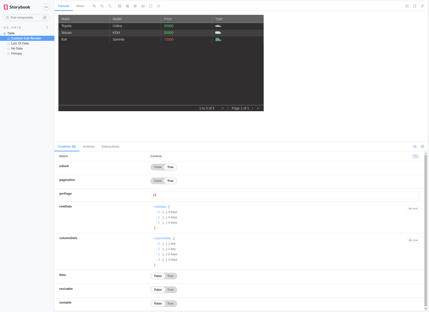
As you can see, a set of controls will be available according to the props you have defined in your component, including a toggle/switch for the isDark prop, which can be set to true or false. You can play around with the controls and even create custom ones.
In a real-world application, you will have several pages with small components similar to this AG Grid table.
Building a Storybook Page
Now let’s take a look at how to use Storybook’s pages concept, which allows you to write stories for pages with multiple components/stories. Create your first page under a new directory called /Pages under the src/ directory. Inside it, create another directory called Home/.
Inside this directory, create two files—Home.tsx and Home.stories.tsx— which will hold the page component and the story for the page. Then add the following code inside the Home.tsx file:
import React from "react";
import { row } from "../../components/Table/Table.types";
import Table from "../../components/Table/Table";

const Home = ({ rowData, title, columnDefs }: { rowData: Array<row>; title: string; footer: string; columnDefs: any }) => {
	return (<div>
    	<h1>{title}</h1>
    	<Table rowData={rowData} columnDefs={columnDefs} />
	</div>);
};

export default Home;
Finally, it’s time to write a story to the page. You can see that this page consists of a component that already has its own story under Table.stories.tsx. You can reuse this story to write pages; all you need to do is to import the story and use it inside your page. Add the following code inside the Home.stories.tsx file:
import React from "react";
import { ComponentStory, ComponentMeta } from "@storybook/react";
import Home from "./Home";
import * as Table from "../../components/Table/Table.stories";
export default {
title: "Ag-Grid/Home",
component: Home,
} as ComponentMeta<typeof Home>;
const Template: ComponentStory<typeof Home> = (args) => <Home {...args} />;
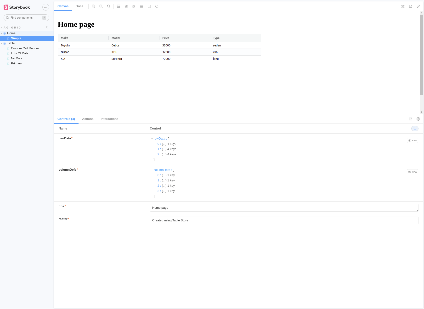
export const Simple = Template.bind({});
Simple.args = {
rowData: Table.Primary.args?.rowData,
columnDefs: Table.Primary.args?.columnDefs,
title: "Home page",
footer: "Created using Table Story",
};
The code above imports the Table.stories.tsx file and uses it to write the story for the page. The data given in the table story has been passed down to the Home.stories.tsx page through the template arguments. You should now see something like this:
Using these methods, you can write stories to pages and mock data, and see how your components behave under different conditions. You can find the source code for this tutorial in this GitHub repo.
Conclusion
In this article, you learned how to configure Storybook to build components and pages in isolation with AG Grid.
AG Grid is undoubtedly one of the best data-grid systems currently available. It’s framework agnostic and highly performant and can easily be added to any React application. Furthermore, it can handle large amounts of data, live streaming data updates, and integrated charting.
Check out the free AG Grid Community today, or explore our docs to learn more.