
The AG Grid React Examples repo has a simulated trading dashboard with a Historical Data Chart. In this post I will create a drop in replacement for the existing chart panel, to use the Free AG Grid Standalone Charting Library.
- Existing Implementation Explained
- Running the example
- Adding Standalone Charts To Project
- Creating a Standalone Charts Component
- Final Component
- Free React Charts Component
Existing Implementation Explained
The existing implementation can be found in the src-trader-dashboard example:
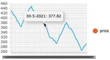
The trader example looks pretty good.
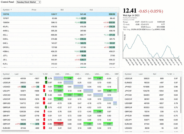
- It has a background web worker simulating the realtime updating of prices
- The prices in the grid update without user interaction and the grids still support sorting of data.
- The historical data graph does not update in real time, but changes when a new stock symbol is selected.
- AG Grid automatically adds scroll bars for the data so we can create tables of fixed size to easily create a layout for a dashboard and not worry about data interfering with the layout.
Source Explained
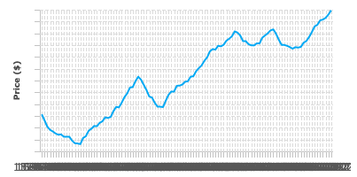
The Historical Graph component is the StockHistoricalChartPanel.jsx in the components folder.
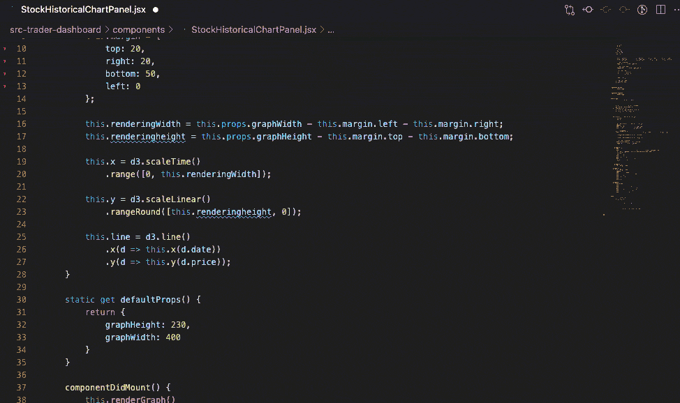
The Historical Chart Panel is a Class based React component using the lifecycle model:
- constructor to setup basic details
componentDidMountcomponentDidUpdaterenderwhich outputs thedivhtml
The heart of the class is the renderGraph method which renders the svg in the output div using D3.
The graph only updates when a property historicalData is changed.
historicalData is an array filled with objects:
- String representing a historical price's date (DD-MM-YYYY)
- Numeric value for the price
[{
    "date": "14-4-2021",
    "price": 231.0734864599267
}]
Since I am going to write a drop in replacement and not make any changes to the application beyond importing a different component, I will code to these constraints.
Running the example
After I download the code for the example repo.
In the root folder I can run:
npm installnpm run trader
Then the application will run.
Adding Standalone Charts To Project
To use Standalone Charts I will first install them using npm:
npm install --save ag-charts-community ag-charts-react
This will install standalone charts which are free and are a community edition, I also install the React components because this is a React project.
ag-charts-communityfree standalone chartsag-charts-reactReact components
Full getting started documentation is available on our web site.
Creating a Standalone Charts Component
Since the component only updates via props I am going to create a very simple component using functions.
I will need to export this function as default for drop in backwards compatiblity with the existing component:
export default class extends Component {
I will create HistoricalDataLineChart.jsx in the component folder.
With the basic boilerplate:
import React from "react";

import * as agCharts from 'ag-charts-community';
import { AgChartsReact } from 'ag-charts-react';

export default function HistoricalDateLineChart(props) {

    let options =  {};
    return <AgChartsReact options={options} />
}
And the one change that I'm going to make to the application is in the StockDetailPanel.jsx to import my new control:
import StockHistoricalChartPanel from "./HistoricalDateLineChart.jsx";
And comment out the old import:
//import StockHistoricalChartPanel from "./StockHistoricalChartPanel.jsx";
This will compile and render but I need to control the sizing to match the existing graph to control the layout.
        let options = {
            height: 230,
            width: 400,
         };
This will render the component, but we haven't configured the graph in any way so the graph will render blank.
Adding the Series
I'm going to create a line graph to replicate the existing functionality.
And the graph will have the Y axis representing the price field in the data, and the X axis representing the date field in the data.
I can do that by adding series into the graph.
        let options = {
            height: 230,
            width: 400,
            series: [
                {
                    type: 'line',
                    xKey: 'date',
                    yKey: 'price',
                    marker:{enabled: false},
                    stroke: '#03a9f4'
                },
            ]
         };
The marker:{enabled: false} makes it a pure line. If I enabled it then I would have markers for each point on the line, but since the graph is so small that seems overkill.
The stroke: '#03a9f4' changes the colour of the drawn line.
Adding the Data
Since this component updates from the props, I am just going to use the props data to start with... I'll change this in a few sections, but we'll use the props directly just to render something on the graph.
export default function HistoricalDateLineChart(props) {

        let options =  {
            height: 230,
            width: 400,
            series: [
                {
                    type: 'line',
                    xKey: 'date',
                    yKey: 'price',
                    marker:{enabled: false},
                    stroke: '#03a9f4',
                },
            ]
        };

        options.data = props.historicalData;

        return <AgChartsReact options={options} />
}
The above is my initial drop in replacement which gives a fairly good idea of how easy it is to add an AG Grid Standalone Chart into an application.
It requires some tidying up, but out of the box we have the benefit that AG Grid Standalone charts has tooltips enabled by default so I can explore the data.
Tidying Up The Layout
To recreate the earlier graph I need to:
- remove the legend
- add an axis label for Prices ($)
- remove the numbers on the Y Axis
- show the X axis labels with rotation
- show the X axis labels for a weekly basis
Removing the Legend
I haven't configured the legend, by default the Standalone Charts show a legend so my only configuration is going to be to remove it.
In the options I add the following property:
            legend: {
                enabled: false
            },
With that configuration added, there is no legend on the graph.
Controlling the Axes Rendering
To control the Axes rendering I need to add a new configuration property into the options:
I need to configure both Axes:
            axes:[{
                type: 'category',
                position: 'bottom',
              },
              {
                type: 'number',
                position: 'left',
              },
            ]
The above code configures:
bottomaxis as acategoryaxisleftaxis as anumberaxis
I've configured the X (bottom) axis as category for the moment because it is a String of the format DD-MM-YYYY.
Adding a Price Title
To add the vertical price title on the Y Axis:
                title: {
                    text: 'Price ($)',
                    enabled: true,
                    fontSize: 9
                }
This property is added to the object representing the left axis:
              {
                type: 'number',
                position: 'left',
                title: {
                    text: 'Price ($)',
                    enabled: true,
                    fontSize: 9
                }
              }
Removing Numbers from the Axis
To remove the numbers from the axis I will change their formatting so they render as an empty string:
                label:{
                    formatter: function(params) {
                        return '';
                    }
                }
The full configuration for my left axis becomes:
              {
                type: 'number',
                position: 'left',
                title: {
                    text: 'Price ($)',
                    enabled: true,
                    fontSize: 9
                },
                label:{
                    formatter: function(params) {
                        return '';
                    }
                }
              },
Configuring the X Axis
The X Axis on the previous chart rotates the text by 55 degrees, and shows the sequence every week.
Adding the rotation to the label is a simple configuration option, and I'll configure the font size at the same time.
             {
                type: 'category',
                position: 'bottom',
                label: {
                    rotation:55,
                    fontSize: 9
                  }
              },
To configure the 'tick' for a weekly basis, I will need to convert the underlying data to use dates rather than Strings.
On the assumption that I can change the data, I will get the chart ready by configuring the X Axis to be a time axis instead of a category axis.
type: 'time',
Which allows me to format the label to render the time as "DD-MM-YYYY".
               label: {
                    format: '%d-%m-%Y',
                    rotation:55,
                    fontSize: 9
                  }
I will use a 'tick' configuration so that I only see the data for each week.
tick: { count: agCharts.time.week },
My full X axis configuration is:
              {
                type: 'time',
                position: 'bottom',
                tick: { count: agCharts.time.week },
                label: {
                   format: '%d-%m-%Y',
                   rotation:55,
                   fontSize: 9
                  }
              },
Converting the String data to Dates
To convert the String date format from "DD-MM-YYYY" I will use a simple split, and then use the date values to create a date:
        const convertToDate = (stringDate) =>{
            let dateValues = stringDate.split("-");
            return new Date(dateValues[2], dateValues[1]-1, dateValues[0])
        }
Rather than using the props directly as we have been doing.
options.data = props.historicalData;
I will map over the property to create a new Array of {date, price} values where the date is an actual JavaScript Date object:
        options.data = props.historicalData.map((datum) => {
            let convertedDate = convertToDate(datum.date);
            let datumPrice = datum.price;
            return {date: convertedDate, price: datumPrice};
        })
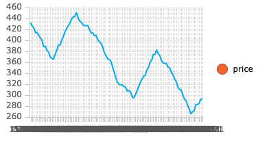
Which renders the time series as we wanted, showing the axis labels on a week basis.
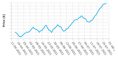
I could continue to format the graph but at this point it matches the D3 implementation and is a good enough drop in replacement with the added benefit of having tooltips and being easier to configure.
The full configuration options are listed in the documentation:
Final Component
The following is the simpler component which uses the AG Grid Standalone Charts.
export default function HistoricalDateLineChart(props) {

        let options =  {
            height: 230,
            width: 400,

            legend: {
                enabled: false
            },

            series: [
                {
                    type: 'line',
                    xKey: 'date',
                    yKey: 'price',
                    marker:{enabled: false},
                    stroke: '#03a9f4',
                },
            ],

            axes:[{
                type: 'time',
                position: 'bottom',
                tick: { count: agCharts.time.week },
                label: {
                    format: '%d-%m-%Y',
                    rotation:55,
                    fontSize: 9
                  }
              },
              {
                type: 'number',
                position: 'left',
                title: {
                    text: 'Price ($)',
                    enabled: true,
                    fontSize: 9
                },
                label:{
                    formatter: function(params) {
                        return '';
                    }
                }
              },
            ]
        };

        const convertToDate = (stringDate) =>{
            let dateValues = stringDate.split("-");
            return new Date(dateValues[2], dateValues[1]-1, dateValues[0])
        }

        options.data = props.historicalData.map((datum) => {
            let convertedDate = convertToDate(datum.date);
            let datumPrice = datum.price;
            return {date: convertedDate, price: datumPrice};
        })

        return <AgChartsReact options={options} />
}
The Standalone chart will update automatically whenever the data changes, which in this case would happen when the historicalData prop changes.
Free React Charts Component
The Standalone Charts Component is free and open source. A full getting started guide is available in the documentation.
Try out the Charts Explorer to see sample code configuration and experiment with the various options interactively.
The enterprise edition of AG Grid has interactive charts which allow the user to explore the data in the grid without any additional programming effort. Information is in the documentation and you can see an overview video on YouTube.