Why Are Integrated Charts Needed?
Last year at our London and New York conferences, we asked attendees what they wanted to see in future versions of ag-Grid. By far the most requested feature was Charting.
This was a bit of a surprise for us as there are numerous excellent charting libraries already available. Probing further we discovered that while some companies may provide a grid and a charting library, it's up to the developer to tie the two together. Instead, what developers are searching for is a grid with integrated charts.
Six months later we are very excited to announce that Integrated Charts are now available in ag-Grid Enterprise v21.
The charts in ag-Grid are tightly integrated such that the charting component understands the columns and rows contained in the grid. This level of integration means both application users and developers are capable of creating charts from the data inside the grid.
- Why Are Integrated Charts Needed?
- User-Created Charts By Selecting Data
- Adjusting Chart Ranges by Dragging
- Changing Chart Data Dynamically
- Data Changes Update In Graph Automatically
- Application Created Charts
- Charting | Video Preview
- Next Steps
User-Created Charts By Selecting Data
To kick things off, let's take a look at how application users can now create charts from inside the grid.
The idea here is to give users a charting experience like that found in spreadsheet applications such as Excel but even better as it can be done inside your applications.
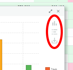
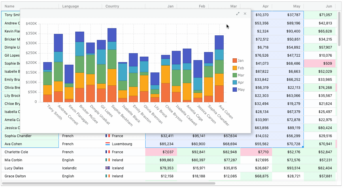
Users start by selecting a range of cells and then choosing a chart from the grids context menu as shown below:
Chart Ranges appear in the grid when the chart is created. These highlight the category and series data being charted.
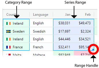
The columns are identified as chart category columns (these appear on an axis eg country names) or series columns (the numeric values getting charted).
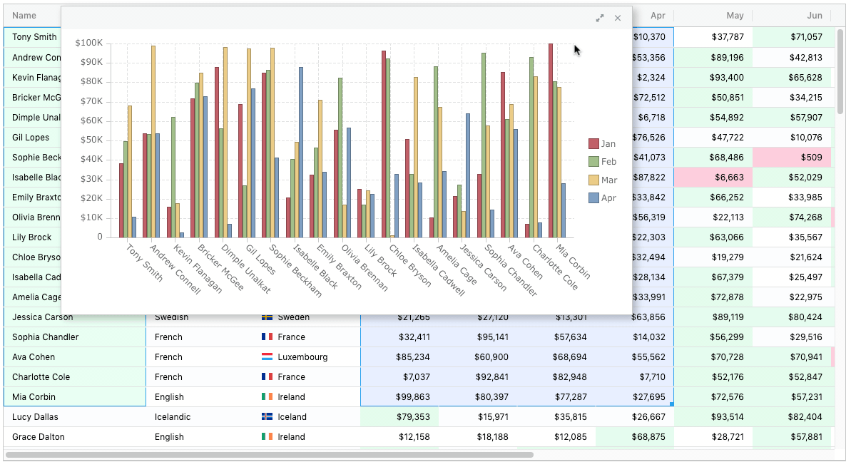
Adjusting Chart Ranges by Dragging
A Range Handle appears at the bottom right of the series range. This can be used to adjust the range of data as illustrated below:
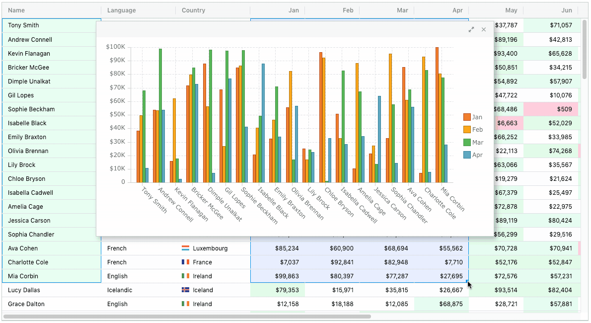
Notice that the category and series ranges are kept in sync as the number of rows in the series range changes. Also notice while adjusting the chart ranges the chart becomes partially transparent to help see the grid data.
Updating Chart Settings
Once a chart is created, users can perform further actions from the Chart Toolbar. The toolbar appears when the mouse hovers over the top right area of the chart.
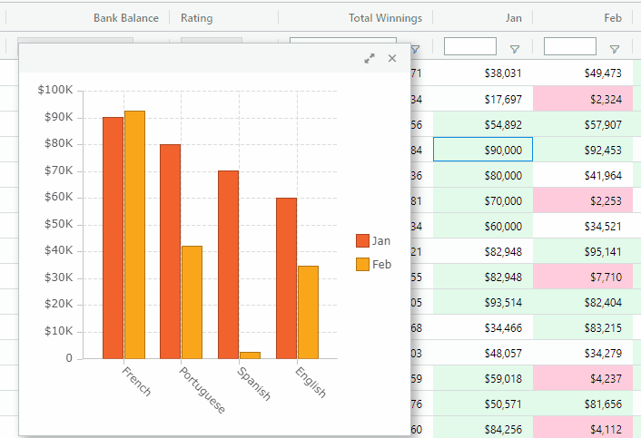
The first item in the toolbar launches the Chart Settings Panel. This panel allows users to change the selected chart type and colour palette as demonstrated below:
In this first release the most popular charts are included. We plan more chart types to be added soon.
Changing Chart Data Dynamically
The second toolbar item launches the Chart Data Panel. This panel allows users to change the category and series columns used in the chart. This is demonstrated below:
Notice that when the category and series columns are changed the chart range is also updated to reflect the new chart data.
Data Changes Update In Graph Automatically
Any updates to data in the grid are immediately shown in the charts. These updates could be due to user actions when cell editing, filtering, sorting, etc... Application updates that change grid data will also be reflected in the charts.
The illustration below shows how editing cell data in the grid updates the chart:
You can try out all of the features described above on our demo page.
Application Created Charts
So far we have seen how users can create charts inside ag-Grid, but what about the application creating charts without need the user to select ranges and chart from the menu?
Charts can be pre-defined or created dynamically from within applications, and as with user-created charts, these charts also benefit from the integration provided with the grid. This is done using the new Chart API.
A dummy financial application is presented below to give a taste of what's possible:
If you want to experiment with this example for yourself, it can be found here.
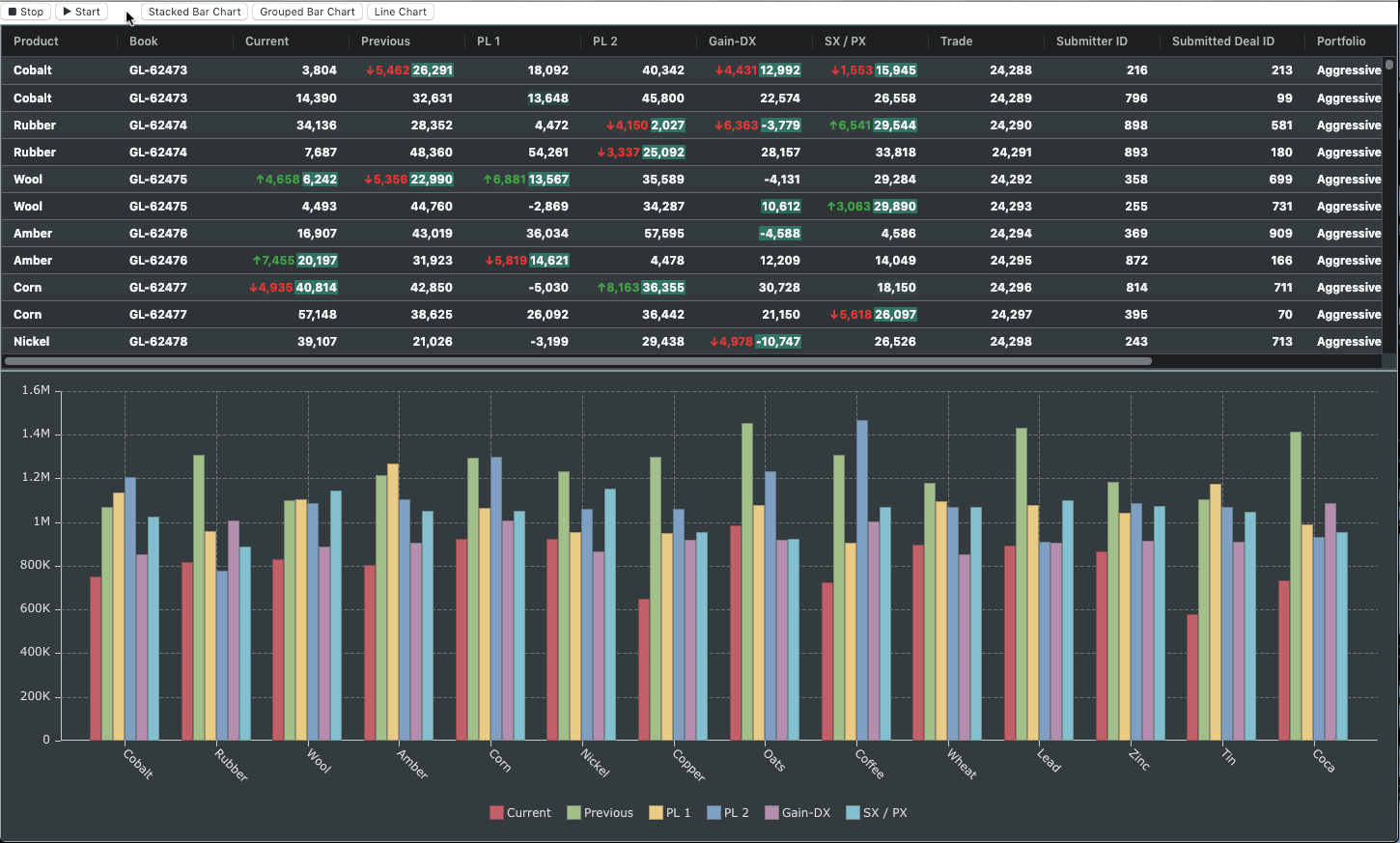
In the example above you'll notice that the chart appears in a separate container below the grid. When the application loads, a pre-defined chart is loaded along with the grid. Charts are also created on the fly when the user clicks on the buttons above the grid.
To highlight the performance, 100 rows are randomly updated ten times a second.
Of course, this is just one example of what is possible through the new Charts API.
Charting | Video Preview
See the features and examples of our integrated Charts in the video preview above.
The video runs through:
- Charting Arbitrary Cell Ranges
- Choosing Chart Types That Suit Your Data Best
- Customizing appearance with Color Palettes
- Creating Multiple Charts with their own Cell Ranges
- Focusing on Particular Series w/Interactive Legends
- Selecting which Categories and Series to Plot
Next Steps
This post announced the release of Integrated Charts, a major new feature available in ag-Grid Enterprise v21.
I hope this post has left you as excited as we are for the possibilities that Integrated Charts brings to your applications.
Learn more about AG Grid — an Enterprise JavaScript Data Grid used by the Fortune 500. Support for multiple frameworks: Angular, Vue, React so you can use the best technology for your business.