
AG Grid exposes over 100 CSS variables, allowing detailed customization of all parts of the Data Grid, including colours, spacing, and component styles. This enables you to create AG Grid themes tailored to your brand, specific use cases, and user needs.
We've simplified this process with our new Theme Builder, which lets designers and developers easily create and customise AG Grid themes, without third-party tools.
There are currently five key features available:
- Theme Presets: Choose a starting point for your customisations.
- Customising Styles: Modify the elements within the Grid.
- Live-preview: Review your changes immediately in the live-preview window.
- Features Control Panel: Enable/disable specific grid features to test your changes with different setups.
- Downloading / Exporting: Export your changes to an AG Grid compatible .css file.
This blog walks through each of these features as you might use them in a real scenario, to help familiarise you with our new tool and help you get started building your own custom AG Grid themes.
Theme Presets in AG Grid Theme Builder
When you open the Theme Builder, you'll be presented with a live preview of a basic grid styled with our default theme: Quartz.
To help you get started with your customisations, we provide several presets that can either serve as a starting point or to demonstrate the various customisations that are available within the Theme Builder:
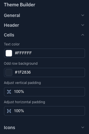
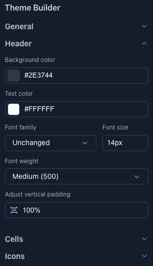
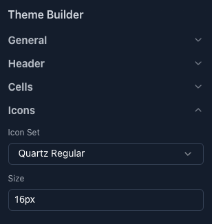
Customising AG Grid Styles
Once you've chosen a preset, you can customise the various styles that make up the theme. Our initial release contains the majority of the CSS variables available within AG Grid; you can customise virtually everything from colours and spacing to specific components like headers, cells and icons:
Real-Time Live-Preview of AG Grid Themes
Any changes applied to variables are immediately reflected within the live preview, letting you test & review your changes in real-time. To help make this visualisation as accurate as possible, we've provided a basic grid with a common configuration which includes row selection, custom cell renderers, value formatters, and features such as sorting, filtering and pagination:
Control AG Grid Features in Theme Builder
To see what your changes might look like in other grid configurations you can use the Grid Features Control Panel to enable/disable grid features (including enterprise ones such as row grouping and advanced filtering) to match your specific use case. This lets you preview exactly how your styles will look in your deployment, without needing to build your own grid:
Download and Export Custom AG Grid Themes
Finally, once you're happy with your design, click the Download Theme button and we'll convert your design into an AG Grid-compatible .css file which can be applied directly to your grid, just like any other theme:
Summary
With this initial release, we hope to make it even easier for developers & designers alike to create and customise AG Grid themes, but we're not stopping here. As we continue to work on this new tool we'd love to hear what features, templates, and customisations you'd like to see next.
Ready to try it out?
Bonus: Getting Started with AG Grid's Figma Design System
If you've made it this far through the blog, you may also be interested in learning about our Figma Design System - a 1:1 representation of AG Grid within Figma built to help designers create themes for AG Grid. To learn more, read our Figma Design System blog post that discusses how we use the Design System internally to create new official themes or jump into the Figma Community to get started.