This post was contributed to the AG Grid blog by Arek Nawo
AG Grid is an advanced, highly customizable, and performant JavaScript grid library. You can use it to create all kinds of web experiences involving large data sets, table views, and data streaming. Some examples of features you can implement with AG Grid include:
- Configurable data sorting and filtering on the frontend.
- Optimized infinite scrolling with DOM virtualization and data streaming.
- Live data updates.
AG Grid provides first-party integrations for the most popular UI frameworks: React, Vue, and Angular. With AG Grid’s React Data Grid, you can build a feature-rich grid using concepts from React that you’re familiar with, like JSX or Hooks.
In this article, you’ll learn how to adapt the React Data Grid to match your website’s look and feel by creating a custom theme. You can follow along with this GitHub repo.
Why Custom Themes?
Custom themes in AG Grid are simple CSS rules that dictate the overall look and feel of the grid. It’s important to know when you should use a custom theme, that is, only when you want to change the general appearance of the grid. If you're going to style a particular column or header in the grid, you should apply your class names to given grid elements or use custom renderers.
It’s worth noting that AG Grid comes with multiple predefined themes, including:
- Alpine / Alpine Dark: A modern theme, recommended as a default.
- Balham / Balham Dark: A theme for data-heavy use cases, good for fitting in more data into a single view.
- Material: A theme based on Google’s Material Design.
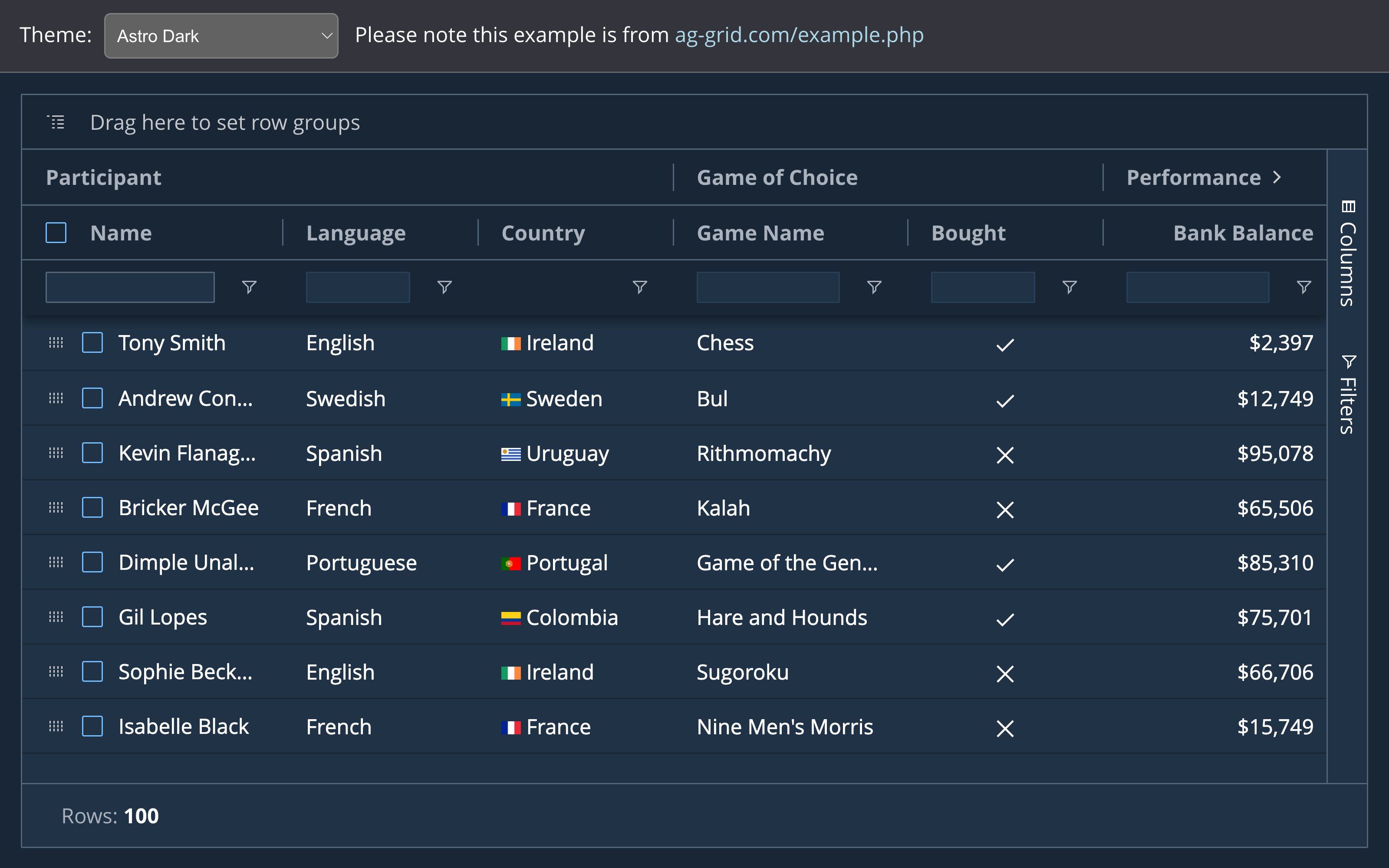
These themes can be used directly or as a reference for your custom designs. For more inspiration, you can also check out other third-party themes, like Astro.

Creating a Custom Theme for AG Grid
This post covers the creation of a custom theme using the legacy AG Grid Sass approach which is documented here. We released a new approach to Themes in version 28 using the Sass Styling API and css variables. This blog post will be useful for people working with our legacy themes. If starting from scratch with a new theme then you are recommended to use our new Sass Styling API.
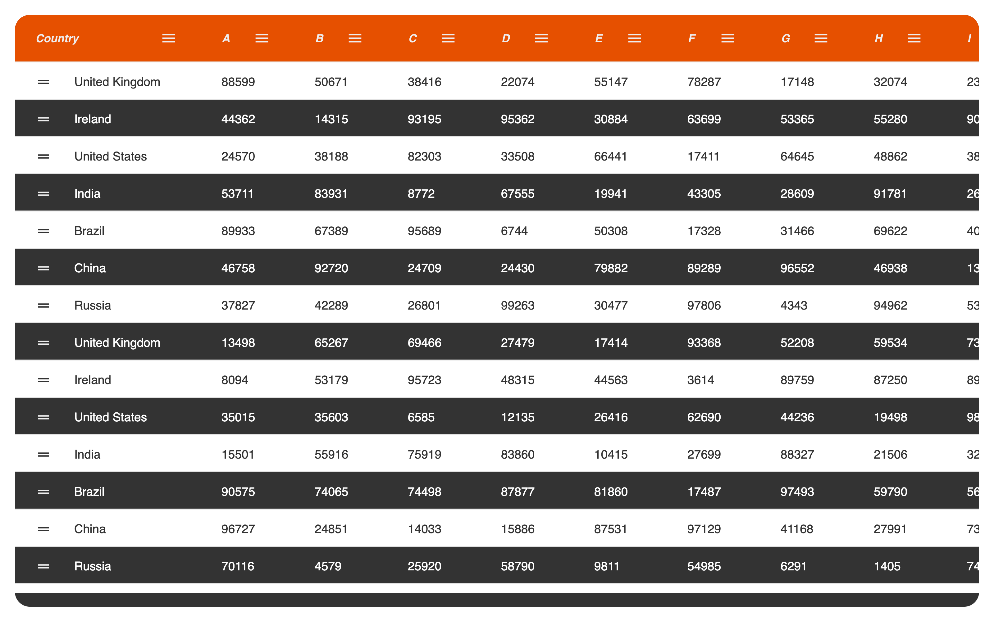
Now that you have some of the predefined and third-party themes, you can start working on one of your own. In this guide, you’ll create a sleek, visually appealing theme like this.

Before diving in, you should get familiar with Sass.
Sass and SCSS
Sass, which stands for “Syntactically Awesome Style Sheets,” is the most popular CSS preprocessor language. It functions as an extension on top of CSS, providing various features like modules, selector nesting, functions, mixins, and more—all of which are preprocessed in a build step to output standard CSS.
Alongside its historically-default indented syntax, Sass also provides the alternative SCSS syntax. For the most part, this is a superset of CSS, making it easy to start using Sass in your project:
// SCSS syntax
@mixin button-base() {
  @include typography(button);
  @include ripple-surface;
  @include ripple-radius-bounded;

  display: inline-flex;
  position: relative;
  height: $button-height;
  border: none;
  vertical-align: middle;

  &:hover {
    cursor: pointer;
  }

  &:disabled {
    color: $mdc-button-disabled-ink-color;
    cursor: default;
    pointer-events: none;
  }
}
For the rest of this guide, we’ll use the SCSS syntax. That said, conversion to indented syntax is relatively easy—just change the extension to .sass, and replace all curly brackets with indents. In this way, you can work with the syntax you prefer.
// Indented (“Sass”) syntax
@mixin button-base()
  @include typography(button)
  @include ripple-surface
  @include ripple-radius-bounded

  display: inline-flex
  position: relative
  height: $button-height
  border: none
  vertical-align: middle

  &:hover
    cursor: pointer

  &:disabled
    color: $mdc-button-disabled-ink-color
    cursor: default
    pointer-events: none
Setting Up the Project
To work on a custom theme for AG Grid, you’ll need to set up a good development environment.
For this example, we’ll use Vite—a modern ES module bundler—with Node.js version 12.2.0 or higher. You can quickly create a new React project, install the necessary dependencies and start the development server using the following commands:
npm create vite@latest project -- --template vanilla
cd project
npm install
npm install -D sass
npm install ag-grid-community ag-grid-react
npm run dev
The installed dependencies are as follows:
- AG Grid Community: The core logic package for AG Grid.
- AG Grid React: The React rendering engine for AG Grid.
- Sass: The JavaScript implementation of Sass, which enables Sass support in Vite.
With the basics set up, you should now create a sample grid to test your custom theme. Inside the src/App.jsx file, create a React component for the grid, and fill it with the following sample data:
// src/App.jsx
import React from "react";
import { AgGridReact } from "ag-grid-react";

import "ag-grid-community/dist/styles/ag-grid.css";
import "ag-grid-community/dist/styles/ag-theme-material.css";

const generateColumnDefs = () => [
  {
    headerName: "Country",
    field: "country",
    enableRowGroup: true,
    filter: true,
    width: 200,
    rowDrag: true,
  },
  ..."ABCDEFGHIJKLMNOPQRSTUVWXYZ"
    .split("")
    .map((letter) => ({ field: letter })),
];
const generateRowData = (columnDefs) => {
  const rowData = [];
  const countries = [
    "United Kingdom",
    "Ireland",
    "United States",
    "India",
    "Brazil",
    "China",
    "Russia",
  ];

  for (var i = 0; i < 100; i++) {
    var item = {};

    item.country = countries[i % countries.length];

    for (var j = 1; j < columnDefs.length; j++) {
      var colDef = columnDefs[j];
      item[colDef.field] = Math.floor(Math.random() * 100000);
    }

    rowData.push(item);
  }

  return rowData;
};
const columnDefs = generateColumnDefs();
const rowData = generateRowData(columnDefs);
const gridOptions = {
  suppressMenuHide: true,
  defaultColDef: {
    width: 100,
    filter: "number",
    sortable: true,
    resizable: true,
  },
  enableCharts: true,
  animateRows: true,
  enableRangeSelection: true,
  rowDragManaged: true,
  headerHeight: 50,
  rowHeight: 40,
  rowGroupPanelShow: "always",
  pivotPanelShow: "always",
  pivotColumnGroupTotals: "before",
  pivotRowTotals: "before",
  sideBar: {
    toolPanels: [
      {
        id: "columns",
        labelDefault: "Columns",
        labelKey: "columns",
        iconKey: "columns",
        toolPanel: "agColumnsToolPanel",
      },
      {
        id: "filters",
        labelDefault: "Filters",
        labelKey: "filters",
        iconKey: "filter",
        toolPanel: "agFiltersToolPanel",
      },
    ],
    defaultToolPanel: "filters",
  },
  columnDefs,
  rowData,
  enableFillHandle: true,
};
const App = () => {
  return (
    <div
      className="ag-theme-material"
      style={{ height: "100%", width: "100%" }}
    >
      <AgGridReact {...gridOptions}></AgGridReact>
    </div>
  );
};

export { App };
Apart from generating data, column definitions, and general configuration for the grid, the component also imports and enables the Material theme by setting the className of the wrapper element to ag-theme-material. This theme will serve as the baseline for later customization.
To render the grid, initiate React DOM in the src/main.jsx file:
// src/main.jsx
import React from "react";
import ReactDOM from "react-dom/client";
import { App } from "./App";
import "./index.css";

ReactDOM.createRoot(document.getElementById("root")).render(
  <React.StrictMode>
    <App />
  </React.StrictMode>
);
It’s worth noting that this snippet uses the new createRoot() API from React 18.
Finally, add some CSS inside src/index.css to add some margin to the grid:
/* src/index.css */
html {
  height: 100%;
  width: 100%;
}
body {
  margin: 0;
  padding: 1rem;
  height: calc(100% - 2rem);
  width: calc(100% - 2rem);
}
#root {
  height: 100%;
  width: 100%;
}
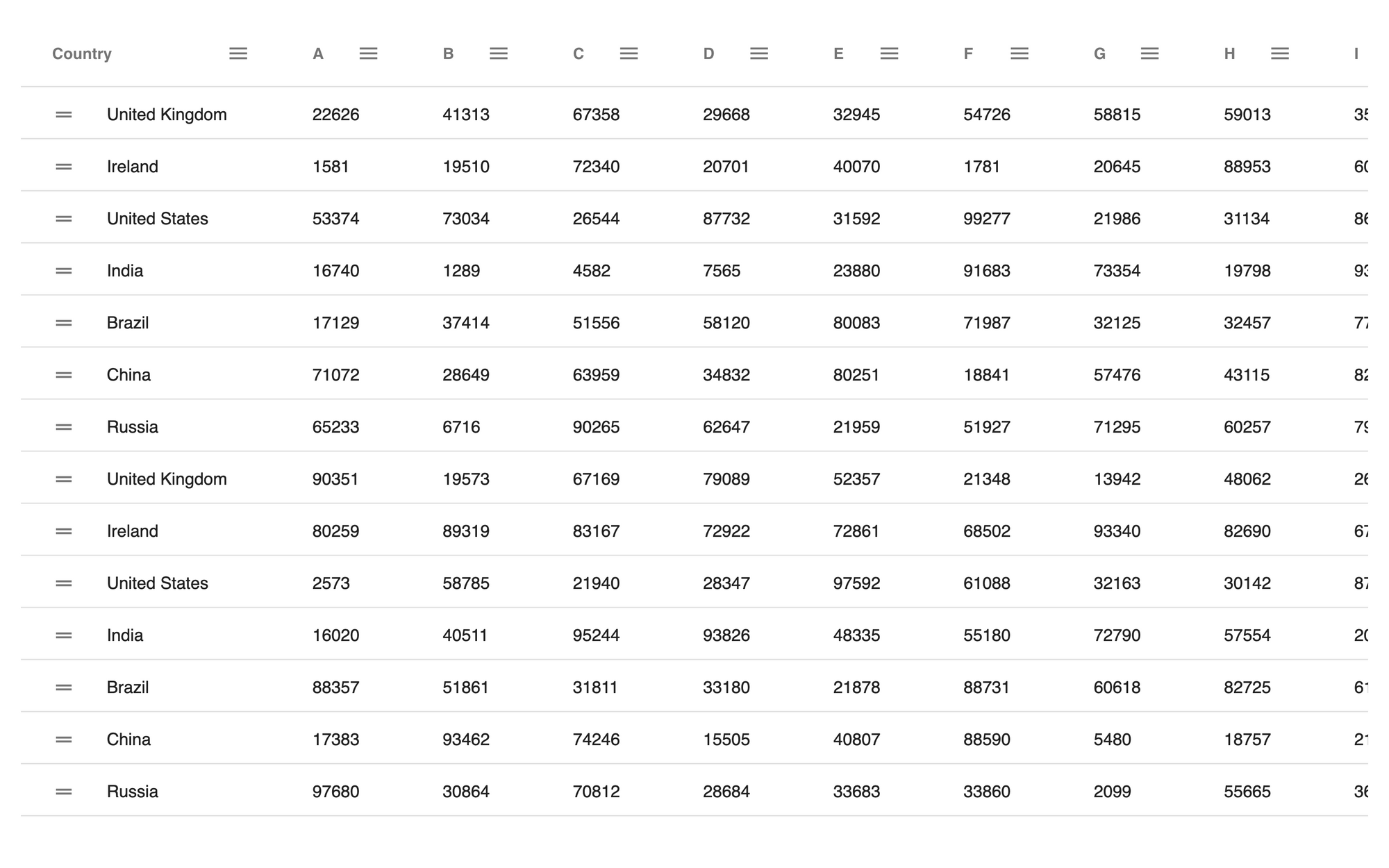
Right now, the grid should look similar to the following.

Setting Up a Custom Theme
With the development environment ready, you can now start working on your custom theme.
Create a new src/theme.scss file:
/* src/theme.scss */
@import "../node_modules/ag-grid-community/src/styles/ag-grid.scss";
@import "../node_modules/ag-grid-community/src/styles/ag-theme-material/sass/ag-theme-material-mixin";

.ag-theme-custom {
  @include ag-theme-material();
}
First, import the basic AG Grid styles and a base theme Sass mixin. Then, define a new class for your custom theme with its name starting with the ag-theme- prefix, which is required for AG Grid to use the theme correctly. Inside it, apply the base theme mixin to the class using @include.
Now, inside the src/App.jsx file, replace all CSS imports with a single one containing the SCSS file, and change the theme to the one you’ve defined:
// ...
import "./theme.scss";
// ...

const App = () => {
  return (
    <div className="ag-theme-custom" style={{ height: "100%", width: "100%" }}>
      <AgGridReact {...gridOptions}></AgGridReact>
    </div>
  );
};

// ...
Right now, the theme is the same as the provided Material one, but ready for customization.
Customizing the Theme
In general, creating a custom theme for AG Grid boils down to setting the styles of various CSS classes used throughout the grid. That said, there are a few shortcuts and things you should look out for.
Theme Parameters
The easiest way to customize your theme is by setting theme parameters. Each of the provided theme mixins accepts a set of such parameters to let you change the most important aspects of the grid. You can set them like in the following example:
@import "../node_modules/ag-grid-community/src/styles/ag-grid.scss";
@import "../node_modules/ag-grid-community/src/styles/ag-theme-material/sass/ag-theme-material-mixin";

.ag-theme-custom {
  @include ag-theme-material(
    (
      background-color: #333,
      header-background-color: #e65100,
      foreground-color: #fff,
      secondary-foreground-color: #eee,
      row-hover-color: #444,
    )
  );
}
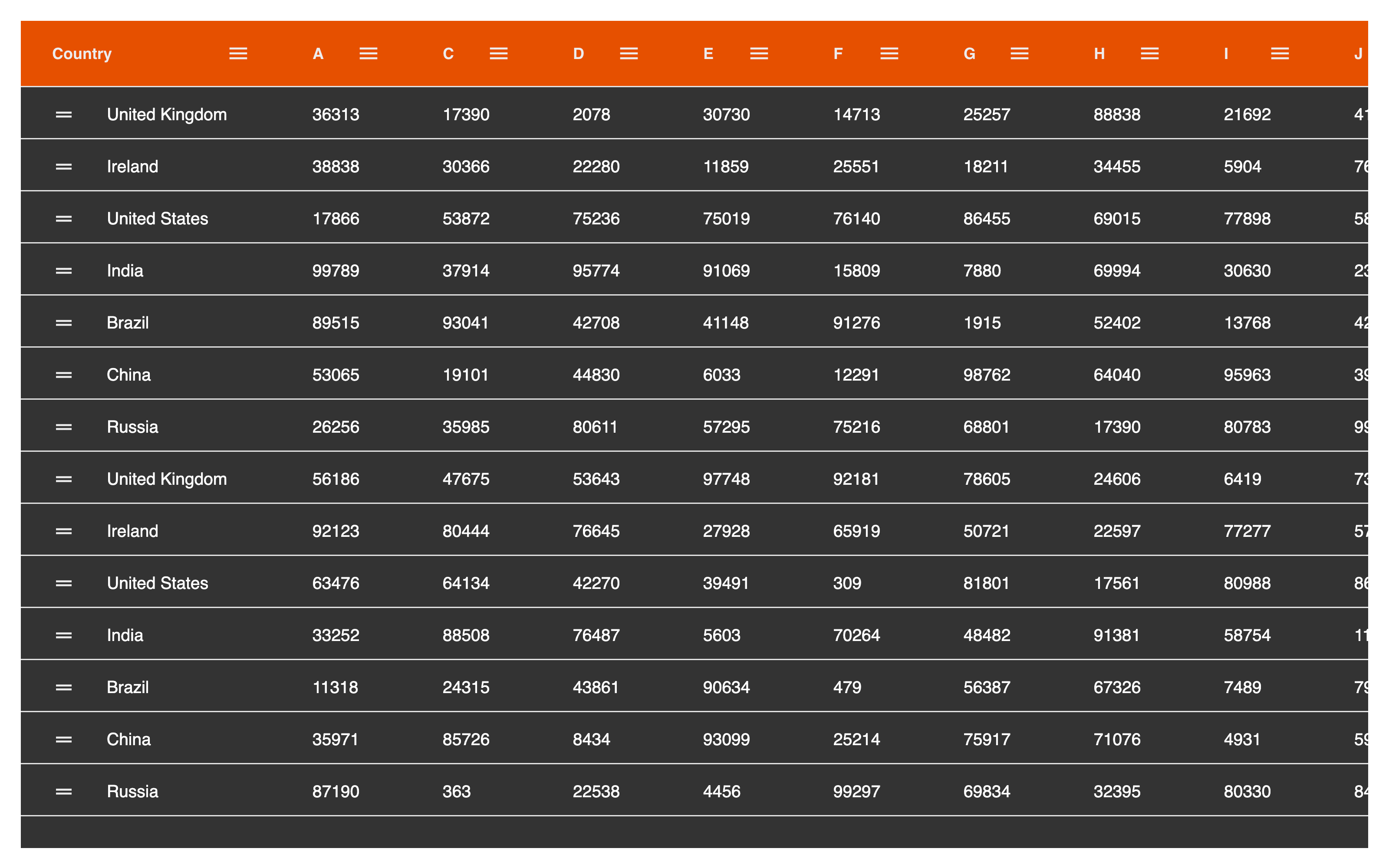
With these changes, the grid already looks much different.

You can reference the complete list of theme parameters from the AG Grid documentation on parameters.
Sass Mixins and Functions
While looking through the list of theme parameters, you’ll encounter a lot of ag-derived() function calls. This function, provided by AG Grid, derives the value from the supplied parameter. Consider the example below:
// Imports are important - they bring all the AG Grid functions and mixins to the global scope.
@import "../node_modules/ag-grid-community/src/styles/ag-grid.scss";
@import "../node_modules/ag-grid-community/src/styles/ag-theme-material/sass/ag-theme-material-mixin";

.ag-theme-custom {
  @include ag-theme-material((
      foreground-color: #000,
      disabled-foreground-color: ag-derived(foreground-color, $opacity: 0.5),
    )
  );
}
The disabled-foreground-color parameter is now derived from the foreground-color with applied opacity of 0.5. Such behavior is called parameter cascading and is often used in the themes provided by AG Grid to aid grid customization.
After the name of the parameter from which it should derive, ag-derived accepts different modifiers for arithmetic operations (eg $divide, $plus) and color manipulations (eg $opacity or $mix). You can find the complete list in AG Grid’s docs.
That said, ag-derived() should primarily be used if you want to create a theme mixin accepting parameters for customization by other developers. If you're going to use parameter values in your theme’s CSS rules, you should use the ag-param() function:
@import "../node_modules/ag-grid-community/src/styles/ag-grid.scss";
@import "../node_modules/ag-grid-community/src/styles/ag-theme-material/sass/ag-theme-material-mixin";

.ag-header-cell {
  background-color: ag-param(foreground-color);
  color: ag-param(background-color);
}
Unlike ag-derived(), the ag-param() function is only meant to be used as a value in CSS rules. It doesn’t accept any modifiers, only a single argument—the reference parameter name.
Lastly, AG Grid also provides the ag-color-property mixin, which you can use to set different color-related CSS properties (eg color, background-color) with built-in support for CSS variables in case you prefer theming the grid that way:
@import "../node_modules/ag-grid-community/src/styles/ag-grid.scss";
@import "../node_modules/ag-grid-community/src/styles/ag-theme-material/sass/ag-theme-material-mixin";

// Input
.ag-header-cell {
  @include ag-color-property(background-color, foreground-color);
  @include ag-color-property(color, background-color);
}
// Output
.ag-header-cell {
  background-color: #000;
  background-color: var(--ag-foreground-color, #000);
  color: #fff;
  color: var(--ag-background-color, #fff);
}
CSS Rules
Customization with theme parameters can only go so far. If you need greater customization than the parameters can provide, you’ll have to use direct CSS rules.
With Sass selector nesting, as well as functions and mixins provided by AG Grid, theming the grid becomes much easier. Simply find the CSS class you want to style (eg with the help of DevTools) and include it in your theme:
@import "../node_modules/ag-grid-community/src/styles/ag-grid.scss";
@import "../node_modules/ag-grid-community/src/styles/ag-theme-material/sass/ag-theme-material-mixin";

.ag-theme-custom {
  .ag-root-wrapper {
    border-radius: 1rem;
    overflow: hidden;
  }
  @include ag-theme-material(
    (
      background-color: #333,
      header-background-color: #e65100,
      foreground-color: #fff,
      secondary-foreground-color: #eee,
      row-hover-color: #444,
    )
  );
  .ag-header-cell-text {
    font-style: italic;
    overflow: visible;
  }
  .ag-row-even {
    @include ag-color-property(background-color, foreground-color);
    @include ag-color-property(color, background-color);
    .ag-icon {
      @include ag-color-property(color, background-color);
    }
    &:hover {
      background-color: #eee;
    }
  }
}
With some custom CSS rules and a few ag-color-property calls, you’ll achieve the final effect.

Maintenance of Custom CSS Rules
When using CSS rules to create your theme, it’s important to keep the grid’s structure and theme’s maintainability in mind. You shouldn’t change properties that are intrinsic to how the grid works—like display or position. Apart from that, to ensure your theme works across releases, you should only use the most general class names possible and thoroughly check its look and behavior to ensure the desired results with every new release.
Conclusion
After reading this article, you should have a good grounding in maintaining and working with custom legacy AG Grid themes. With some knowledge of CSS, Sass, and features provided by AG Grid, you’ll be able to create your own grid theme to fit your website’s look and feel in no time.
AG Grid now has support for CSS Variables to help bring your themes up to date with modern CSS approaches, and you can find more information in our docs.
AG Grid is a high-performance JavaScript table library that’s easy to set up and customize. It comes with powerful out-of-the-box features, like large data handling, live data streaming, and charting. Check out the official AG Grid documentation to learn more.