
In this post, we'll show how to use AG Grid to implement column drill-down functionality by displaying different detail-level content depending on the master-level column expanded. This way you can provide your users with additional information for each master-level column, displaying more contextual information about the data.
See the live sample in action below - expand different columns and note they have different detail content:
You can see the code in the StackBlitz above and also download the Github repo for this project here.
We'll implement this scenario in 3 steps as shown in the contents below:
Contents
- Displaying Detail-level content depending on master-level column expanded
- Building a Cell Renderer to handle master-level column expansion
- Sharing context between detail renderers and master-level grid
- What's Next?
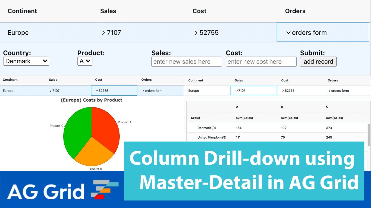
Displaying Detail-level content depending on master-level column expanded
In order to display different detail-level renderers depending on the master-level column the user expanded we use a detail renderer factory.
We add a separate expansion button in each master-level column to expand a different detail-level content panel. We keep track of the column the user expanded in the context object provided by the grid whenever we expand a row. This way, based on the master-level column the user expanded, we return different detail-level content.
Please see this class implemented in the code below and note:
1) The expanded column is retrieved from the context object
2) Depending on the expanded column, a different type of detail-level renderer is set to the GUI detail-level element
class DetailCellRenderer {
  init(params) {
    this.params = params;
    var colId = params.context.selectedDetail;

    if (colId === "cost") {
      var chartDetail = new PieChartDetail(params);
      this.eGui = chartDetail.eGui();
    } else if (colId === "orders") {
      var costFormDetail = new CostFormDetail(params);
      this.eGui = costFormDetail.eGui();
    } else if (colId === "sales") {
      var gridDetail = new GridDetail(params);
      this.eGui = gridDetail.eGui();
    }
  }
  getGui() {
    return this.eGui;
  }
}
export default DetailCellRenderer;
Building a Cell Renderer to handle master-level column expansion
Now that we have three different detail-level grids displayed when we expand different columns, we need expansion buttons to expand and collapse them in the master-level columns.
AG Grid provides an expansion button (chevron) in the default agGroupCellRenderer, but these expansion buttons share their expanded state when in the same row - when the user expands one of them, all expansion buttons in the row are displayed as expanded.
This is why we need a custom expansion button to keep the expansion state separately on a column-level instead of on the row-level. We'll build a custom cell renderer for the master-level columns to implement this.
See the custom (parameterized) cell renderer for the master-level columns implementation in the code segment below. Note the following:
1) In the custom cell renderer, we have the cell value shown in a span element, and an expansion button (chevron) image in SVG format taken from the AG Grid Alpine theme to toggle the expanded state of its detail renderer
2) The code in the switch statement adds expansion buttons to master-level columns to make them expandable
3) The expansion button element listens for a mouse click and changes the source parameter to store the expanded state of the chevron. We add a class to each expansion button, allowing us to easily find all the expansion buttons in a row so that when one of the expansion buttons is expanded, we can easily find and collapse the remaining ones in the same master-level row.
function makeMasterCellRenderer(params, col) {
  let container = document.createElement('div');
  let chevron = document.createElement('img');
  let span = document.createElement('span');
  container.classList.add('master-row-container');

  chevron.classList.add(`row-${params.node.data.id}`);

  let chevronState = treeClosed; //svg with closed chevron
  chevron.setAttribute('src', chevronState);
  //make sales,cost,orders columns expandable by adding a chevron
  switch (col) {
    case 'orders':
      span.innerText = 'orders form';
      container.appendChild(chevron);
      break;
    default:
      span.innerText = params.value;
      container.appendChild(chevron);
      break;
  }

  chevron.addEventListener('click', (event) => {
    let chevron= event.target;
      openDetail(params, col, chevron);
  });

  container.appendChild(span);
  return container;
}Opening the detail-level content for the expanded column
Let's now take a look at how to display the detail renderer for the expanded column. To do this, we first check if the master-level row is expanded already and whether the expansion button just clicked was the one that expanded it. If that's the case, we collapse the row and change the expansion button state to collapsed.
If a different expansion button was expanded, we update the context object so it contains the column the expansion button belongs to, allowing our detail renderer factory class to return the correct detail. We then get all of the cell renderers in this row and set their expansion button state to closed before expanding the row, and updating the expansion button which was just clicked and updating it to show the expanded state. Finally, we refresh the detail row so the new detail renderer is displayed.
See this implemented below:
const openDetail = (params, column, cellRenderer) => {
 if (gridOptions.context &&
      gridOptions.context.chevKeyMap[cellRenderer.className] === column
      && params.node.expanded) {
      params.node.setExpanded(false);
      cellRenderer.setAttribute('src', treeClosed);
      return;
  }
  gridOptions.context = { ...gridOptions.context, selectedDetail: column };
  let className = '';
  cellRenderer.classList.forEach((cssClass) => {
    if (cssClass.indexOf('row') != -1) {
      className = cssClass;
    }
  });
  let nodeRenderers = document.querySelectorAll(`.${className}`);
  nodeRenderers.forEach((renderer) => {
    renderer.setAttribute('src', treeClosed);
  });
  params.node.setExpanded(true);
    if (gridOptions.context.chevKeyMap) {
    gridOptions.context.chevKeyMap[cellRenderer.className] = column;
  } else {
    gridOptions.context.chevKeyMap = {};
    gridOptions.context.chevKeyMap[cellRenderer.className] = column;
  }
  cellRenderer.setAttribute('src', treeOpen);

    params.api.redrawRows({rowNodes:[params.node.detailNode]})
};Saving and restoring expansion button state to support grid row virtualization
Our cell renderer needs to save the expanded state of its expansion button because the grid uses row virtualization and destroys and recreates rows when they're scrolled out of view, taking their cell renderers with them. When the cell renderers are recreated they show their default state which is desynchronized from the actual state.
The code to save and restore expanded state is shown below. Please note:
1) We save the expanded state of expansion buttons so we can restore it when the expansion buttons are recreated when the row they belong to is scrolled back into view.
2) We save expansion button state in a map in the context object provided by the grid. Each time a cell renderer is created we check if it was open before and if it was we restore its expanded state from the map.
function makeMasterCellRenderer(params, col) {
  let isExpanded = params.node.expanded;
  let container = document.createElement('div');
  let chevron = document.createElement('img');
  let span = document.createElement('span');
  let openCol = null;

  chevron.classList.add(`${params.node.data.continent.replace(/ /g, '')}-row`);

  if (params.context) {
    openCol = params.context.chevKeyMap[chevron.className];
  }
  let chevronState =
    isExpanded && col == openCol ? treeOpen : treeClosed;
  chevron.setAttribute('src', chevronState);

  ...
}Now, when we create our cell renderers with expansion buttons for a master-level row, we can restore the correct expansion state for the columns based on whether it was expanded before it was scrolled out of view.
Sharing context between detail renderers and master-level grid
The above sections show you how to implement displaying different content in detail pane when expanding a different column in the master row.
Let's now take a look at the detail-level content we're showing when the different master-level columns are expanded. Specifically, we will look at how to share context between the detail renderers and the master-level grid.
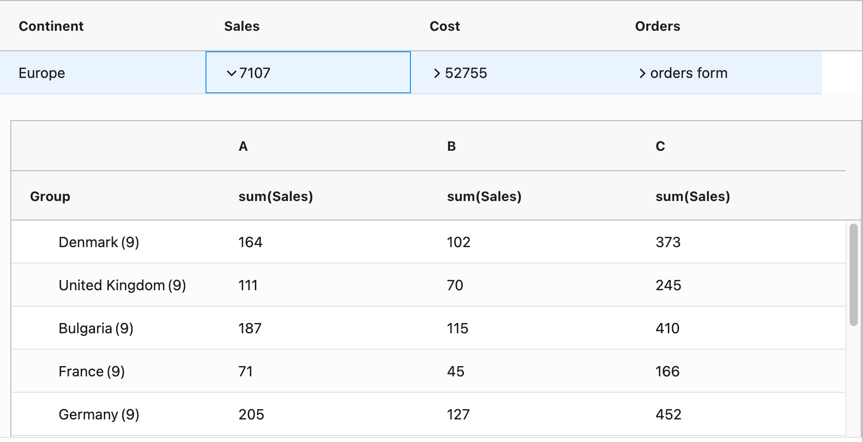
Sales Detail Content
When expanding the Sales column of a master-level row, the detail renderer shown displays a grid in pivot mode. An important detail is that we use the AG Grid context object to provide data to the detail-level renderer.
Specifically, when rendering the detail-level content, we check the AG Grid context to see if we've added any records (using the Cost detail) so we can show the most up to date information for this master-level row.
  constructor(params) {
    this.params = params;
    this.rowData = params.data.data;
    if (params.context.newRecords) {
      let continent = this.params.data.continent
      this.rowData = this.rowData.concat(
        params.context.newRecords[continent]
      );
    }
}See a screenshot of the sales detail content below:
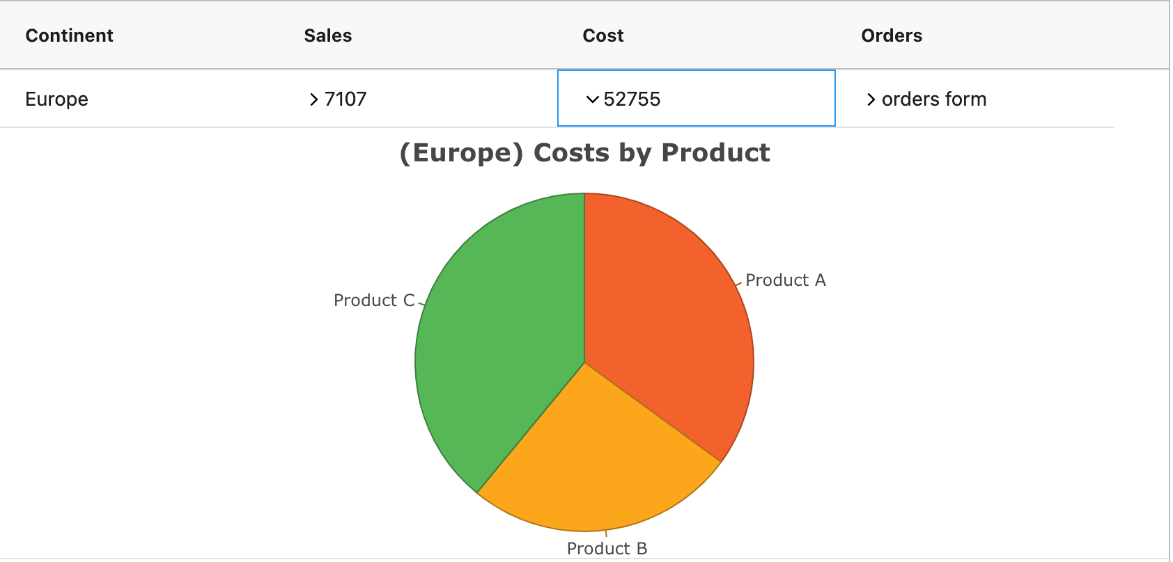
Cost Detail Content
When expanding the Cost column of a master-level row, we display a pie chart showing the total cost of each product in the grid detail under sales. We use the context object here in a similar way to the Sales detail to display the latest data if a user has added a record using the Cost detail as shown below:
createChart(){
   let continent = this.params.data.continent;
    let rowData = this.params.data.data;
    let newRecords = this.params.context.newRecords;
    let productACost = 0;
    let productBCost = 0;
    let productCCost = 0;

    if (newRecords) {
      rowData = rowData.concat(newRecords[continent]);
    }
...}See a screenshot of the Cost detail presenter below:
Orders Detail Content
When expanding the Orders column of a master-level row, the detail content shows a data entry form. We can use this form to add records to update the sales and cost details and the values in our master row.
The order form consists of two drop down menus, two text inputs and a button. The first drop down contains the countries listed in the sales detail, the second contains products A, B and C. The text inputs allow the user to enter the sales and the cost of this product and the button adds the record as shown below:
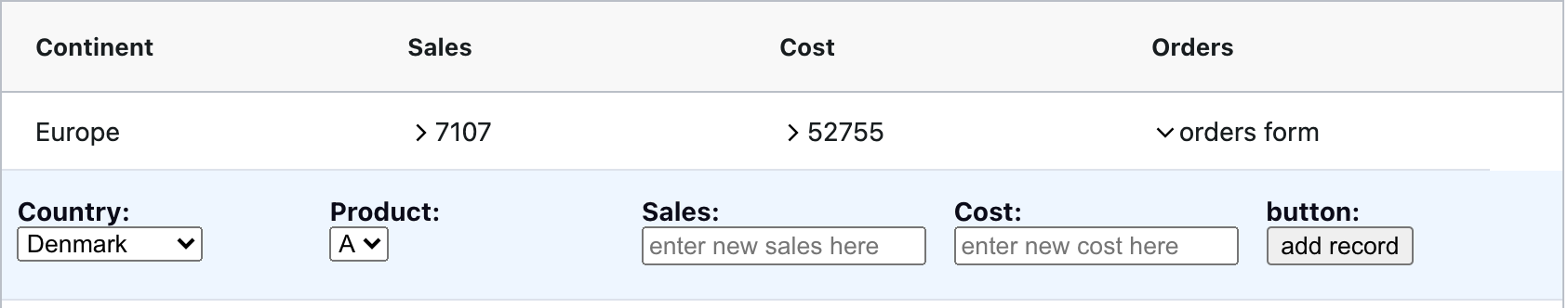
When we click the form button we add a new record to the grid context and update the master row values with the total cost and sales for this continent.
What's Next?
We hope you find this article useful when implementing multiple detail grids in an application using a master-detail grid. Please feel free to fork the example from the blog post or use any code snippets and modify them to fit your application.
If you would like to try out ag-Grid check out our getting started guides (JS / React / Angular / Vue)
Happy coding!