
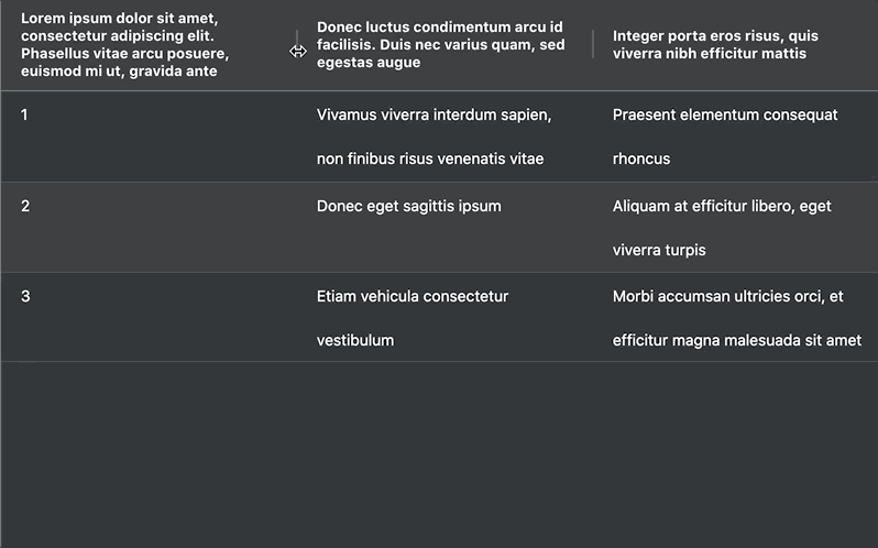
Wrapping text is a common requirement for Data Grids, especially when you have a lot of data that needs to be displayed without being truncated (e.g. cut-off with an ellipsis), like so:
This blog post will show you how to automatically wrap text in AG Grid's Column Headers, Cells, and Column Group Headers.
TL;DR
To wrap text in AG Grid:
- Cells: Use
colDef.wrapTextandcolDef.autoHeight. - Column Headers: Use
colDef.wrapHeaderTextandcolDef.autoHeaderHeight(available from v28+). - Column Group Headers: Apply
wrapHeaderTextandautoHeaderHeighton Column Groups (available from v32.1+).
Pre-requisites
- You're using AG Grid v28 or later.
- You have a basic understanding of AG Grid.
- You have a working project where you can test and implement the code snippets provided.
Live Demo
See text wrapping in action with the live demo below. Resize columns and group headers to see the grid adjust automatically:
Cell Text Wrapping
To enable text wrapping in specific cells, set the wrapText property on the relevant column, or use defaultColDef to apply it to all cells. Using wrapText automatically applies the CSS property white-space: normal, causing the text to wrap within the cell.
Pairing wrapText with the autoHeight property makes the Data Grid dynamically resize cells to fit the wrapped text without truncating it:
const defaultColDef = useMemo<ColDef>(() => {
  return {
    resizable: true, // Enable resizing
    initialWidth: 200, // Optional: Set a default size
    wrapText: true, // Wrap Text
    autoHeight: true, // Adjust Cell Height to Fit Wrapped Text
  };
}, []);wrapText is intended to be used when you are not using a custom Cell Renderer.Header Text Wrapping
Wrapping Header Text is achieved similarly, however, instead of using wrapText and autoHeight properties, you need to use the wrapHeaderText and autoHeaderHeight properties instead.
To apply this to a specific Header, set the wrapHeaderText property on the relevant column, or use defaultColDef to apply it to all headers:
const defaultColDef = useMemo<ColDef>(() => {
  return {
    resizable: true, // Enable resizing
    initialWidth: 200, // Optional: Set a default size
    wrapHeaderText: true, // Wrap Text
    autoHeaderHeight: true, // Adjust Cell Height to Fit Wrapped Text
  };
}, []);autoHeaderHeight=true the Grid automatically disables the Span Header Height, see: Suppress Span Header Height.If you're using an AG Grid version earlier than v28, expand the section below to see how you can implement this functionality manually:
Custom Header Text Wrapping - Pre v28
This section explains how to use Custom Header Templates to implement header text wrapping when working with earlier (pre-v28) versions of AG Grid.
Part 1: Setting Up
First, open or fork the Multi-Line Text Example in Plunkr which contains three columns, each with long header text. We'll use this example as our starting point.
Part 2: Column Header Template
Next, we need to create our own Custom Header Template which the grid will use to render headers, as opposed to using the default headers. In this case, we'll use the Column Header Template from our documentation:
var defaultColDef = {
  flex: 1,
  resizable: true,
  sortable: true,
  headerComponentParams: {
    template:
      '<div class="ag-cell-label-container" role="presentation">' +
      '  <span ref="eMenu" class="ag-header-icon ag-header-cell-menu-button"></span>' +
      '  <div ref="eLabel" class="ag-header-cell-label" role="presentation">' +
      '    <span ref="eSortOrder" class="ag-header-icon ag-sort-order"></span>' +
      '    <span ref="eSortAsc" class="ag-header-icon ag-sort-ascending-icon"></span>' +
      '    <span ref="eSortDesc" class="ag-header-icon ag-sort-descending-icon"></span>' +
      '    <span ref="eSortNone" class="ag-header-icon ag-sort-none-icon"></span>' +
      '    <span ref="eText" class="ag-header-cell-text" role="columnheader" style="white-space: normal;"></span>' +
      '    <span ref="eFilter" class="ag-header-icon ag-filter-icon"></span>' +
      '  </div>' +
      '</div>',
    },
};
As this template will be used for all of our columns, make sure it is declared in the defaultColDef.headerComponentParams property.
Note: The style declared for the eText span: white-space: normal; is crucial for making sure the text will wrap. We recommend reading the white-space MDN Web Docs if you're not already familiar with the white-space property.
Part 3: Getting the Column Header Height
Next, we need to implement two functions; the first function will calculate how tall the headers should be, and the second function will set the Data Grid's header height based on the result from the first function.
First, to get the required height, create a new function - headerHeightGetter():
function headerHeightGetter() {
  // Get All Header Cell Text Elements
  var columnHeaderTexts = [
    ...document.querySelectorAll('.ag-header-cell-text'),
  ];
  // Get Height of All elements
  var clientHeights = columnHeaderTexts.map(
    headerText => headerText.clientHeight
  );
  // Return the largest Height
  return Math.max(...clientHeights);
}
In this function we're:
1. Accessing all header cell text elements via document.querySelectorAll('.ag-header-cell-text') and placing these in an array.
2. Mapping over each element and storing its height in a new array via the clientHeight property.
3. Using Math.max() to return the tallest header cell text element height
Part 4: Setting the Column Header Height
Now we have the height of our tallest column header text, we need to set our header height via the Data Grid's API.
To do this, create a function called headerHeightSetter():
function headerHeightSetter() {
  var padding = 20;
  var height = headerHeightGetter() + padding;
  gridOptions.api.setHeaderHeight(height);
}
In this function, we're using the setHeaderHeight() method from the Grid API to set the height of the headers to match the height of the largest header text element in our grid, along with some additional (20px) padding for a cleaner UI.
Part 5: Header Text Wrapping
The last thing to do is to call the headerHeightSetter() function when the Data Grid renders, as well as whenever the Data Grid is resized:
var gridOptions = {
  columnDefs: columnDefs,
  rowData: rowData,
  defaultColDef: defaultColDef,
  onFirstDataRendered: headerHeightSetter,
  onColumnResized: headerHeightSetter,
};
In the code above, we're using the gridOptions.onFirstDataRendered and gridOptions.onColumnResized properties to call the headerHeightSetter() method whenever the Data Grid is rendered, or columns are resized, respectively.
And that's it - you should now have a custom header that wraps header text in pre-v28 versions of AG Grid:
For the complete source code, take a look at the Plunkr demo
Column Group Text Wrapping
In v32.1 we introduced support for text wrapping in Column Group Headers.
Instead of applying these properties via defaultColDefs, just set the wrapHeaderText and autoHeaderHeight properties on the Column Groups that you'd like to apply this functionality to:
const [columnDefs, setColumnDefs] = useState<(ColDef | ColGroupDef)[]>([
  {
    children: [{ field: "athlete" }, { field: "country" }],
  },
  {
    headerName: "A shared prop for all Groups",
    resizable: true,
    wrapHeaderText: true,
    autoHeaderHeight: true,
    children: [
      { columnGroupShow: "closed", field: "total" },
      { columnGroupShow: "open", field: "gold" },
      { columnGroupShow: "open", field: "silver" },
      { columnGroupShow: "open", field: "bronze" },
    ],
  },
]);
Example
Bringing this all together, your Data Grid configuration should look something like this:
const myApp = () => {
  const columnDefs = useMemo(
    () => [
      {
        children: [{ field: 'athlete' }, { field: 'country' }],
      },
      {
        headerName: 'A shared prop for all Groups',
        resizable: true,
        wrapHeaderText: true, // Wrap Column Group Header
        autoHeaderHeight: true, // Auto Size Column Group Header
        children: [
          { columnGroupShow: 'closed', field: 'total' },
          { columnGroupShow: 'open', field: 'gold' },
          { columnGroupShow: 'open', field: 'silver' },
          { columnGroupShow: 'open', field: 'bronze' },
        ],
      },
    ],
    []
  );

  const defaultColDef = useMemo(() => ({
    initialWidth: 200,
    wrapText: true, // Wrap Cell Text
    autoHeight: true, // Auto Height Cells
    wrapHeaderText: true, // Wrap Header Text
    autoHeaderHeight: true, // Auto Height Header
  }));

  return (
    <div className="ag-theme-quartz" style={{ height: '500px' }}>
      <AgGridReact
        rowData=getRowData()
        columnDefs={columnDefs}
        defaultColDef={defaultColDef}
      />
    </div>
  );
}
Source Code
The code in this blog focused on React. If you want to see this in action, or if you're using a different framework, try one of our sample apps:
Summary
In this blog, we've explored how to implement text wrapping in AG Grid for Cells, Column Headers, and Column Group Headers by leveraging properties like wrapText, autoHeight, wrapHeaderText, and autoHeaderHeight.
Want to create your own Data Grids with AG Grid?