AG Grid 26 is an ambitious release offering significant improvements to the developer experience and adding valuable end-user functionality. In this post, we’ll briefly cover this new version. Please see the full list of changes in AG Grid 26 in our changelog.
We've used this major version to add new functionality and improve the API by deprecating and removing unused API members. This is why we recommend consulting the list of breaking changes when planning to update to this version.
AG Grid UI in Pure React
In order to support React better, we're introducing a new rendering engine that is written purely in React. This means the entire AG Grid UI is now available in React and your React components (cell renderers, cell editors, etc) will interact directly with the rest of the AG Grid UI. This will improve rendering performance, simplify your component code and better support React-specific language constructs and concepts.
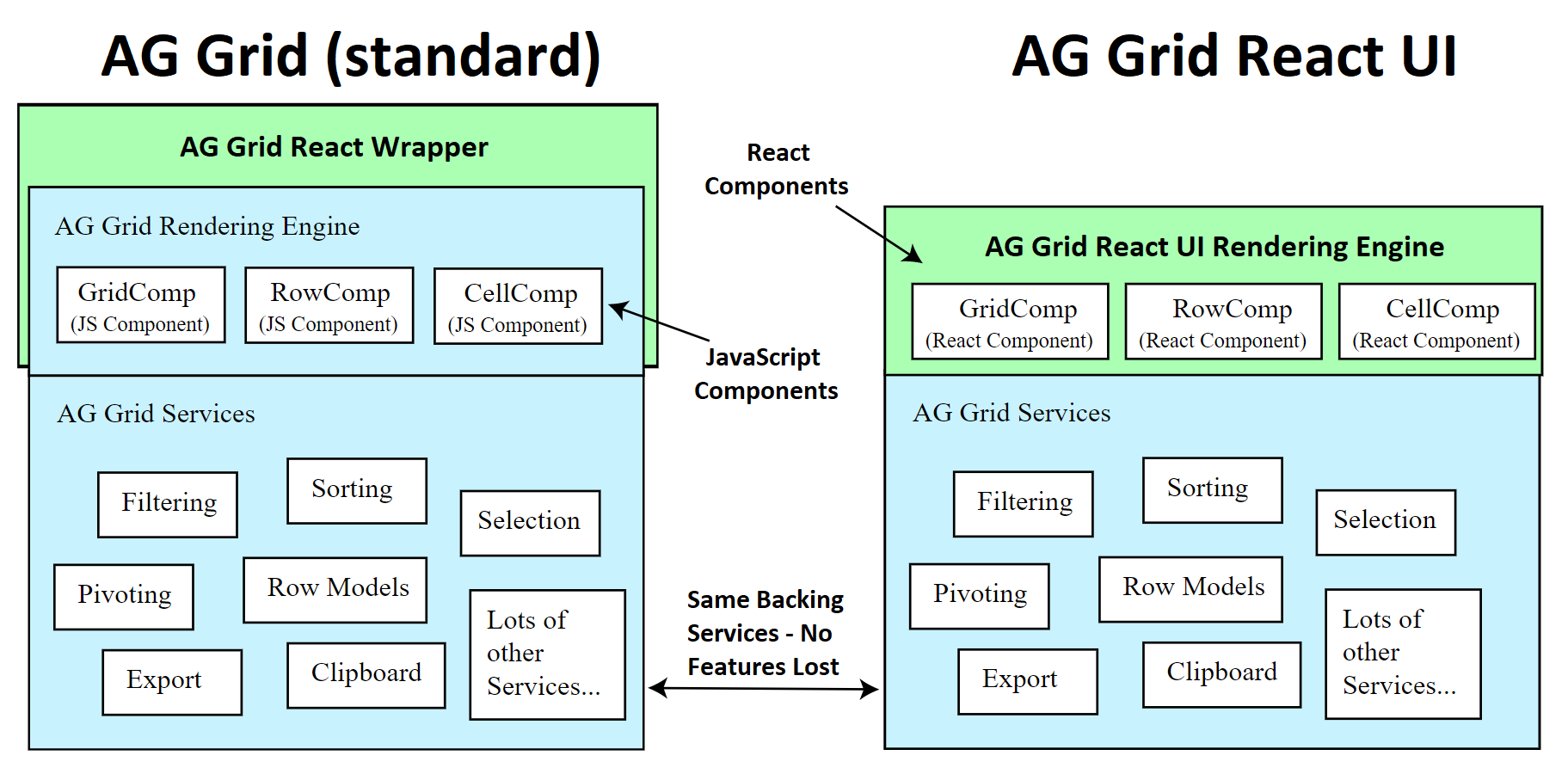
A large portion of the AG Grid UI is now written in React. We will be working on making the rest of the AG Grid UI available in React over time. Learn more about AG Grid for React in our documentation.
Vue 3 Composition API Support & Improved Documentation Samples
As part of AG Grid 26 we now fully support the Vue 3 Composition API. We’ve also improved our documentation so that all examples are now in Vue 3 (alongside Vue 2). You can display any documentation example in Vue 3 using the dropdown just above the example.
This will make it easier for you to see how to use AG Grid with Vue 3.
Updated API Typing Information
We've updated the typing for all grid API and column API members providing the names of specific parameter types, return types and default values. This API typing information is now fully available in our API documentation, making it easy to reference and use.
This improves the developer experience not only making you more productive but also reducing the risk for bugs in your code.
Angular Typing Information
AG Grid is now fully typed for Angular users - this will make it easier to use auto-complete & the Angular Language Service, which in turn should improve your productivity!
Row Grouping Updates
We've rebuilt the documentation and API related to row grouping to better document how to work with grouping scenarios. The new row grouping documentation is much easier to work with, covers more scenarios and includes new samples.
We've also introduced new functionality related to row grouping.
Sort on non-grouped columns keeping the existing group order
You can now sort on non-grouping columns maintaining the existing group order. This is available with a new property that's documented and illustrated here.
Easily sort on multiple group columns
Comparators defined on columns are now automatically used to sort these columns when grouped. Please see this documented and illustrated here.
Customize the appearance of the group footer row
You can now set a custom cell renderer to be used for group footer rows. This allows you to customize the content displayed in the footer row. See this documented and illustrated here.
User Experience Enhancements
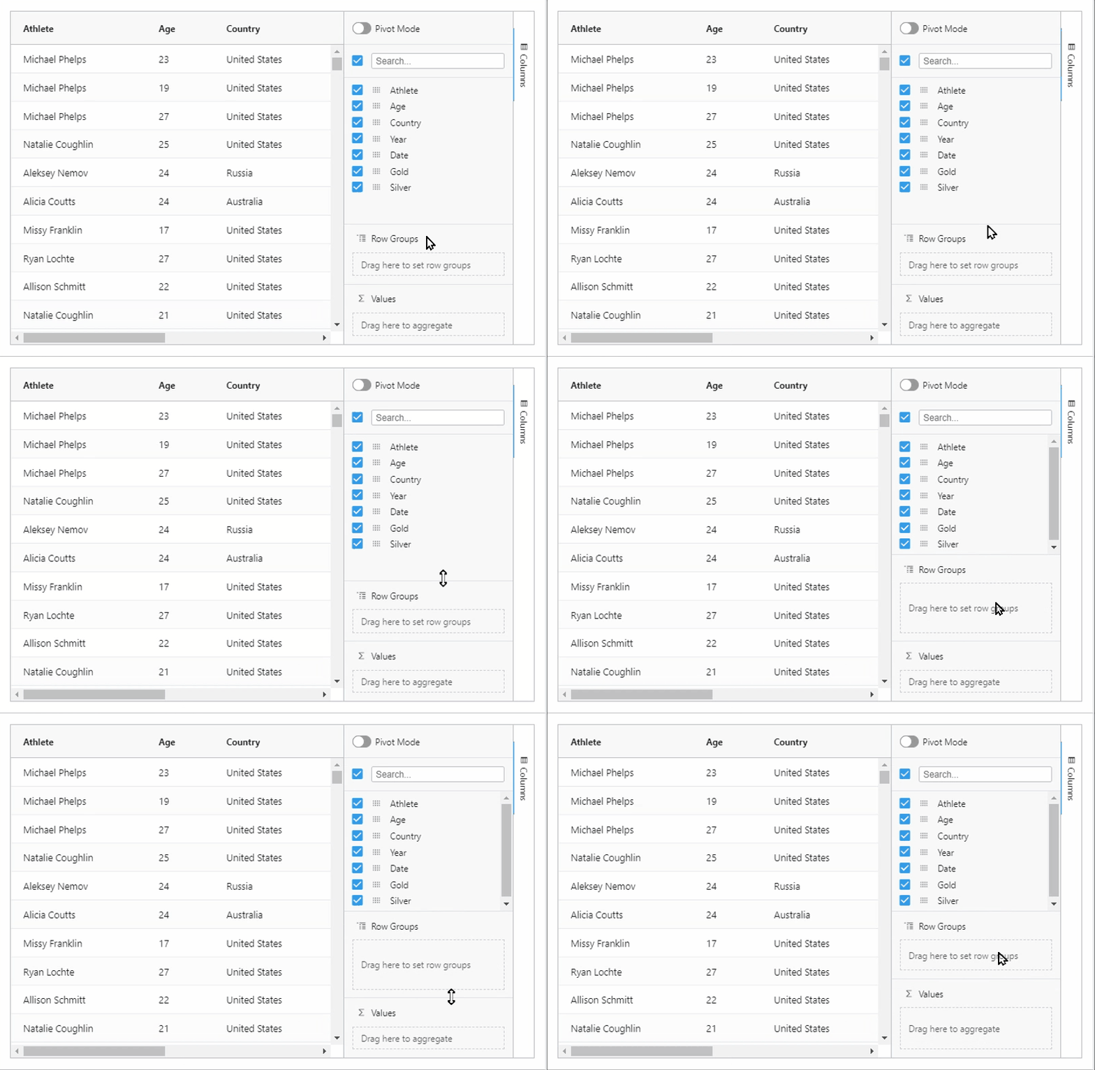
Resizable Column Tool Panels
Users can now resize the different panels inside the column tool panel. This will make it easier to use many columns in the row groups, columns and values panels.
Resizable Set filter popup
Users can now resize the set filter popup to fully fit longer values. This is now standard functionality that will make it easier to work with a variety of data, as shown below.

Set min/max width of the tool panels
You can now set min/max/initial width of tool panels as shown below, creating a better user experience, as shown below. Please see this documented and illustrated here.
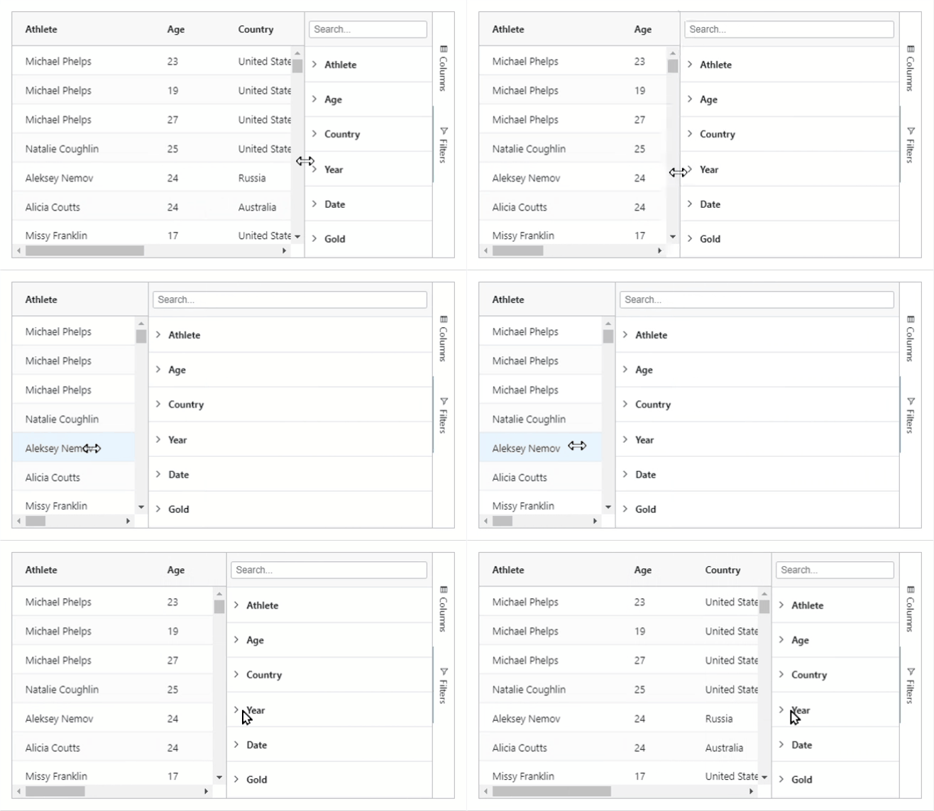
Chart Series Marker Labels
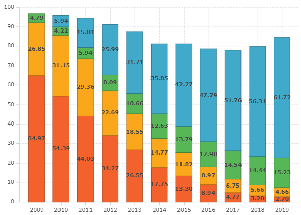
In AG Grid 26, the chart adds series marker labels for line, area, column, bubble and scatter series. See the image below showing marker labels for a stacked column chart.
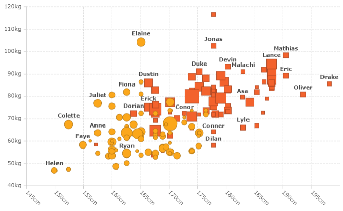
The bubble and scatter charts have label anti-collision logic ensuring a user-friendly rendering of your data, as shown below:
AG Grid 26 - a Long-Term Support Release
AG Grid 26 will be the last major release to support Internet Explorer 11 and Polymer, Angular 7, AngularJS. We're making this change to respond to the current popularity level of these frameworks and Microsoft's own decision to end support for Internet Explorer 11 in June 2022.
We are aware that many of you are relying on Internet Explorer 11 and/or AngularJS and Angular 7 for your applications. This is why we have designated AG Grid 26 as а long-term support (LTS) release.
If you have any issues specifically with Polymer, Angular 7, AngularJS or Internet Explorer 11 in AG Grid 26 please report them and we will release new minor versions of AG Grid 26 to address these.
This will allow you to continue using AG Grid 26 (and its minor versions) in order to support the above environments.
Summary
The above highlights list only some of the many improvements we’ve made as part of AG Grid 26. These improvements are a compelling reason to upgrade, so you can benefit from the improved developer productivity and deliver a better user experience to end-users.
As always, we’re keen to help you upgrade and to hear your feedback.
Happy coding!
