
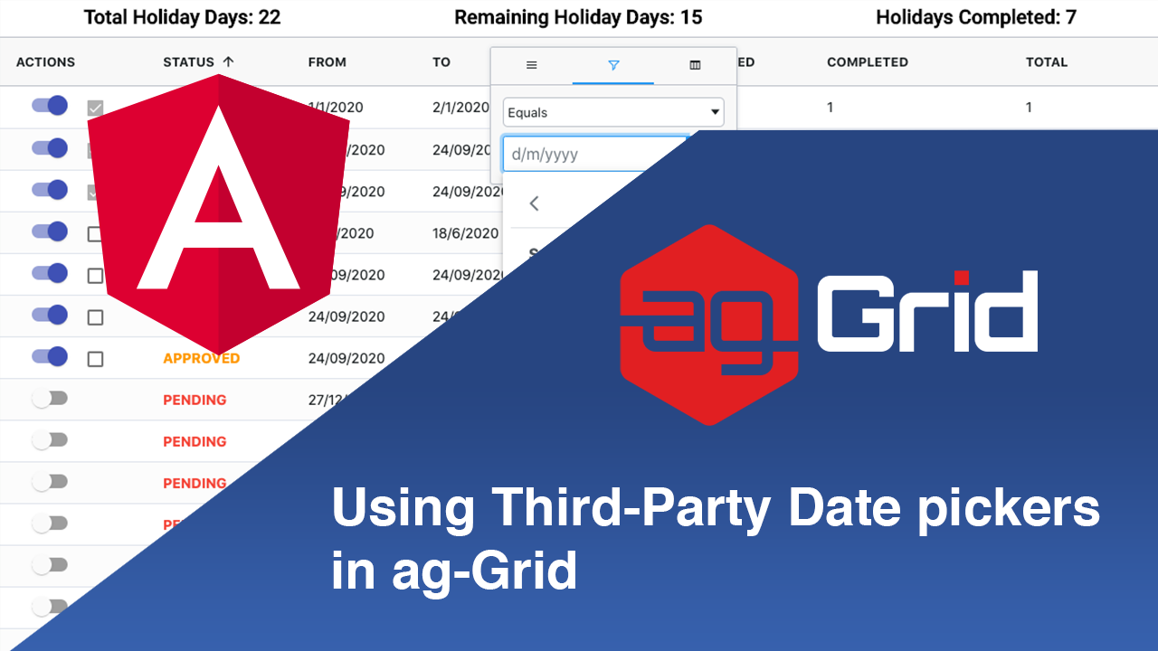
In this post I'll show you how to add third-party date pickers to ag-Grid to allow your users to easily filter and edit dates using a powerful date picker. Hopefully by the end of this blog you'll be an expert in working with date pickers in ag-Grid!
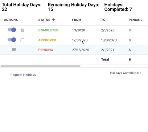
In order to illustrate this, we've created an Angular application using the PrimeNG Calendar date picker to track the amount of holidays taken. Please see the date picker illustrated in the GIF below:
Live demo
Please see the live demo below - click inside the FROM and TO column filters or cells to open the date picker. You can see the Angular demo code in Stackblitz here, and get the full github project here.
We'll be looking at:
- Using the date picker for filtering
- Using the date picker for editing
- Using aggregations
- Using Cell Class Rules to style cells based on data
Using the date picker for filtering
To use our date picker for filtering, first we have to register the component, which ag-Grid will use every time the user filters a column. You can see how to register custom date components in our documentation.
After the date component is registered, we can define our date picker:
<p-calendar
  [(ngModel)]="date"
  [panelStyleClass]="'ag-custom-component-popup'"
  [appendTo]="'body'"
  [placeholder]="'d/m/yyyy'"
  dateFormat="d/m/yy"
  [showIcon]="true"
  [monthNavigator]="true"
  [showButtonBar]="true"
  (onSelect)="onSelect($event)"
  (onClearClick)="onClearClick($event)"
  (onInput)="onInput($event)"
></p-calendar>appendTo and panelStyleClass which are paramount to understand when using date pickers in any framework.💡 To learn more about the configrations for the date picker, visit the API for the component here
Configuring date picker appearance
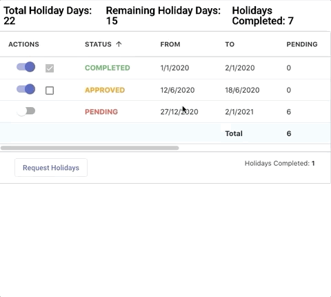
When hosting a date picker, they are often clipped by the container. In this case, you can see below the date picker is clipped by the column menu popup.
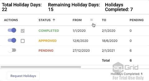
You solve this issue by setting the popup element to the document body (or any HTML DOM element, if you like). Here, we achieve this by simply adding [appendTo]="'body'" to the component. This allows the date picker to fully render itself.
Handling mouse clicks on the date picker
Since our date picker has a popup element outside of the parent filter, when you click on it the grid will think you clicked outside of the filter and close the column menu, as shown below:
One way to get around this problem is to add the ag-custom-component-popup CSS class to the popup, which we've set by adding [panelStyleClass]="'ag-custom-component-popup'". This allows you to correctly handle clicks inside the date picker as shown below:
With these changes, our date picker is now fully functional as a column filter editor.
Using the date picker for editing
To enable cell editing with our date picker, first we have to register it as a cell editor component. You can see how to do that in our documentation.
Implementing the Cell Editor Component
Once the component is registered, we can start implementing the Cell Editor:
<p-calendar
  #container
  [(ngModel)]="value"
  [appendTo]="'body'"
  [style]="{ height: '100%', width: '100%' }"
  [inputStyle]="{ height: '100%', width: '100%' }"
  [monthNavigator]="true"
  yearRange="2015:2025"
  dateFormat="d/m/yy"
  (onSelect)="onSelect($event)"
  ></p-calendar>
As mentioned in the previous section, we won't be going into each of these property bindings, as they are mainly for visual purposes. It's important to note we're using [appendTo]="'body'" to ensure the popup renders correctly.
And now to implement the logic for the editor!
export class PrimeCellEditorComponent
  implements AgEditorComponent, AfterViewInit {
  params: any;
  value: Date;

  @ViewChild('container', { static: true }) public container;

  agInit(params: any): void {
    this.params = params;

    if (this.params.value) {
      const dateArray = this.params.value.split('/');

      const day = parseInt(dateArray[0]);
      const month = parseInt(dateArray[1]);
      const year = parseInt(dateArray[2]);

      this.value = new Date(year, month - 1, day);
    }
  }

  // open the calendar when grid enters edit mode, i.e. the datepicker is rendered
  ngAfterViewInit() {
    this.container.toggle();
  }

  // ensures that once a date is selected, the grid will exit edit mode and take the new date
  // otherwise, to exit edit mode after a selecting a date, click on another cell or press enter
  onSelect(event) {
    this.params.api.stopEditing(false);
  }

  getValue() {
    const d = this.value;
    return `${d.getDate()}/${d.getMonth() + 1}/${d.getFullYear()}`;
  }
}
As you can see, it is a simple component which implements agInit and getValue. These methods are required for the cell editor to work in ag-Grid. You can find out more about these methods here.
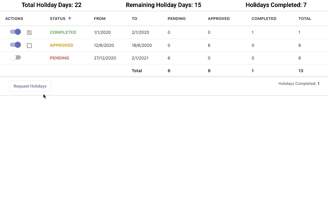
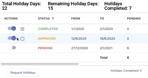
Using aggregations
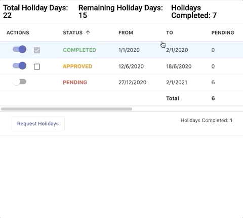
We are also taking advantage of the grid's aggregation feature to compute the sum of the Pending, Approved, Completed and Total columns:
This is achieved by simply adding the aggFunc to the columns we want to aggregate by. In this case, we want to add a sum aggregation across the columns by adding aggFunc:'sum':
//  [...]
  {
    field: 'totalPending',
    aggFunc: 'sum',
    valueGetter: totalPendingValueGetter,
  },
  {
    headerName: 'APPROVED',
    field: 'totalApproved',
    aggFunc: 'sum',
    valueGetter: totalApprovedValueGetter,
  },
  {
    headerName: 'COMPLETED',
    field: 'totalCompleted',
    aggFunc: 'sum',
    valueGetter: totalCompletedValueGetter,
  },
  {
    headerName: 'TOTAL',
    field: 'total',
    aggFunc: 'sum',

    valueGetter: (params) =>
      !params.node.footer
        ? params.getValue('totalPending') +
          params.getValue('totalApproved') +
          params.getValue('totalCompleted')
        : false,
  },
Since we are not grouping, we can instead show the aggregations by adding a row at the bottom of the grid by enabling the grid property groupIncludeTotalFooter :
<ag-grid-angular
  // [...]
  [groupIncludeTotalFooter]="true">
</ag-grid-angular>
Using Cell Class Rules to style cells based on data
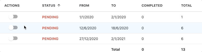
In order to clearly indicate the status of a request, cell style changes when the Status column data is updated. As you can see, in the following gif, the values for the status are COMPLETED, APPROVED and PENDING which have a green, orange and red colour scheme:
This can be achieved using the Cell-Class Rules feature. We simply provide a CSS class to be applied based on a condition, as described in our documentation. See this approach illustrated below:
{
 // [...]
    field: 'status',
    cellClassRules: {
      'status-completed': function (params) {
        if (!params.node.footer) {
          return params.data.status == 'COMPLETED';
        }
      },
      'status-pending': function (params) {
        if (!params.node.footer) {
          return params.data.status == 'PENDING';
        }
      },
      'status-approved': function (params) {
        if (!params.node.footer) {
          return params.data.status == 'APPROVED';
        }
      },
    },
  },
Then in our CSS file, we add the styling for the classes:
.status-approved {
  color: #ff9800 !important;
  font-weight: bold;
}
.status-pending {
  color: #f44336 !important;
  font-weight: bold;
}
.status-completed {
  color: #4caf50 !important;
  font-weight: bold;
}
This way the cells are styled conditionally based on their value, delivering a much easier to use UI.
Summary
We hope this post has shown how to easily add third-party date pickers to the grid. Although the framework used here is Angular, the concepts remain the same and you can use other frameworks to integrate date pickers in ag-Grid. This will enable your users to filter and edit date values in ag-Grid using any of the powerful date pickers available.
If you would like to try out ag-Grid check out our getting started guides (JS / React / Angular / Vue)
Happy coding!