

In this post we will look at performing CRUD operations in ag-Grid while keeping our row data and column definitions inside an NgRx store. We hope you'll see how easy it is to integrate ag-Grid with Angular and NgRx!
We've built a sample to illustrate this - please see it in action below:
Live Demo
The live demo shows the store data and column definitions below the grid so you can see these are updated in response to changes you're making in ag-Grid.
Please see the live demo with source code below:
Contents
- Editing cells
- Deleting rows
- Adding rows
- Setting rows as read-only
- Styling disabled rows
- Loading column definitions from NgRx store
Editing cells
By default, when a user edits a cell ag-Grid will update its internal state but not automatically update the associated NgRx store. This requires you to explicitly update the external store with the edits done in ag-Grid.
There's two steps in the process:
(1) Suppress the built-in ag-Grid editing behavior
(2) Dispatch an action that updates the store
This approach can be easily implemented using a valueSetter, which allows you to set the values in the grid. By defining our own valueSetter we can essentially suppress the default editing logic and instead dispatch an action that updates the NgRx store. Once the NgRx store is updated, it will automatically update the cell value in ag-Grid.
Please see the code below:
  defaultColDef: any = {
    valueSetter: (params) => {
      let newVal = params.newValue;
      this.store.dispatch(new UpdateRow(nodeId, colId, newVal));
      return false;
    },
  };
You can learn more about valueSetters in the ag-Grid documentation.
Deleting rows
In our sample we have a Delete button in each of our rows. The button is rendered with the help of a cellRenderer which gets passed a params object with the data for that row. We implement row deletion by listening to the click event and dispatching an action to the NgRx store with the id as its payload. You then need to use the reducer with this id to delete the row in the NgRx store.
Please see this implementation in the code below:
@Component({
  selector: 'app-editable-cell-renderer',
  template: `
    <div class="actions-container" >
      <div  *ngIf="!isGroupNode">
      	//[...] some code is removed for simplicity here

        <button
          type="button"
          color="primary"
          mat-stroked-button
          color="warn"
          (click)="onDeleteRow($event)"
          >
          Delete
        </button>
      <div>
    </div>
  `,
  styleUrls: ['./editable-cell-renderer.component.scss']
})
export class EditableCellRendererComponent implements OnInit {
  //[...] some code is removed for simplicity here

  onDeleteRow() {
    this.params.deleteRow(this.params.node.data.id);
  }
}
Here is an example of a reducer for deleting a row:
function deleteRow(state, action) {
  const nodeIdToRemove = action.payload;
  const filteredData = state.rowData.filter(node => node.id !== nodeIdToRemove);
  return {
    ...state,
    rowData: [
      ...filteredData
    ]
  };
Adding rows
To add a new row we simply need to update the row data in our NgRx store.
In our live demo we implement this with an Add Menu Item button that listens to a click event and dispatches the following action with some hard-coded data as shown in the code below:
  onAddRow() {
    this.store.dispatch(new AddRowAction({
      id: uuid(),
      name: 'product',
      quantity: 0,
      price: 0,
      editable: true,
    }));
  }
Setting rows as read-only
Some of the rows in our data are read-only and cannot be edited. This is indicated by the editable property on the row data telling the grid whether to allow a row to be edited.
To make specific rows editable you can provide an editable callback to your column definition and update the store accordingly.
Similar to deleting rows we will use the same cellRenderer to render an additional button that will dispatch an action to update the editable property in our store.
Please see this illustrated in the code below which includes both the Editable and Delete buttons:
@Component({
  selector: 'app-editable-cell-renderer',
  template: `
    <div class="actions-container" >
      <div  *ngIf="!isGroupNode">
        <button
        mat-stroked-button
        (click)="onToggleEditable($event)">
        {{buttonEditableText}}
        </button>


        <button
          type="button"
          color="primary"
          mat-stroked-button
          color="warn"
          (click)="onDeleteRow($event)"
          >
          Delete
        </button>
      <div>
    </div>
  `,
  styleUrls: ['./editable-cell-renderer.component.scss']
})
export class EditableCellRendererComponent implements OnInit {
  params: any;
  buttonEditableText;
  isGroupNode: boolean;


  agInit(params: any): void {
    this.params = params;
    this.isGroupNode = params.node.group;
    if (!this.isGroupNode) { this.buttonEditableText = params.node.data.editable === true ? 'disable' : 'enable'; }
  }


  onToggleEditable() {
    this.params.toggleEditable(this.params.node.data.id);
  }

  onDeleteRow() {
    this.params.deleteRow(this.params.node.data.id);
  }
}
You can learn more about editable cells, cellRenderers in ag-Grid in our documentation on Cell Renderers, and Cell Editing.
Styling disabled rows
We can reuse the editable metadata property to style our rows accordingly. ag-Grid provides a mechanism for this called getRowStyle. This is a callback which receives a params object that holds all the data about a specific node. Based on the editable meta data we provide an object that holds the appropriate CSS styles.
Please see this in the code below:
gridOptions {
 //[...] some code is removed for simplicity here
 getRowStyle(params) {
    if (!params.node.group) {
      if (!params.node.data.editable) {
        return {
          background: 'rgba(111,111,111,0.12)',
        };
      }

      return {
        background: 'white',
      };
    }
  }
}
You can learn more about styling ag-Grid rows/cells here - Styling Rows, Styling Cells.
Loading column definitions from NgRx store
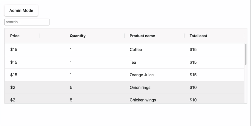
In addition to changing row data in the NgRx store, you can also load the column configuration from the store. In our example we have a button that lets you switch between Admin mode and Customer mode to display a different set of columns. This demonstrates how you can change ag-Grid columns on the fly.
In order to implement this, we have two sets of column definitions in our reducer and corresponding actions to load these.
We dispatch loadAdminColumnDefs and loadCustomerColumnDefs actions to load the column definitions. The handling of these actions happens in the reducer, with the action payload holding a reference to the Angular ag-Grid component.
Our reducer looks like this:
function loadAdminColumnDefs(state, action) {
    const component = action.payload;
    return {
        ...state,
        columnDefs: ADMIN_COLS(component)
    };
}

function loadCustumerAdminColumnDefs(state, action) {
    const component = action.payload;
    return {
        ...state,
        columnDefs: CUSTUMER_COLS(component)
    };
}
The Admin columns are defined like this (receiving the ag-Grid component as a parameter):
function ADMIN_COLS(comp) {
  return [
      {
          headerCheckboxSelection: true,
          checkboxSelection: true,
          colId: 'editable',
          width: 250,
          headerName: 'actions',
          cellRenderer: 'editableCellRendererComponent',
          cellRendererParams: {
              toggleEditable: comp.onToggleEditable.bind(comp),
              deleteRow: comp.onDeleteRow.bind(comp),
          },
          field: 'editable',
          hide: false,
      },
      {
          colId: 'price',
          headerName: 'price',
          field: 'price',
          valueFormatter: comp.currencyFormatter,
          editable: comp.editable,
      },
      {
          colId: 'quantity',
          headerName: 'quantity',
          field: 'quantity',
          editable: comp.editable,

      },
      {
          colId: 'category',
          headerName: 'category',
          field: 'category',
          enableRowGroup: true,
          cellEditor: 'agSelectCellEditor',
          cellEditorParams: { values: ['drink', 'starter', 'main', 'desert'] },
          editable: comp.editable,
          rowGroup: comp.groupByCategory,
          hide: false

      },
      {
          colId: 'id',
          headerName: 'id',
          field: 'id',
          hide: true,
      },
      {
          colId: 'name',
          headerName: 'name',
          field: 'name',
          editable: comp.editable,
      },

      {

          colId: 'total',
          headerName: 'total',
          aggFunc: 'sum',
          valueFormatter: comp.currencyFormatter,
          valueGetter: (params) => {
              if (!params.node.group) { return params.data.quantity * params.data.price; }
              return params.value;
          }
      },
  ];
}
The Customer columns are defined in the code below (receiving the ag-Grid component as a parameter):
function CUSTUMER_COLS(comp) {
  return [
    {
      colId: 'editable',
      width: 250,
      headerName: 'actions',
      cellRenderer: 'editableCellRendererComponent',
      cellRendererParams: {
        toggleEditable: comp.onToggleEditable.bind(comp),
        deleteRow: comp.onDeleteRow.bind(comp)
      },
      field: 'editable',
      hide: true,
    },
    {
      colId: 'price',
      headerName: 'price',
      field: 'price',
      valueFormatter: comp.currencyFormatter,
      editable: comp.editable,
    },

    {
      colId: 'quantity',
      headerName: 'quantity',
      field: 'quantity',
      editable: comp.editable,
    },
    {
      colId: 'category',
      headerName: 'category',
      field: 'category',
      enableRowGroup: true,
      hide: true,
      rowGroup: comp.groupByCategory
    },

    {
      colId: 'id',
      headerName: 'id',
      field: 'id',
      hide: true,
    },
    {
      colId: 'name',
      headerName: 'name',
      field: 'name',
      editable: comp.editable,
    },
    {
      colId: 'total',
      headerName: 'total',
      aggFunc: 'sum',
      valueFormatter: comp.currencyFormatter,
      valueGetter: (params) => {
        if (!params.node.group) { return params.data.quantity * params.data.price; }
        return params.value;
      }
    },
  ];
}
This will allow you to easily store your column definitions in the NgRx store and allow the user to switch between them at runtime.
You can learn more about how to work with columns in ag-Grid in our documentation on column definitions.
What's next?
In this blogpost, I've demonstrated how easy it is to integrate ag-Grid with NgRx. I hope this helps you take advantage of all the advanced functionality that using NgRx can bring to your application.
Please check out our other blog posts and documentation for a great variety of usage scenarios you can implement with ag-Grid.
If you would like to try out ag-Grid check out our getting started guides (JS / React / Angular / Vue)
Happy coding!