Blog post contributed to the AG Grid blog by Cameron Pavey.
Standard tables are not typically adequate when working with lots of data in complex web applications, which is where data grids come in. Data grids are similar to tables in that they present tabular data, but they tend to have advanced functionality and interactivity, such as sorting and filtering. One such data grid is the offering from AG Grid. AG Grid offers a powerful grid that works with vanilla JavaScript and Angular, React, and Vue. In this tutorial, you will learn about some of AG Grid’s styling features. AG Grid offers three different approaches for applying CSS styles, and this tutorial will touch on each of these.
Styling AG Grid With Custom CSS Styles
To best illustrate the different approaches for styling, having a common frame of reference will be beneficial. To this end, all three examples will be based on the same scenario: you have a list of student names, and each student is enrolled in five courses. For each course, each student has a grade between 0 and 100, inclusive, with higher scores being better. This scenario will serve as the basis for the examples that follow.
AG Grid offers three different approaches for applying Custom CSS styles. These approaches are:
- Cell / Row Styles
- Cell / Row Classes
- Cell / Row Class Rules
This tutorial will cover all three methods, each of which is useful in specific situations.
Prerequisites
Before getting started, there are a few things you will need:
- A recent version of Node.js and npm. Refer to the official site for installation instructions for your operating system.
- A code editor of your choice. VS Code is a good choice if you do not have a preference.
You can find all of the code in this tutorial in this GitHub repo if you want to look through it. Otherwise, you can follow along to achieve the same outcome.
Initial Setup
The easiest way to get started with custom styles for AG Grid React is to set up a minimalist React application and try it for yourself. Once you have Node and npm installed, you should also have the npx utility. You can use this to create a starter React application:
npx create-react-app ag-grid-custom-styles
Once this command finishes running, you should have a new directory called ag-grid-custom-styles/. Open this directory with your code editor.
Next, you will need to install Faker, which you can use to generate some realistic dummy data, and the dependencies for AG Grid itself. To do this, run the following commands in your terminal:
npm install ag-grid-react ag-grid-community
npm install @faker-js/faker --save-dev
You're almost ready to start coding when this command finishes running. The create-react-app helper includes many files that you don’t need for this tutorial, so to keep things clean, delete everything in the src/ directory and create a new index.js file. You can do this with the following commands:
rm src/*
touch src/index.js
After this, open the new index.js file in your code editor, and enter the following content:
import React, { useState } from 'react';
import { render } from 'react-dom';
import { AgGridReact } from 'ag-grid-react';

import { faker } from '@faker-js/faker';

import 'ag-grid-community/dist/styles/ag-grid.css';
import 'ag-grid-community/dist/styles/ag-theme-alpine.css';

const generateGrade = () => faker.datatype.number({ min: 0, max: 100 });

const makeData = (rowsToMake) => {
	let data = [];

	for (let index = 0; index < rowsToMake; index++) {
    	data.push({
        	name: faker.name.findName(),
        	ag101: generateGrade(),
        	ag102: generateGrade(),
        	ag103: generateGrade(),
        	ag104: generateGrade(),
        	ag105: generateGrade(),
    	})
	}

	return data;
};

const App = () => {
   const [rowData] = useState(() => makeData(15));

   const [columnDefs] = useState([
   	{ field: 'name' },
   	{ field: 'ag101' },
   	{ field: 'ag102' },
   	{ field: 'ag103' },
   	{ field: 'ag104' },
   	{ field: 'ag105' },
   ])

   return (
   	<div className="ag-theme-alpine" style={{ height: 600 }}>
       	<AgGridReact
           	rowData={rowData}
           	columnDefs={columnDefs}>
       	</AgGridReact>
   	</div>
   );
};

render(<App />, document.getElementById('root'));
This will serve as the relatively unstyled foundation for you to build upon. In this code, Faker is used to generate some realistic data to suit the scenario described above. You can see how this looks in the browser by running the following command in your terminal:
npm run start
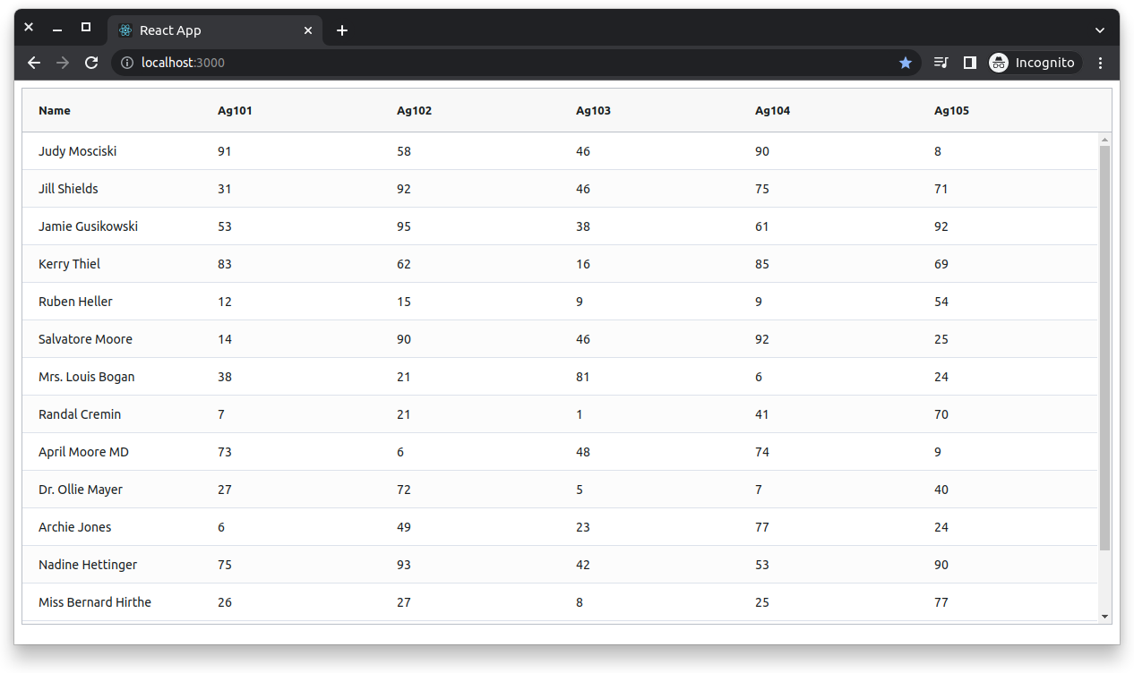
This should open a new tab in your browser, typically pointing to http://localhost:3000/. Once the tab loads, you should see something like this:

If you do, you can move on to applying custom styling.
Cell and Row Styles
The first method is applying style objects directly to rows and cells. Suppose you wanted all of the “Name” cells to be bolded. You could do this with cell styles by modifying your columnDefs state as follows:
  const [columnDefs] = useState([
   	{ field: 'name', cellStyle: { 'fontWeight': 'bold' } },
   	{ field: 'ag101' },
   	{ field: 'ag102' },
   	{ field: 'ag103' },
   	{ field: 'ag104' },
   	{ field: 'ag105' },
   ])
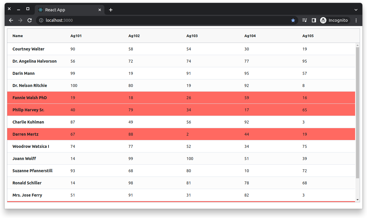
If you save your changes and look at the browser, you should see that all of the names are now bolded. You can also apply ad hoc styles like this to entire rows. This is done by defining a getRowStyles function and passing it to the AgGridReact component. This function will receive each row and can return a style object, if no styles are available, or undefined. To see how this works, suppose you want to color rows where the average score across all five classes is less than fifty percent of the potential top score. To do this, modify index.js to add the following function inside the component and pass it to the return value as a prop:
…
const getRowStyle = (params) => {
	const data = { ...params.data };
	delete data.name; // remove the name, as it is irrelevant
	const dataKeys = Object.keys(data);
	const totalGrade = dataKeys.reduce((total, key) => {
  	return total + data[key];
	}, 0);
	const averageGrade = totalGrade / dataKeys.length;

	const threshold = 50;
	if (averageGrade < threshold) {
  	return { background: "#ff7979" };
	}

	return undefined;
  };

  return (
	<div className="ag-theme-alpine" style={{ height: 600 }}>
  	<AgGridReact
    	rowData={rowData}
    	columnDefs={columnDefs}
    	getRowStyle={getRowStyle}
  	></AgGridReact>
	</div>
  );
After both of these changes, the output should now look something like this. Note the bolded names and the highlighted rows.

This approach could technically work for whatever customizations you need to make, but it is not necessarily ideal. Just like when using CSS for other applications, using inline styles like this is generally avoided in favor of using CSS classes. Styles can be useful if you need to quickly change a single property or two, but classes tend to lead to an overall cleaner and more maintainable codebase. Fortunately, AG Grid also allows you to apply classes in place of inline styles.
Cell and Row Classes
One of the great benefits of CSS classes is that they allow you to encapsulate styles for reuse. To demonstrate this in the context of AG Grid, suppose you want to italicize all of the scores. As the scores are spread across five columns, you would have to apply the style to each column definition if you were using inline styles. You still have to apply the class to each column when using classes, but if you decide later that you want to change it from being italicized to being bolded like the title, you'll only have to make one change to the CSS style itself. You will first need to create a new file in the src/ directory to try this for yourself. You can call this styles.css. Once you’ve made this file, give it the following content:
.score-cell {
	font-style: italic;
}
Then, back in index.js, below your other imports, import your new stylesheet, and update your columnDefs to include the new class on each of the “Score” cells:
…
import “./styles.css”;
…
  const [columnDefs] = useState([
	{ field: "name", cellStyle: { fontWeight: "bold" } },
	{ field: "ag101", cellClass: "score-cell" },
	{ field: "ag102", cellClass: "score-cell" },
	{ field: "ag103", cellClass: "score-cell" },
	{ field: "ag104", cellClass: "score-cell" },
	{ field: "ag105", cellClass: "score-cell" },
  ]);
Similar to the previous example with inline styles, you can also add classes to entire rows. You can do this by specifying a class name (or an array of class names) with the rowClass prop, or using the getRowClass prop to create a function that will receive the row, as with the previous example. You can do this now to add additional styling to rows with an average score of at least sixty-five. First, add the following class to styles.css:
.green-row div{
	background-color: #badc58;
}
Next, because the logic for this function will be very similar to the previous function, there is an opportunity to refactor to avoid unnecessary duplication. Above the App component, add the following function:
const getAverageGradeFromParams = (params) => {
	const data = { ...params.data };
	delete data.name; // remove the name, as it is irrelevant
	const dataKeys = Object.keys(data);
	const totalGrade = dataKeys.reduce((total, key) => {
  	return total + data[key];
	}, 0);
	return totalGrade / dataKeys.length;
  };
After this, refactor the App component, replacing the getRowStyle function and return statement with the following code:
const getRowStyle = (params) => {
	const averageGrade = getAverageGradeFromParams(params);

	if (averageGrade < 50) {
  	return { background: "#ff6961" };
	}

	return undefined;
  };

  const getRowClass = (params) => {
	const averageGrade = getAverageGradeFromParams(params);

	if (averageGrade >= 65) {
  	return "green-row";
	}
	return undefined;
  };

  return (
	<div className="ag-theme-alpine" style={{ height: 600 }}>
  	<AgGridReact
    	rowData={rowData}
    	columnDefs={columnDefs}
    	getRowStyle={getRowStyle}
    	getRowClass={getRowClass}
  	></AgGridReact>
	</div>
  );
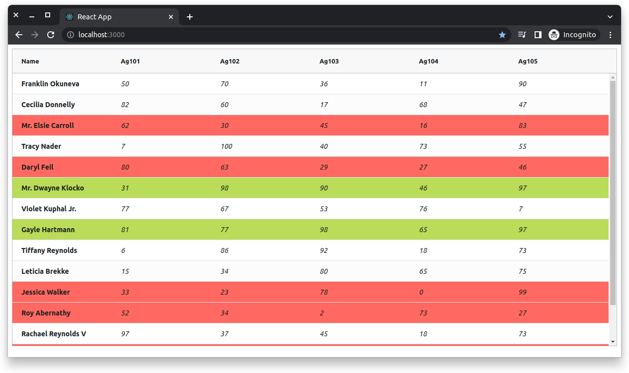
Save your changes and return to the browser. You should now see something like this:

If you don't immediately see that, it's likely that none of the random data meets the threshold of 65 for the green rows. Refreshing to load new data will likely fix it.
Using CSS classes like this is generally a more maintainable way to style your application than inline styles. Classes also allow you to construct more complex styles. In this example, you’ve applied a background color to the row, but nothing stops you from applying more advanced styling if desired.
Cell and Row Class Rules
The third way to apply styles in AG Grid is using class rules. This is essentially a mechanism to specify classes and conditions under which they should be applied. It is conceptually similar to how the current styling is applied by checking a threshold value, but more streamlined and intended for such purposes, rather than just incidentally supporting them. Much like the rest of these styling approaches, you can apply class rules either to rows or cells. For instance, if you wanted to color each “Score” cell’s text either green, orange, or red based on thresholds, you could do so as follows. First, update styles.css again to include the following styles:
.green-text { color: #6ab04c; }
.orange-text { color: #f0932b; }
.red-text { color: #eb4d4b; }
Next, replace the block of code where columnDefs is defined with the following:
const cellClassRules = {
	"green-text": (params) => params.value >= 75,
	"orange-text": (params) => params.value <= 45,
	"red-text": (params) => params.value <= 25,
  };

  const [columnDefs] = useState([
	{ field: "name", cellStyle: { fontWeight: "bold" } },
	{ field: "ag101", cellClass: "score-cell", cellClassRules },
	{ field: "ag102", cellClass: "score-cell", cellClassRules },
	{ field: "ag103", cellClass: "score-cell", cellClassRules },
	{ field: "ag104", cellClass: "score-cell", cellClassRules },
	{ field: "ag105", cellClass: "score-cell", cellClassRules },
  ]);
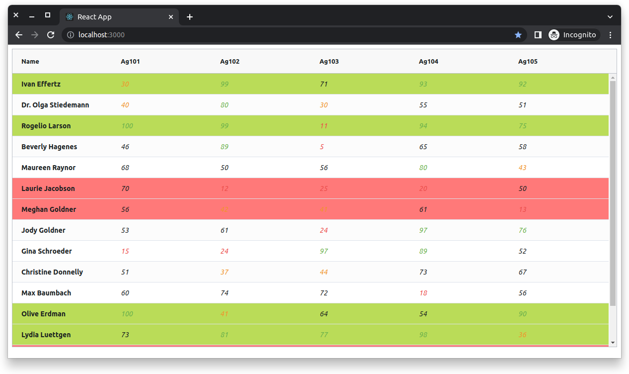
Now each score cell should have conditionally colored text if they fall into any of these brackets. Save your code and return to the browser. You should now see something like this:

This is perhaps a bit garish as far as styles and color choices go, but it does well to illustrate the different mechanisms available to you when it comes to styling in AG Grid.
In most cases, you likely wouldn't need to use all of these methods together. For example, the logic that you implemented with getRowStyle and getRowClass could also have been done with rowClassRules, and probably would have resulted in cleaner code. In a real codebase, it's important to consider which mechanism makes the most sense for you in the given circumstances. Still, it is equally important to be familiar with all of the options available to you so you're able to make an educated decision when the time comes.
Wrapping Up
In this article, you have seen the different ways you can apply styles to your data grids using AG Grid React. In addition to the extensive styling possibilities for your data grids, AG React also offers an impressive array of features. They offer a robust demo, or give it a try yourself with their free community version and five-minute quick-start guide.