
AG Grid 34.2 introduces more flexible ways to structure and explore data, smoother interactions for large datasets, and UI enhancements that provide clearer feedback and a more familiar workflow:
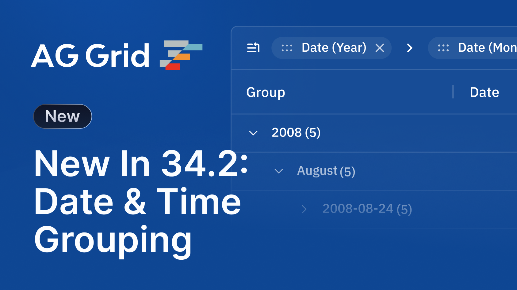
- Date & Time Grouping - Define custom grouping hierarchy based on parts of a date, e.g day, week, month, year, quarter, etc...
- Tool Panels Outside of the Grid - Display Tool Panels outside of the grid, in a container controlled by your application.
- Expand / Collapse All Group Rows in SSRM - Set expansion state for all row groups, including those not yet loaded on the client-side.
- Clipboard Improvements - Support for paste via the context menu, and pasting copied cell ranges into smaller/larger cell ranges.
- Row Dragging Improvements - Automatically display a customisable "Not Allowed" icon when the current row dragging position is invalid.
Date & Time Grouping
Row Grouping now supports grouping of date values at hierarchical levels (e.g. day, week, month, year, quarter) for date-type columns.
The grid provides built-in support for several components of a date/time value, which can be used with the rowGroupingHierarchy column property. You can also define custom grouping hierarchies via the groupHierarchyConfig Grid Option.
const [columnDefs, setColumnDefs] = useState([
    {
        field: 'date',
        rowGroup: true,
        rowGroupingHierarchy: ['year', 'month'] // Built-in
    },
    // ...other column definitions
]);

// Custom Grouping Definitions
const groupHierarchyConfig = useMemo(() => {
  return {
    week: {
      headerValueGetter: (params) => { /* Grouping Definiton */ },
      valueGetter: (params) => { /* Grouping Definiton */ }
    }
  }
});

<AgGridReact
  columnDefs={columnDefs}
  groupHierarchyConfig={groupHierarchyConfig}
/>
This feature provides users with more flexibility to group date values in ways that match their needs:
Tool Panels Outside of the Grid
By default, Tool Panels are rendered inside the Side Bar. In AG Grid 34.2, you can now render Tool Panels outside of the grid, for example inside a pop-up window or in a separate section of your UI.
The parent property controls where the tool panel is rendered; the Popup Parent property must also be set to an element that contains both the Tool Panel parent and the grid, e.g. the <body>:
const columnsToolPanel = useMemo(() => {
  return {
    parent: popupContentRef.current, // Define tool panel container
    ...
  };
}, [popupContentRef.current]);

return (
  <AgGridReact
    // Element that contains the tool panel's container & the grid
    popupParent={document.body}
    ...
  />

  /* Div to display the Column Tool Panel in */
  <div id="popup" ref={popupRef}>...</div>
);
This makes it easier for users to access and work with panels without losing screen space or disrupting the main grid view, especially when using smaller grids:
Expand/Collapse All Groups in SSRM
The Server-Side Row Model (SSRM) now supports expanding & collapsing of all groups, including those not yet loaded on the client-side.
Loaded group rows can be expanded or collapsed using the expandAll() and collapseAll() grid API's. To expand/collapse all row groups, including those not yet loaded, set ssrmExpandAllAffectsAllRows to true in your grid options:
const onExpandAll = useCallback(() => {
  gridRef.current!.api.expandAll();
}, []);

const onCollapseAll = useCallback(() => {
  gridRef.current!.api.collapseAll();
}, []);

<AgGridReact
  ssrmExpandAllAffectsAllRows={true}
  ...
/>
This feature provides a smoother user experience when navigating through large, grouped data sets:
Clipboard Improvements
AG Grid 34.2 now allows the pasting of copied cell ranges into both smaller and larger cell ranges. If the selected cell range being pasted is larger than the copied range, it will repeat if it fits evenly, otherwise, it will copy the cells into the start of the range, just like Excel.
We've also made multiple enhancements to Clipboard operations, including:
- Improved performance when selecting & copying a cell range across many rows whilst using the Server-Side Row Model (SSRM).
- Pasting via the "Paste" item in the context menu.
This functionality is enabled by default and doesn't require any configuration.
By closely matching the behaviour found in Excel, AG Grid provides users with a familiar, smooth experience when performing clipboard operations.
Row Dragging Improvements
The isRowValidDropPosition callback is now called when using unmanaged row dragging. This allows clearly showing the end-user when a drop location is invalid in custom row dragging implementations.
When row dragging and the isRowValidDropPosition returns false, a "Not Allowed" icon is automatically displayed to indicate to the user that the row cannot be dropped at the current position.
This feature is enabled by default once you have implemented the isRowValidDropPosition callback:
const isRowValidDropPosition = useCallback(
  (params: IsRowValidDropPositionParams) => {
    // Only allow dropping on folders
    return params.newParent?.data?.type === "folder";
  },[]
);

<AgGridReact
  isRowValidDropPosition={isRowValidDropPosition}
  ...
/>
The icons that are displayed can also be customised by using the iconOverrides part in the Theming API:
// Create an icon override part
const customIcons = iconOverrides({
  type: 'image',
  mask: true,
  icons: {
    // Override the 'not-allowed' icon
    "not-allowed": { svg: '<svg> ... svg source ...</svg>' },
  }
});

// Use the part in your Theme
const myTheme = themeQuartz.withPart(customIcons);
These icons provide users with immediate feedback and help prevent mistakes, with the option to customise the icon to match your application’s design.
Summary
AG Grid 34.2 adds enhanced date/time grouping, more flexible tool panel placement, expand/collapse for all groups in SSRM, clipboard improvements, and clearer row dragging feedback.
As always, we're here to help you upgrade, and we're keen to hear your feedback. Enterprise customers can contact us via Zendesk; Alternatively, please submit a GitHub issue.
Next Steps
New to AG Grid? Get started in minutes, for free:
Considering AG Grid Enterprise? Request a free two-week trial licence to test your application in production and get direct access to our support team.
Happy coding!