AG Grid 26.2 is a minor release with important improvements to ReactUI rendering mode, column filters, sparklines, Vue3 and accessibility support. In this post, we'll highlight the enhancements that make AG Grid 26.2 an important step forward in terms of new functionality, framework and accessibility support.
As always, you can see the full list of changes in AG Grid 26.2 in our recently updated changelog page.
ReactUI Supports All AG Grid UI Elements
As part of AG Grid 26 we released a new rendering engine that is written purely in React. Using this ReactUI rendering mode improves rendering performance, simplifies your component code and better supports React-specific language constructs and concepts.
ReactUI rendering now fully supports all UI elements which are used across AG Grid - column filters, floating filters, tool panels, status bar, overlays and tooltip. We encourage you to start using ReactUI across all your AG Grids to deliver the improvements in performance and simplify your component code.
Bar Sparkline
AG Grid 26.1 introduced sparklines - mini charts rendered inside grid cells allowing you to easily visualize data in the context of a row.
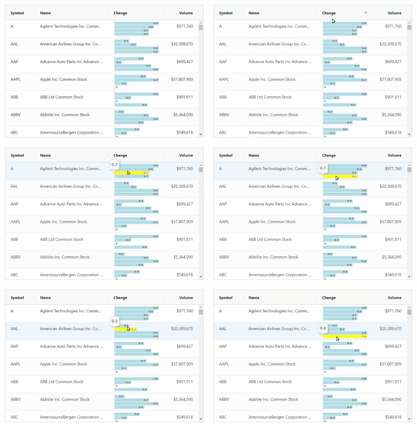
As part of AG Grid 26.2 we've added a bar sparkline, so you can now choose between area, bar, column, and line sparklines. We've also added sparkline labels for bar and column sparklines.
See an example with bar sparklines with labels and tooltips below:
Accessibility improvements
We've improved accessibility support for full-width rows and the set filter. This is part of our ongoing work to ensure that AG Grid delivers a fully-accessible user experience.
Column Filtering improvements
Column filtering is a cornerstone of the grid user experience. As part of AG Grid 26.2, we've made filters more customizable and quicker for users to navigate through.
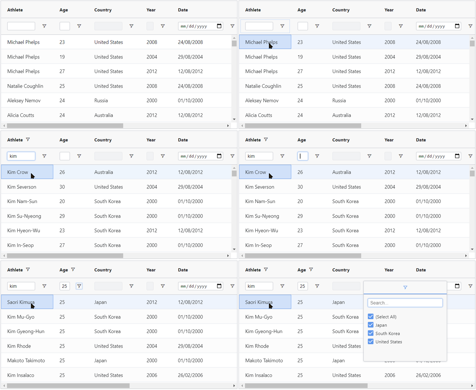
Easily move through floating filter inputs
The user can now directly TAB through the floating filter inputs in AG Grid. This allows to quickly move from one column filter input to another and to configure filters with ease, as shown below:
Custom filter options with 2 inputs
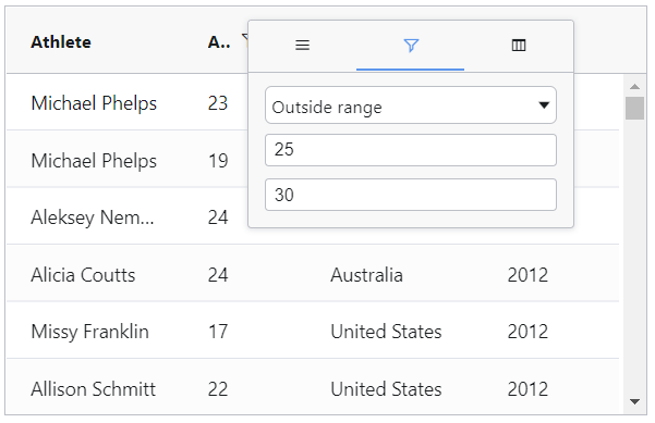
You can now build custom filter options with two parameters. This allows you to build your own "outside range" custom filter as shown below:
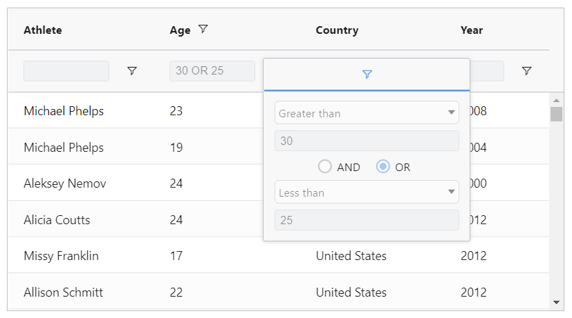
Make column filters read-only
You can now set a column filter and make the filter inputs read-only. This way users will see the filter options applied but will be unable to modify them as shown below:
Vue3 support in Standalone charts
Standalone charts now support Vue3. We've updated the documentation live examples and these all have Vue3 versions now so you can get started easily.
Summary
In this post we covered the key improvements in AG Grid 26.2. Even if you've been using the same version of AG Grid for a while, we recommend upgrading to this new version for its enhancements in ReactUI and to improve the user experience, particularly in column filtering.
As always, we’re keen to help you upgrade and to hear your feedback.
Happy coding!
