

Real-time trading dashboards. Manufacturing telemetry monitors. Live medical sensors. AG Charts 13 transforms how developers build data-intensive applications that can't afford to miss a beat, while cutting your bundle size by up to 45%.
Key Features
- High Frequency Updates - Add, remove and update points in your chart as fast as the user's monitor can refresh to visualise real-time data.
- Zoom Data Change Strategies - Configure how Zoom responds to data updates by preserving the domain/ratios, or snapping to the latest data.
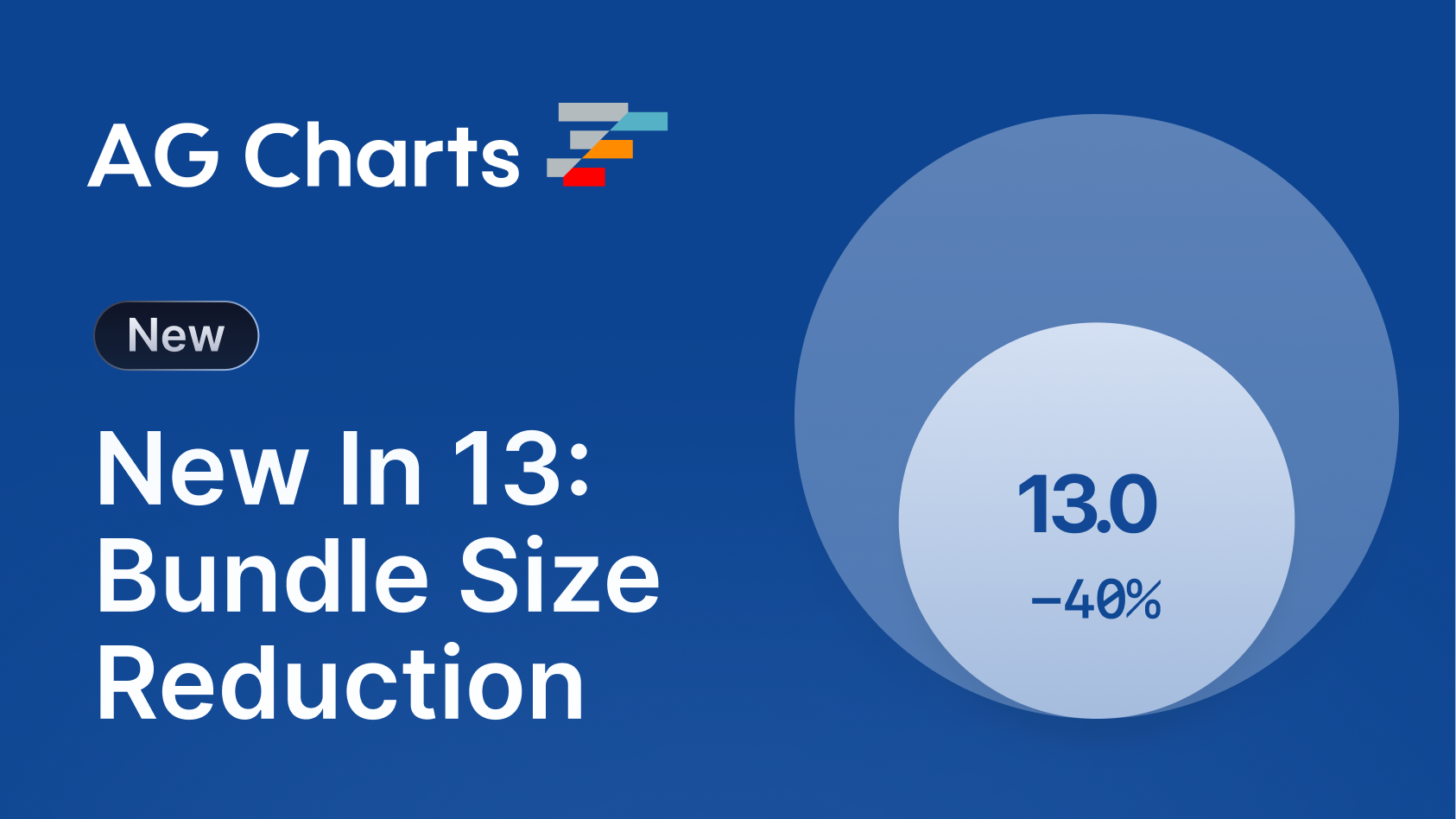
- Bundle Size Reduction - Reduce your bundle size by up to 45% with Modules, thereby reducing your application load times.
- Simplified Axis Configuration - Easily configure x, y and secondary axes, with reduced boilerplate code, and automatic secondary axis setup.
- Improved Highlighting Defaults - Provide better visual cues to users when highlighting items by dimming other series and bringing the highlighted item to the foreground.
-
Dynamic Context Menu Items - Define context menu items at runtime using the new
getItemscallback to provide contextually-relevant actions to users.
High Frequency Data Updates
AG Charts 13 now supports high-frequency data updates, allowing data to be added, removed and updated as fast as the user's display can refresh - enabling use cases that visualise real-time data feeds, such as stock tickers or sensor telemetry monitors.
The feature is available for free in AG Charts Community, supports all appropriate series types, integrates seamlessly with zooming and panning, and scales to large datasets without degrading interaction performance:
Live Market Data Example
Plot real-time financial data with millisecond updates so that traders and analysts never miss a signal:
Real Time Telemetry Example
Monitor live telemetry from a manufacturing line to alert operatives instantly to any anomalies in the data:
ECG Sensor Example
Visualise a patient's vitals in real-time to monitor their condition and respond to any changes:
To efficiently update the underlying dataset, use the applyTransaction API and supply an array of data points to add, remove or update:
chart.applyTransaction({
    remove: [oldItems[0], oldItems[1]],
    update: [modifiedItem],
    add: [{ time: new Date('2024-01-01'), value: 50 }, ...],
    addIndex: 0, // Optional insertion index
});
The applyTransaction API will efficiently combine all of the operations, with updates occurring every animation frame for smooth real-time streaming.
Visit our High Frequency Data documentation for more information.
Zoom on Data Change
In addition to support for high-frequency updates, AG Charts 13 also adds new options for managing how zoom behaves during data changes, allowing users to snap to the latest data, focus on a specific domain, or retain the current zoom ratios as new data is loaded in:
To configure how Zoom handles data updates, set the zoom.onDataChange.strategy property to one of the following values:
preserveDomainkeeps the current viewport fixed, ideal for analysing a specific time window or region of interest.preserveRatiosmaintains the zoom level but allows the domain to shift, keeping the visual scale consistent.resetrestores the initial zoom state on every update.
The optional stickToEnd property ensures the viewport automatically follows the most recent data when the user is already at the end of the range:
{
  zoom: {
    enabled: true,
    onDataChange: {
      strategy: 'preserveDomain', // or: preserveRatios || reset
      stickToEnd: true
    },
  },
}
This feature ensures users always have access to the most up-to-date information, whilst retaining the freedom to interact with it in whichever way suits their needs.
Visit our Zoom documentation for more information.
Bundle Size Reduction
AG Charts 13 now supports Modules, which can reduce your application's bundle size by up to 45%. Instead of importing the entire AG Charts Community or Enterprise packages, you can now choose the Modules you need, and the unused ones will be automatically tree-shaken out.
To start using Modules, simply import them and register them via the ModuleRegistry:
import {
    AllCommunityModule,
    AnimationModule,
    HeatmapSeriesModule,
    ModuleRegistry,
} from 'ag-charts-enterprise';

ModuleRegistry.registerModules([AllCommunityModule, HeatmapSeriesModule, AnimationModule]);
We've also built a Module Selector to help you find and register the correct modules - just select the features you need, and copy the generated code into your application:
If bundle size isn't a concern, you can quickly access all of the Community and Enterprise features with the AllCommunityModule and AllEnterpriseModules:
import { AllEnterpriseModule, ModuleRegistry } from 'ag-charts-enterprise';

ModuleRegistry.registerModules([AllEnterpriseModule]);
Modules make your applications load faster and get your charts in front of users quicker by reducing your application's bundle size. It will also help to improve Core Web Vitals metrics, such as LCP and INP, which are particularly important for SEO.
Visit our Modules documentation for more information.
Simplified Axes Configuration
AG Charts 13 simplifies axes configuration by automatically detecting and configuring secondary axes, and removing the need to manually define each x/y axis.
Previously, configuring a secondary axis required that each axis have its own object defined within the axes property. With the new series.yKeyAxis property, AG Charts will automatically create and configure a secondary axis for you:
{
    series: [
        // These two series are linked to the default 'y' axis
        { type: 'bar', xKey: 'year', yKey: 'male' },
        { type: 'bar', xKey: 'year', yKey: 'female' },
        // This series is linked to a new, automatically created 'ySecondary' axis
        {
            type: 'line',
            xKey: 'year',
            yKey: 'exportedTonnes',
            yKeyAxis: 'ySecondary',
        },
    ],
}
This change also allows for simplified configuration of the x/y axes; e.g. to configure the y-axis, you just use the y key:
{
    axes: {
        y: { title: { text: 'Price' } },
    },
}
This API change reduces the amount of boilerplate code you need to write and maintain, and makes it easier for new adopters of AG Charts to get started quickly.
Visit our Secondary Axes documentation for more information.
Improved Highlighting Defaults
AG Charts 13 refines the default highlighting behaviour so that when a point, segment or bar is highlighted, non-highlighted items are subtly de-emphasised, and the active item is brought to the foreground:
These improvements apply automatically across all series types without any additional configuration. If you need to customise the behaviour, you can adjust the highlight options on a per-series basis to control aspects such as stroke width or opacity, or disable highlighting entirely where it’s not required:
{
  highlight: {
    highlightedItem: {...},
    unhighlightedItem: {...},
    highlightedSeries: {...},
    unhighlightedSeries: {...},
  }
}
These improved highlighting defaults help users more efficiently interrogate their data, particularly in large, broad data sets, without requiring any additional configuration.
Visit our Series Highlighting documentation for more information.
Dynamic Context Menu Items
AG Charts 13 now supports dynamic context menu items, allowing you to show the most contextually relevant actions to users, based on where they clicked within the chart:
Menu entries are generated at runtime using the getItems callback. The callback provides a parameter containing information about where the user has clicked. e.g. if the user has right-clicked a node, the params will contain the datum and series, etc...
A typical implementation might look like:
{
    contextMenu: {
        getItems: (params) => {
            if (params.showOn === 'series-node') {
                const xName = params.datum[params.xKey];
                return [
                    'defaults',
                    'separator',
                    // Dynamic Context Menu Item
                    {
                        type: 'action',
                        showOn: 'series-node',
                        label: `Log Datum "${params.seriesId} - ${xName}"`,
                        action: () => console.log(params.datum),
                    },
                ];
            }
        },
    },
}
Dynamic context menu items ensure users always have access to the most relevant actions, with just a single right-click anywhere in the chart.
Visit our Context Menu documentation for more information.
Next Steps
Ready to Migrate to AG Charts 13?
New to AG Charts? Get started in minutes, for free:
Considering AG Charts Enterprise?
Our trial licence gives you direct access to our support team, removes the watermark and console error, and allows you to test in production.
TL;DR
AG Charts 13 is one of our most significant releases yet, focused on speed, scalability, and developer experience:
- High-frequency updates stream data at display-refresh rates for smooth, real-time visualisations,
- Zoom data change strategies allow you to control how zoom responds to updates, maintaining current domains/ratios, or always showing the latest data,
- Module-based builds cut bundle sizes by up to 45% for faster load times,
- Automatic secondary axis configuration reduces boilerplate and simplifies axis configuration,
- Refined highlighting improves focus and readability in dense visuals, and
- Dynamic context menus surface context-aware actions tailored to the user’s interaction.
As always, we're here to help you upgrade, and we're keen to hear your feedback. Enterprise customers can contact us via Zendesk; Alternatively, please submit a GitHub issue.
Happy coding!