

AG Charts 12.1, our JavaScript Charting Library, is centred around providing developers with more flexibility when styling the chart by adding new customisation options for various chart elements, including grid bands, axis labels, the legend, the series area, and titles.
The key features from this release include:
- Alternating Band Shading - Apply alternating fills for grid bands along chart axes.
- Extra Axis Zooming Interactions - Configure whether dragging the axes pans or zooms the chart.
- Axis Label Truncation - Automatically truncate axis labels when there isn't enough space to display them fully.
- Floating Legend - Improved position presets and fine-grained control over the legend's X/Y position.
- Fills and Borders - Style fills and borders of chart elements, including axis labels, the series area and the legend.
- Multi-Style Text Elements - Apply Multiple font styles within a single element, e.g. title, subtitle, footer, etc...
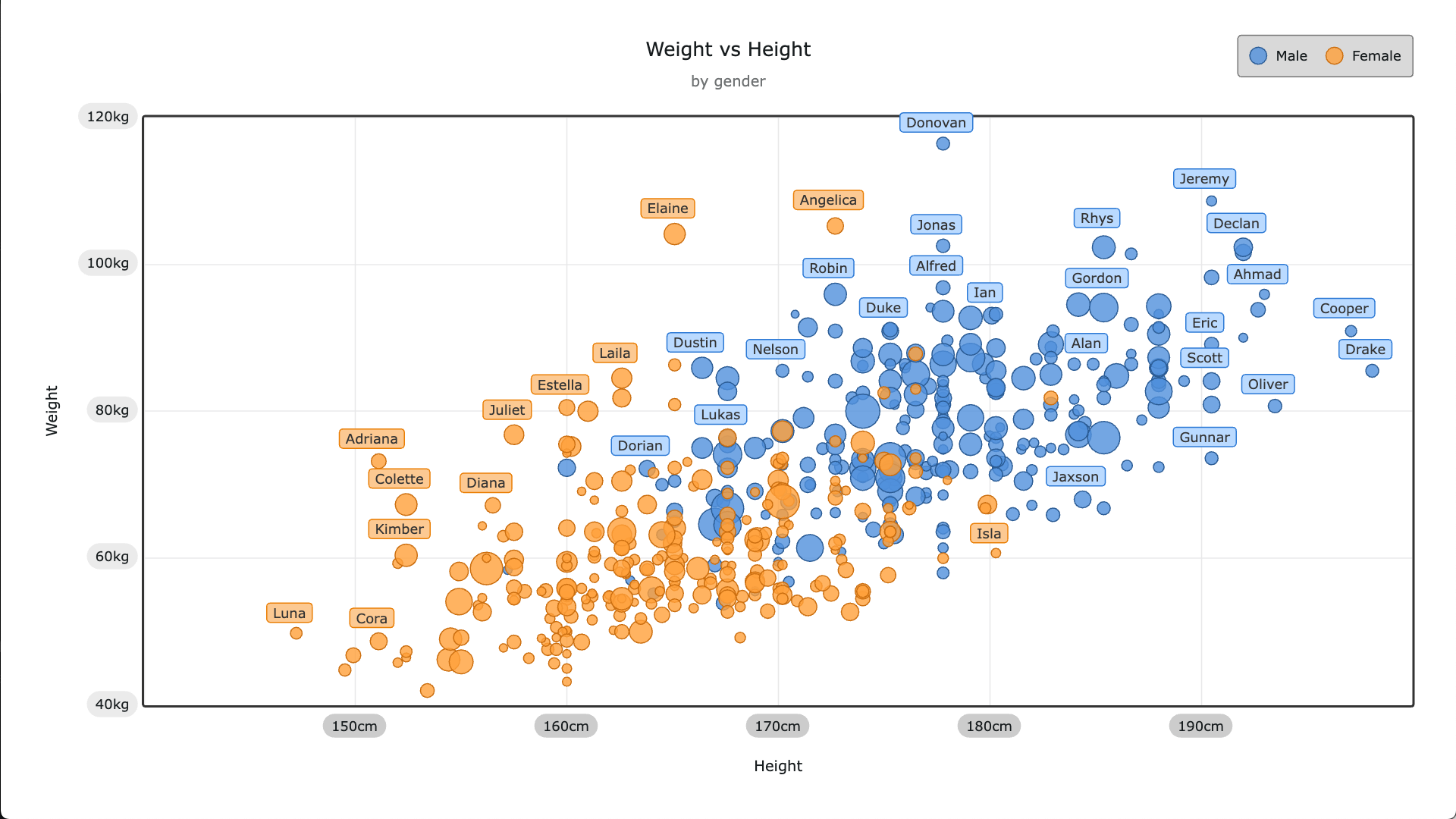
Alternating Band Shading
AG Charts 12.1 introduces the option to define fill colours for grid bands along chart axes.
Alternating grid fill patterns can be controlled by providing two or more objects to the gridLine.style array with different values:
gridLine: {
  style: [
    {
      fill: 'black',
      fillOpacity: 0.05
    },
    {}, //empty object for an unshaded band
  ],
},
Alternating colours of bands provides greater visual separation between bands, making comparisons between bands faster and more intuitive.
Extra Axis Zooming Interactions
AG Charts 12.1 provides the ability to configure whether dragging the axes pans or zooms the chart, as well as adding the ability to zoom by scrolling over the axis.
To control the actions performed when an axis is dragged, set the zoom.axisDragMode property to either 'zoom' or 'pan':
zoom: {
  enabled: true,
  enableAxisDragging: true,
  enableAxisScrolling: true,
  axisDraggingMode: "zoom", // or 'pan'
},
This feature improves the interactivity and navigation of charts, especially for dense datasets:
Axis Label Truncation
AG Charts 12.1 includes a new feature which automatically truncates axis labels when there isn't enough space to display them fully and displays a tooltip with the complete text when hovered.
To enable label truncation, set the axis.label.truncate property to true:
axes: [
  {
    label: {
      truncate: true
    },
  },
]
Truncation prevents overlapping text and ensures that as much as possible of each label remains readable regardless of the chart's size, without reducing the number of ticks:
Floating Legend
AG Charts 12.1 supports floating legends, which allow for fine-grained control over where the legend is rendered.
To make the legend float, set the legend.position.floating property to true. The placement, xOffset and yOffset properties provide precise control of where the legend is rendered:
legend: {
  position: {
    placement: 'right-top',
    floating: true,
    xOffset: -50,
    yOffset: 75,
  },
}
Floating legends help save space and improve context when users are comparing series within a small chart area.
Fills and Borders
AG Charts 12.1 offers a new styling feature that allows customisation of the fills and borders of chart elements, including the legend, axis labels, and the series area.
To customise the fills and borders, define the fill and border properties of the chart element, for example, the axes.label property:
axes: [
  label: {
    fill: '#badaff',
    fillOpacity: 0.8,
    border: {
      enabled: true,
      stroke: '#2c79d5',
      strokeWidth: 1,
    },
    cornerRadius: 4
  }
]
By customising fill and border styles, charts can, for example, more accurately match the wider application theme, highlight important values, and add high-contrast colours to improve accessibility:
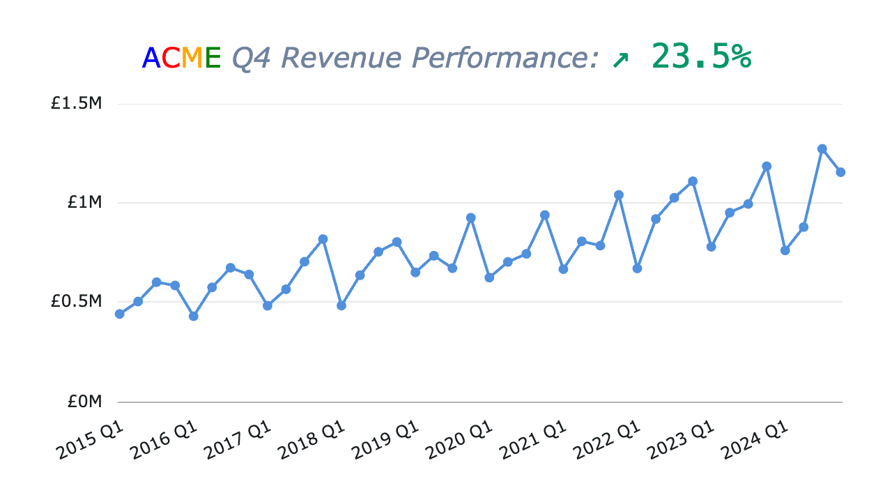
Multi-Style Text Elements
The chart title, subtitle and footnote now support multiple font styles within a single element, e.g. title, subtitle, footer, etc...
To supply multiple styles, pass an array of TextSegment objects (that contain the text and font style overrides) to the text property of the element to be styled:
{
  title: { // Or subtitle, footer, etc..
    text: [
      {
        text: "2025",
        fontStyle: "italic",
      },
      {
        text: " Financial Growth ",
        fontSize: 26,
      },
      {
        text: "Overview",
        color: "#ff7f0e",
        fontFamily: "monospace",
      },
   ],
  }
}
Being able to apply multiple styles to text elements allows you to, for example, highlight key information, establish visual structure, and align with wider branding or style guidelines:
Summary
AG Charts 12.1 continues to enhance developer and end-user flexibility through deeper styling control and richer interaction patterns.
As always, we're here to help you upgrade, and we're keen to hear your feedback. Enterprise customers can contact us via Zendesk; Alternatively, please submit a GitHub issue.
Next Steps
New to AG Charts? Get started in minutes, for free:
Considering AG Charts Enterprise? Request a free two-week trial licence to test your application in production and get direct access to our support team.
Happy coding!