Version 11 of AG Charts, our JavaScript Charting Library, includes significant performance enhancements to our Line Series. These improvements allow you to render over a million data points that can be zoomed, panned, and interacted with at over 60 fps, making these transitions appear seamless to users.
To achieve this level of performance, we implemented the M4 algorithm: an aggregation-based time series dimensionality reduction technique that provides error-free visualizations at high data reduction rates. This blog post details our implementation of this algorithm and the performance improvements we've gained from it.
Challenges in Rendering Large Datasets
AG Charts leverages the HTML5 Canvas API for its drawing operations. We've discussed some of the techniques we apply to optimize HTML5 Canvas rendering in a previous blog post, however, no matter what optimisations are applied, rendering a million data points in a chart is computationally intensive.
If you're not already familiar with the Canvas API, drawing lines is akin to instructing a virtual pen: you issue one command to place the pen nib at specific coordinates on the screen, and another command to move the nib to a different set of coordinates, which then draws a line between the two points. This means that as the size of our data grows, so does the number of drawing operations required, which means more work for us to do.
Introducing the M4 Algorithm
Given the way the Canvas API works, the only way to reduce the work needed to draw a chart is to physically draw less, which is where the M4 algorithm comes in. According to the original paper, the M4 algorithm "exploits the semantics of line rasterization to drive the data reduction of high-volume time series data." In other words, this approach allows us to reduce the number of drawing operations required to render a line chart, whilst retaining its original characteristics.
How the M4 Algorithm Works
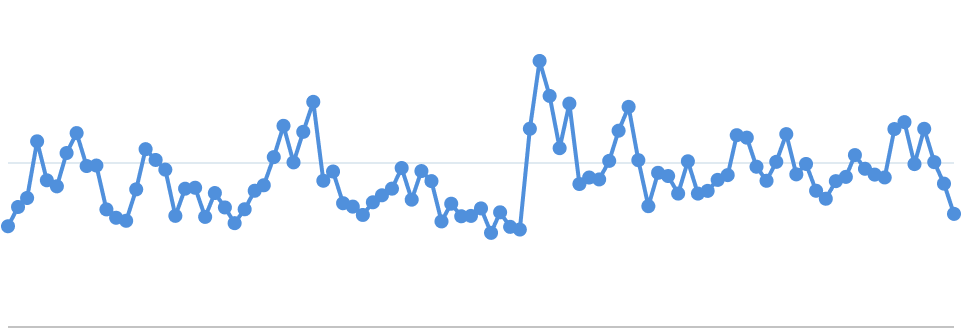
This algorithm might sound complicated, but it's actually quite simple. Consider the following line chart, which contains 100 data points:

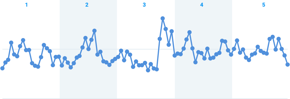
To apply the M4 algorithm, start by determining the range of your x-values. For instance, if your x-data ranges from 100 to 200, you might divide this range into 10 equal buckets: 100–110, 110–120, and so on. In this case, we've divided our example into 5 buckets:

Next, for each bucket, identify the data points that meet the following criteria:
- Minimum x-value
- Maximum x-value
- Minimum y-value
- Maximum y-value
Because a data point may fit more than one criterion, each bucket will have up to four points. These have been highlighted in each bucket below:
Finally, connect the selected data points with lines to draw the simplified Line Series:
And that's it... by applying the M4 algorithm we've reduced the number of drawing operations required from 100 to 18.
We purposefully made our buckets large in this example to illustrate how the algorithm works. To make this optimised chart appear almost indistinguishable from if the algorithm had never been applied, you’ll want your number of buckets set so that each bucket is around a pixel wide.
For example, if you're rendering a chart that's 500 pixels wide and contains one million data points, you would divide the data into 500 buckets - one bucket per pixel. Each bucket would contain 2,000 data points (since 1,000,000 divided by 500 equals 2,000). In this example, applying the M4 algorithm reduces each bucket to a maximum of four points, meaning you'd end up with up to 2,000 points in total (500 buckets × 4 points), which is just 0.2% of the original data.
Optimizing for Interactivity
When implementing this algorithm the first problem we encountered was that iterating over a million points is slow. To achieve 60fps performance we need to render each frame in around 16ms, however, our most optimised implementation took around 100ms to complete, which made features like Zoom feel sluggish.
To fix this, we can pre-compute the M4 algorithm at different zoom levels, much like Google Maps does as you zoom out from a small street to a city. This works by starting with of snapshot of the highest detail you have available, and then gradually reducing the level of detail to generate additional snapshots until there is no value in reducing it further.
For the M4 algorithm, we employ a clever technique to accelerate detail reduction. Instead of processing the original dataset at each level of detail, we utilize the results from a previous run by combining each adjacent pair of buckets, effectively halving the number of buckets.
Below is an illustration of our example after merging the buckets:
This approach allows us to reuse the already filtered data, rather than starting from scratch with the entire dataset. When dealing with a dataset of one million points, reducing the filtered data to just a few thousand points makes a huge difference. As an added bonus, each time this step is repeated, it will take less time than the previous run.
Results
As you can see from the chart below, these optimizations have the biggest impact on large datasets.
Try It Out
Use the buttons in the example below to change the size of the dataset, and then zoom in and out to see the performance of the chart in real time:
The source code for this example is available on our GitHub.
Conclusion
By implementing the M4 algorithm and optimizing data processing, AG Charts 11 delivers high-performance rendering of large Line Series datasets. These enhancements enable you to create interactive charts that remain fast & responsive, even with millions of data points.
If you've made it this far, you may be interested in some of our other performance-related blogs, that discuss a range of other optimisations we've made to AG Charts to make it The Best JavaScript Charting Library In The World:
- Optimising HTML5 Canvas Rendering: Best Practices and Techniques
- Building AG Charts: Efficient JavaScript Charting with Tree-Based Scene Graphs
Want to add high-performance JavaScript Charts to your application? Get started today, for free:
