
A common requirement for data grids is to allow users to interact with the grid through popover elements such as tooltips/menus. Popover menus can be especially useful to expose additional functionality in the context of a grid row or cell without cluttering the UI with multiple buttons in each row.
In this blog post, I'll use a third-party library to showcase how to create an interactive menu component as a popup that is triggered on a button click.
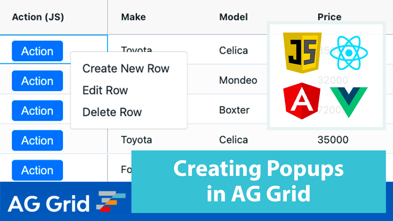
Popup Menu in Action
See the popup menu in action below:
Live Example
See the live sample in JavaScript below and links to the same sample in other frameworks just below it.
Open the live example in all the major frameworks using the links below:
Contents
- Building a Custom Popup Component
- Creating a Button
- Creating the Menu Content
- Toggling the Menu
- Configuring the Menu
- Implementing the Menu Actions
Building a Custom Popup Component
There are many third party libraries which provide components that can be configured as a popup out of the box. For this post however, we won't be focusing on any particular third party library, but instead creating a simple component from scratch. The principles shown in this post can be used for any component, and will work just the same.
To handle the popup positioning, we will be leveraging Tippy.js which is built on Popper.js - a library that allows us to create tooltips, popovers, dropdowns, and menus.
According to the Tippy.js documentation, a tippy consists of three parts:
- Content - the content of the
tippy. This is where you define your menu/tooltip component. - Target - the trigger for the
tippyso that it knows where to render and position the tooltip/popover based on the target as an origin point. - Props - optional properties to configure
tippy. This allows us to make the menu component into a popup and interact with its elements.
The rest of the blog post will look at how we implement these three parts to get our menu popup running.
Creating a Button
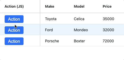
First let's create a custom cell renderer on the "Action" column in the grid, which will render a button.
The snippet below shows the HTML of the button we want to create:
<button class="btn btn-primary" data-action="toggle">Action</button>See the code for the custom cell renderer in Vanilla JavaScript shown below. You can find the implementation for React, Angular and Vue in the Live Examples section above:
  init(params) {
    this.params = params;
    this.eGui = document.createElement('div');

    this.eActionButton = document.createElement('button');
    this.eActionButton.innerHTML = 'Action';
    this.eActionButton.setAttribute('data-action', 'toggle');
    this.eActionButton.classList.add('btn');

    this.tippyInstance = tippy(this.eActionButton);
    this.tippyInstance.disable();

    this.eGui.appendChild(this.eActionButton);
  }
Note that the button has a data-action attribute, this is needed so we can handle click events. This will be covered in the section Toggling the Menu.
Initialising a tippy instance
In the code segment above, we are creating a tippy instance by calling the tippy() constructor with this.eActionButton as the argument.
This means that the "Action" button is the target for our tippy instance, meaning that tippy will position our menu relative to the button.
Creating the Menu
Now that we've created a button and have a tippy instance, let's now create our menu which will serve as the content for the tippy.
The snippet below shows the HTML of the menu we want to create:
<div class="menu-container">
    <div class="menu-item" data-action="create">Create New Row</div>
    <div class="menu-item" data-action="edit">Edit Row</div>
    <div class="menu-item" data-action="delete">Delete Row</div>
</div>
To generate the menu in Vanilla JavaScript we use a helper function createMenuComponent as shown below:
  createMenuComponent() {
    let menu = document.createElement('div');
    menu.classList.add('menu-container');

    let options = ['Create', 'Edit', 'Delete'];

    for (let i = 0; i < options.length; i++) {
      let item = document.createElement('div');

      const option = options[i];
      item.classList.add('menu-item');
      item.setAttribute('data-action', option.toLowerCase());
      item.innerText =
        option == 'Create' ? `${option} New Row` : `${option} Row`;
      item.addEventListener('click', this.menuItemClickHandler.bind(this));
      menu.appendChild(item);
    }

    return menu;
  }
This essentially creates three menu items with the text Create New Row, Edit Row and Delete Row, which also have an event listener method menuItemClickHandler to handle mouse clicks events.
Toggling the Menu
The next step is to toggle the menu when the "Action" button is clicked. We are capturing the click event on the button by implementing the Grid Event onCellClicked.
When a cell is clicked, we check if the event target has data-action=toggle and if it does, we then grab the instance of the Cell Renderer which triggered the event and toggle the menu by calling the instance method togglePopup as shown below:
const gridOptions = {
  // [..]
  onCellClicked: (params) => {
    if (
      params.event.target.dataset.action == 'toggle' &&
      params.column.getColId() == 'action'
    ) {
      const cellRendererInstances = params.api.getCellRendererInstances({
        rowNodes: [params.node],
        columns: [params.column],
      });
      if (cellRendererInstances.length > 0) {
        const instance = cellRendererInstances[0];
        instance.togglePopup();
      }
    }
  },
};
Inside our Cell Renderer, we are keeping track of whether the menu is showing or hidden by the instance variable isOpen which has a boolean value, set to false by default:
export default class PopupCellRenderer {
  constructor() {
    this.isOpen = false;
    // [..]
  }
}
The method togglePopup updates isOpen and then creates the menu component by calling the helper function createMenuComponent which creates the menu dynamically.
This is implemented in Vanilla JavaScript as follows:
  togglePopup() {
    this.isOpen = !this.isOpen;
    if (this.isOpen) {
      this.configureTippyInstance();
      this.eMenu = this.createMenuComponent();
      this.tippyInstance.setContent(this.eMenu);
    } else {
      this.tippyInstance.unmount();
    }
  }
Configuring the Menu via tippy
Now that we've displayed the menu component, let's see how we can configure it. We've provided properties to the tippy instance by calling the helper method configureTippyInstance.
  configureTippyInstance() {
    this.tippyInstance.enable();
    this.tippyInstance.show();
    this.tippyInstance.setProps({
      trigger: 'manual',
      placement: 'right',
      arrow: false,
      interactive: true,
      appendTo: document.body,
      hideOnClick: false,
      onShow: (instance) => {
        hideAll({ exclude: instance });
      },
      onClickOutside: (instance, event) => {
        this.isOpen = false;
        instance.unmount();
      },
    });
  }
For the purposes of this post, we won't be going through all of these, but it's worth noting the following:
appendToallows us to make the content of thetippyas a popup by binding it todocument.bodyinteractivedetermines if the tippy has interactive content inside of it, so that it can be hovered over and clicked inside without hiding.
You can read more about the configurable props in the tippy documentation.
Now, when we click on the "Action" button, the menu is created dynamically and then shown as a popup!
Implementing the Menu Actions
Each menu item has the click event listener menuItemClickedHandler to allow the user to interact with the menu to perform create, edit and delete actions. See how these actions are handled in the code below:
  menuItemClickHandler(event) {
    this.togglePopup();
    const action = event.target.dataset.action;
    if (action === 'create') {
      this.params.api.applyTransaction({
        add: [{ make: 'Toyota', model: 'Celica', price: 40000 }],
      });
    }
    if (action === 'delete') {
      this.params.api.applyTransaction({ remove: [this.params.data] });
    }

    if (action === 'edit') {
      this.params.api.startEditingCell({
        rowIndex: this.params.rowIndex,
        colKey: 'make',
      });
    }
  }
In the code snippet above note the following:
- For creating and deleting rows, we are using the Transaction API to tell the grid to update as necessary
- To edit a row, we are using the Editing API to tell the Grid to start editing on the row that the menu belongs
You can follow the same pattern to define actions in your own implementation of the popup menu.
Summary
I hope you this article helps illustrate how to create your own popup components in AG Grid using the Tippy.js library. These can be useful in a variety of scenarios - for displaying popup menus or for additional information about a row. I hope the guidance above can help you implement your own popup and improve the usability of your application.
If you would like to try out AG Grid check out our getting started guides (JS / React / Angular / Vue)
Happy coding!