AG Charts 10 adds powerful Financial Charts, allowing users to visualise, easily navigate and annotate financial data. Also, there are new series types and features to allow users to interact with data:
As this is a major version there are breaking changes for anyone upgrading. We recommend reading our migration guide and reviewing the list of changes in the release notes when planning to update to this version.
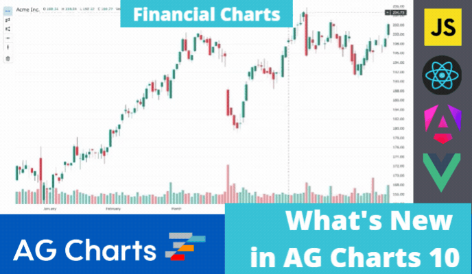
Financial Charts
Financial charting is a ready-to-use powerful tool to visualise, navigate and annotate financial data. It includes built-in range zooming, annotations and status bar to show the hovered series item values to deliver a powerful financial charting experience.
Financial charts come pre-configured and require no additional options to be set to use its advanced features - just provide the financial data as an array of objects with open, close, low, high and volume (optional) keys.
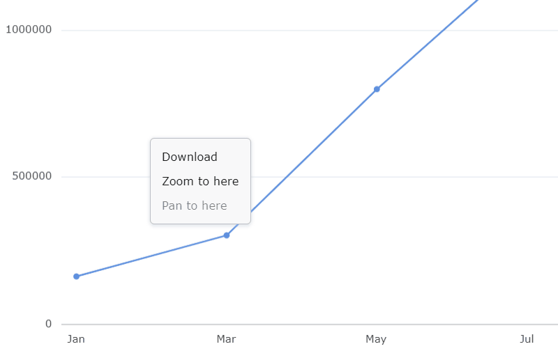
Users can navigate the financial charts in a variety of ways - using range buttons for exact time ranges, zoom buttons, turning the mouse wheel or dragging and dropping the axes to change the shown data range, as shown below:
Users can add and manage chart series annotations - trendlines, horizontal/vertical lines, parallel/disjoint channels using the chart toolbar. This enables an enhanced data analysis experience and allows users to easily share their annotations with others by saving the annotation state, as shown below:
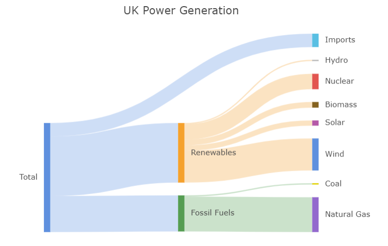
Sankey Series
The Sankey Series displays the flow of movement or change between different data items, expressed by links running between nodes with the value represented by the size.
See this documented here and illustrated below:
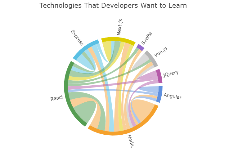
Chord Series
The Chord Series is a variation of the Sankey Series, displaying the same data in a circular visualisation. Unlike the Sankey Series, the Chord Series allows a link to start and end at the same node.
See this documented here and illustrated below:
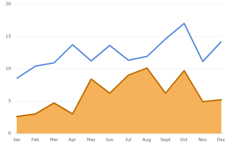
Smooth and Step Line Style
Line and Area series now support interpolation with smoothing or step transitions between series data points. This allows to better visualise the data based on the type of transition between data points.
See this documented here and illustrated below:
Localisation
AG Charts now supports localisation, allowing all text shown in the charts (including tooltips, overlays and context menus) to be translated into any language. AG Charts provides translations in 31 languages that you can easily use to provide a fully localised charting experience in these languages. You can modify any of these translations to adjust the messages your users see in any language.
See this documented here and illustrated below:
Summary
AG Charts 10 is an important major version - it adds powerful Financial Charts alongside new series types. In addition, there are many improvements in performance, stability and quality of existing features.
If you're upgrading from a previous version of AG Charts, we recommend reviewing the migration guide when planning to update. You can also see the full list of changes in our changelog.
As always, we’re keen to help you upgrade and to hear your feedback.
Happy coding!