
- Introduction
- Customization through components
- Custom cell renderer
- Custom cell editor
- Custom column filter
- Complete implementation
- Use component in column definition
Implement custom filtering logic, cell editor and renderer
Introduction
AG Grid is built to allow customisation and extension. We believe that developers should be able to easily extend default functionality to meet their business requirements. Our React grid is already component based and you can easily extend the default functionality by creating your custom React components and integrating them into the datagrid.
In the previous article on how to get started with React Data Grid, we’ve integrated ag-Grid into the React application. If you haven’t worked through the tutorial in the article you can download the previous sample application from this GitHub repository.
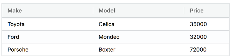
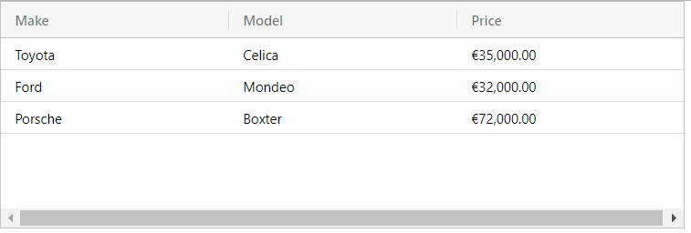
In the previous tutorial we used ag-Grid to render the following data on the screen:
In this tutorial, we’ll extend the default filtering, editing and rendering functionality available for the column “Price”.
To do that we’ll implement a custom filter, cell renderer, and cell editor.
Here’s what we’ll add to our React grid.
Custom cell renderer
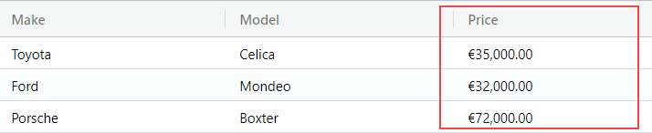
First, we’re going to implement a custom cell renderer to format numbers to show them according to a user’s locale. So if I’m in Europe the numbers in the column “Price” are displayed like this:
Custom cell editor
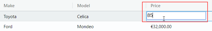
Since the “Price” column is numeric, it can’t contain non-numeric characters. By default, when a cell is being edited users can type in any character. So we’ll implement a custom cell editor to restrict the input only to numbers:
Custom filter
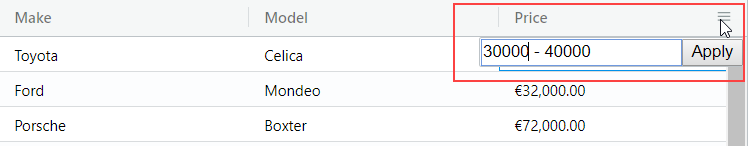
And we’ll finish this tutorial by implementing a custom filter. Our new filter will provide UI to type in the price range and filter out cars that fall out of that range:

Ready to get started? Let’s see how we can do it.
You can download the sample that we’ll be building in this article from the GitHub repository in the directory customization-demo-classes.
Customization through components
You can customize our React data grid component through custom React components. Besides the render method responsible for defining UI these components will also need to implement some methods called by ag-Grid. For example, a cell editor should implement the getValue method that ag-Grid uses to request the value from our component and update the data. A custom column filter should implement the doesFilterPass method that processes values and so on. Interfaces described in the react data grid documentation defines these required methods. As we go through the tutorial, we’ll get familiar with some of them.
Custom cell renderer
The job of the grid is to lay out the cells. By default, the grid will create the cell and render values as simple text. If you want more complex HTML inside the cell or need to customize the value before it’s rendered, you can do it with a custom cell renderer. In this tutorial, we want to format our number according to a user’s locale, so that’s the use case for a custom renderer component. This renderer will take advantage of the built-in function toLocaleString to format values.
Define custom component
To implement the renderer we first need to implement a React component. It will receive the value of a cell through React props. We will render the formatted value inside a simple span HTML element.
So, create a new file NumberFormatter.js and put the code for our component inside:
import React, { Component } from 'react';

export class NumberFormatter extends Component {
    render() {
        const value = Number(this.props.value);
        const text = value.toLocaleString(undefined, {style: 'currency', currency: 'EUR'});

        return (
            <span>{text}</span>
        )
    }
}
It’s a simple component with just one method render that returns a span element containing the formatted text.
Register the component
Now that we have our React component, we need to tell ag-Grid about it. All custom components should be listed in the frameworkComponents prop configuration option on the grid itself. So let’s import our custom cell renderer and register it:
<AgGridReact
    defaultColDef={{sortable: true, filter: true }}
    pagination={true}

    frameworkComponents: {{
        'numberFormatter': NumberFormatter,
    }}
    ...
Specify the renderer for the column
We’re almost done. The only thing that’s left is to specify our component as a cell renderer for the “Price” column. We can do that in the column definition:
<AgGridColumn field="price"
            cellRenderer= 'numberFormatter'
></AgGridColumn>
Now if you run the application you should see the price formatted:
Custom cell editor
Our React Grid provides rich editing capabilities. It resembles a spreadsheet allowing you to edit data inline. Just press F2 or double-click on a cell and ag-Grid activates the edit mode. You don’t need to provide a custom editor for simple string editing. But when there’s a need for custom editing logic we need to create our cell editor.
Enabling editing
Before we start working on a custom component that will act as an editor, we need to enable editing for the Price column and we do that by adding editable: true to the column definition:
<AgGridColumn field="price" editable= {true}
        cellRenderer= 'numberFormatter'
></AgGridColumn>
Define custom component
Similarly to a custom cell renderer, we need to define a React component to act as a cell editor. Let’s start with the basic implementation that will render an input element with a cell value received from ag-Grid. The input will pop up when a user activates the edit mode.
The component will be in NumericEditor.js.
import React, { Component } from 'react';

export class NumericCellEditor extends Component {
    constructor(props) {
        super(props);
        this.textInput = React.createRef();
    }

    getValue() {
        return this.textInput.current.value;
    };


    render() {
        return (
            <input defaultValue={this.props.value}/>
        );
    }
}
Once editing is finished by pressing Enter or moving the focus away from the input, ag-Grid needs to get the value from our editor. It calls the getValue method on our React component that should return the result of the editing. In our component, it’s the value that the user typed into the input. We need access to that input to read its value. In React we can use the Refs mechanism to accomplish that. Here is the implementation:
import React, { Component } from 'react';

export class NumericCellEditor extends Component {
    constructor(props) {
        super(props);
        this.textInput = React.createRef();
    }

    onKeyPress(event) {
        if (!isNumeric(event.nativeEvent)) {
            event.preventDefault();
        }

        function isNumeric(event) {
            return /\d/.test(event.key);
        }
    }


    getValue() {
        return this.textInput.current.value;
    };


    render() {
        return (
            <input onKeyPress={this.onKeyPress} ref={this.textInput} defaultValue={this.props.value}/>
        );
    }
}
Note that I’m using the React.createRef mechanism. Check out the react documentation to learn how you can do this in previous versions of React.Now we’re ready to implement the functionality to filter out non-numeric characters. To do that, we need to add an event listener to the input and check each item typed in by the user. Here’s how we do it:
    componentDidMount() {
        this.textInput.current.addEventListener('keydown', this.onKeyDown);
    }
What we also want to do is to prevent losing focus when a user presses left and right arrow navigation keys. We can intercept the keydown event and stop propagation if we detect the key:
    onKeyDown(event) {
        if (event.keyCode === 39 || event.keyCode === 37) {
            event.stopPropagation();
        }
    }
All right, now we’ve got almost everything set up. Here’s the last thing we need to do. We want to bring focus to the input in our custom cell editor as soon as the user activates the edit mode. Conveniently, ag-Grid gives us the afterGuiAttached method that can be used for that purpose. It gets called once after GUI is attached to DOM and we can use the reference to the input element to focus it:
    afterGuiAttached() {
        if (this.textInput) this.textInput.current.focus();
    };
So here is the full code for NumericEditor.js if you want to copy/paste it:
import React, { Component } from 'react';

export class NumericCellEditor extends Component {
    constructor(props) {
        super(props);
        this.textInput = React.createRef();
    }

    onKeyPress(event) {
        if (!isNumeric(event.nativeEvent)) {
            event.preventDefault();
        }

        function isNumeric(event) {
            return /\d/.test(event.key);
        }
    }

    onKeyDown(event) {
        if (event.keyCode === 39 || event.keyCode === 37) {
            event.stopPropagation();
        }
    }

    afterGuiAttached() {
        if (this.textInput) this.textInput.current.focus();
    };

    getValue() {
        return this.textInput.current.value;
    };

    componentDidMount() {
        this.textInput.current.addEventListener('keydown', this.onKeyDown);
    }

    render() {
        return (
            <input onKeyPress={this.onKeyPress} ref={this.textInput} defaultValue={this.props.value}/>
        );
    }
}
Register the component
Similarly to a custom cell renderer, we need to register our cell editor in the frameworkComponents:
            frameworkComponents:{ {
                'numberFormatter': NumberFormatter,
                'numericCellEditor': NumericCellEditor,
            } }
Specify the editor for the column
Once we have our component registered, we can specify it as an editor for the “Price” column:
<AgGridColumn field="price" editable= {true}
            cellRenderer= 'numberFormatter'
            cellEditor= 'numericCellEditor'
></AgGridColumn>
And that’s it. We’re all good now to start working on our last task of implementing a custom filter.
Custom column filter
Filtering is one of the most useful features of data grids. It allows users to zoom in on a particular set of records. Our React data grid provides a simple string filtering out of the box. But when you need your custom filter types, custom filter components is the way to go. The component we will be working on provides capability filter out cars based on a price range.
Enabling filtering
Before getting to the implementation of the filter component, we need to enable filtering in the grid which we do by adding :
Before getting to the implementation of the filter component, we need to ensure filtering is enabled in the grid which we have done by adding default column definitions to the grid:
    <AgGridReact
        defaultColDef={{sortable: true, filter: true }}
             ...
Define custom component
To implement a custom filter, we follow the familiar customization approach and define a React component.
This will be in the file RangeFilter.js
The UI for our filter will be rendered as an input and a button to apply the filter. Let’s put this HTML into the render method of the component:
    render() {
        return (
            <form onSubmit={this.onSubmit}>
                <input name="filter" ref={this.input} />
                <button>Apply</button>
            </form>
        );
    }
Users will use our filter UI to specify a range for a car price in the form of lower boundary — upper boundary:
We need to store the current filter condition in the component’s state, so we declare the filter property. When the input is shown, we want to pre-fill it with the current filtering condition. To do that, we can use the defaultValue property. Here’s the code that implements this:
    render() {
        return (
            <form onSubmit={this.onSubmit}>
                <input name="filter" ref={this.input}
                    defaultValue={this.state.filter}/>
                <button>Apply</button>
            </form>
        );
    }
Then we need to process user input and save it to the component’s state. So we register an event listener on the form and process input when the form is submitted using the Apply button:
this.onSubmit = this.onSubmit.bind(this);
Whenever there’s a change in the filtering condition, we not only need to update the state but also notify ag-Grid about the change. We can do that by calling the filterChangedCallback that ag-Grid provides for us through the component props. Let’s modify the call to setState a little bit and add the notification logic:
    onSubmit(event) {
        event.preventDefault();

        let filter = event.target.elements.filter.value;

        if (this.state.filter !== filter) {
            this.setState({filter: filter}, () => {
                this.props.filterChangedCallback();
            });
        }
    }
We’re done now with the user interface.
Next, we need to implement the doesFilterPass method that performs filtering. It’s called by ag-Grid to determine whether a value passes the current filtering condition or not. We also need to implement the method isFilterActive that is used by ag-Grid to determine whether the component has any filtering condition to apply.
Let’s add this functionality to our React component:
    isFilterActive() {
        return this.state.filter !== '';
    }

    doesFilterPass(params) {
        const filter = this.state.filter.split('-');
        const gt = Number(filter[0]);
        const lt = Number(filter[1]);
        const value = this.valueGetter(params.node);

        return value >= gt && value <= lt;
    }
Notice that we also receive the valueGetter function through component props. It’s the function provided by ag-Grid to retrieve the current value of a cell.
Saving and restoring filters
ag-Grid implements an API that can be used to activate and deactivate filters on demand. Usually, this API is triggered by some UI element, like a button:
For this functionality to work, our custom component should implement two methods — setModel and getModel. ag-Grid calls setModel to activate the filter and getModel to obtain the current filtering condition. Here’s how we implement these methods in code:
    getModel() {
        return {filter: this.state.filter};
    }

    setModel(model) {
        const filter = model ? model.filter : '';
        this.setState({filter: filter});
    }
We’re almost ready. The last thing we need to do is bring focus to input when it’s shown. To do that we’ll use the familiar afterGuiAttached callback:
afterGuiAttached(params) {
    this.input.current.focus();
}
Complete implementation
So here is the full code for our component:
import React, { Component } from 'react';

export class RangeFilter extends Component {
    constructor(props) {
        super(props);

        this.input = React.createRef();

        this.state = {
            filter: ''
        };

        this.valueGetter = this.props.valueGetter;

        this.onSubmit = this.onSubmit.bind(this);
    }

    isFilterActive() {
        return this.state.filter !== '';
    }

    doesFilterPass(params) {
        const filter = this.state.filter.split('-');
        const gt = Number(filter[0]);
        const lt = Number(filter[1]);
        const value = this.valueGetter(params.node);

        return value >= gt && value <= lt;
    }

    getModel() {
        return {filter: this.state.filter};
    }

    setModel(model) {
        const filter = model ? model.filter : '';
        this.setState({filter: filter});
    }

    afterGuiAttached(params) {
        this.input.current.focus();
    }

    onSubmit(event) {
        event.preventDefault();

        let filter = event.target.elements.filter.value;

        if (this.state.filter !== filter) {
            this.setState({filter: filter}, () => {
                this.props.filterChangedCallback();
            });
        }
    }

    render() {
        return (
            <form onSubmit={this.onSubmit}>
                <input name="filter" ref={this.input} defaultValue={this.state.filter}/>
                <button>Apply</button>
            </form>
        );
    }
}
Use component in column definition
Once we have our component ready, we need to register it in the frameworkComponents :
            frameworkComponents: {{
                'numberFormatter': NumberFormatter,
                'numericCellEditor': NumericCellEditor,
                'rangeFilter': RangeFilter
            }}
And then specify our custom filter for the Price column:
<AgGridColumn field="price" editable= {true}
                    cellRenderer= 'numberFormatter'
                    cellEditor= 'numericCellEditor'
                    filter= 'rangeFilter'
                    ></AgGridColumn>
Summary
The tutorial above described the React Components we used to customize the datagrid. The full code for this tutorial can be found on Github:
- github.com/ag-grid/react-data-grid
- in the directory customization-demo-classes
You might also find the examples described in these blog posts, useful starting points:
Learn more about React AG Grid — an Enterprise JavaScript Data Grid used by the Fortune 100.